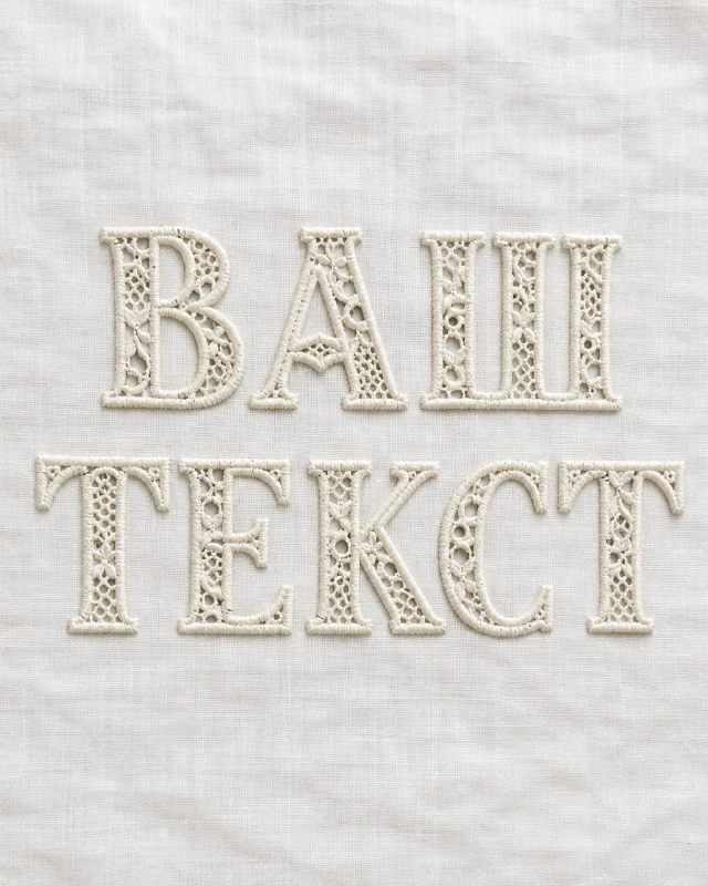
Choose a word with room for openwork
The prompt in the author's comment describes lettering with dense embroidery along its outline and open, lace-like areas inside the letters. Choose a short word with fairly broad strokes. A thin, narrow font leaves almost no room for cut-outs.
Replace [TEXT] with the final lettering. The brackets mark a placeholder and should not appear in the result. Keep the required case, then identify the letters that need especially careful checking.
For the first test, keep the composition calm and omit additional symbols. Openwork already produces a detailed pattern. Extra flowers or frames can conceal whether the open areas actually belong to the letters.
The stitched-outline and cut-out prompt
Cutwork embroidery
Create the exact word [TEXT] using delicate cutwork embroidery, elegant letterforms outlined with dense thread stitching and partially opened lace-like areas inside the letters, fine ornamental perforations, crisp handcrafted edges and subtle shadows on white linen, refined monochrome ivory-on-ivory palette, luxurious heirloom textile aesthetic, no additional text, no logo, no watermark, vertical 4:5 format, ultra detailedDense thread stitching specifies a densely stitched outline, while partially opened lace-like areas defines open areas. Both should be visible. If the result only shows patterns drawn on solid fabric, the main effect is still missing.
Fine ornamental perforations adds small decorative holes. They should not destroy the main strokes. Check whether each letter is recognisable without reading the whole word. If a character depends on guesswork, reduce the cut-outs in the problematic area.
Distinguish openings from ordinary shadows
An open area should look like space between threads and fabric edges. A dark patch inside a letter can read as shadow or dirt. Specify clear cut-out edges while retaining soft lighting.
Look at the threads around the openings. They should support the form and connect adjacent areas. Extremely thin, random bridges resemble damaged fabric, while a continuous dense mesh removes the openwork feeling.
Check the letter's own counters separately from decorative openings. Do not let the ornament close an essential counter or create a new one that changes the character. This matters especially in a word with several similar letters.
Adjust contrast on white linen
The original specifies an ivory-on-ivory palette and white linen. Slight tonal differences, texture and soft shadows convey volume. A strong black outline would make the lettering more graphic and change the example's character.
If the letters disappear, first separate the embroidery and background tones slightly. Then assess the light on the thread edges. Avoid sharpening the whole photograph equally: fine fabric texture may start competing with the word.
Check the result at a smaller size. Openwork details may become subtle, but the overall silhouette should remain. Choose a scale that lets viewers read the name before examining the stitching.
Build the textile heading in your editor
Save the image without additional captions. The white backing is part of the scene and does not promise a transparent file. If moving the letters to a new background, carefully process the cut-outs and fine thread edges.
Set the explanatory line nearby in a regular font. Do not turn all small text into openwork: decorative holes need space and disappear when reduced. One large heading gives the material sufficient room.
Keep the image and informational layers separate in the working file. For a new palette, first compare two quiet background versions with the same word and placement. This shows whether contrast improved or only the mood changed.
Select the inscription for the next layout
Creative AI Typography contains 823 prompts with material examples. The demo offers 40 prompts: compare several effects on one word and choose a readable version.