Start with the packaging and composition of the drink
original comment proposed a subject frame based on the can design. Prepare a photo with a visible label, a readable title, and a clear outline of the lid. A clean overall view is more useful than a random shot with half the can obscured by a hand or reflection.
Identify the real fruits that should appear nearby. The color of the packaging may indicate the mood, but does not indicate the exact composition of the drink. For example, a purple can by itself does not prove the presence of grapes. For advertising images, choose the environment based on proven taste information, and use color to coordinate the palette.
Pass the reference to the generator, which accepts the source images. If cans of different flavors are included in the same series, first assemble one scene and check its structure. Then change the product and the corresponding fruit, keeping the angle and lighting comparable.
Original query for a dense scene
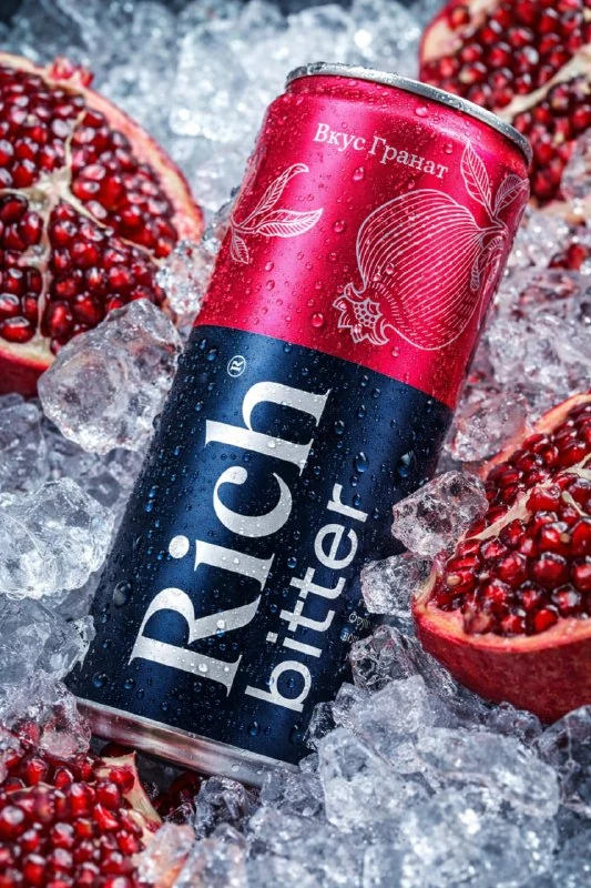
Can of drink among fruits and ice
Photorealistic commercial product photography of a beverage can, using the provided can design as reference.
A sleek aluminum can with its original colors, branding, and label fully preserved. The surface is covered with highly realistic cold condensation droplets, with natural variation in size and distribution.
The can is positioned at a dynamic diagonal angle, slightly tilted, with the main label clearly visible and facing the camera.
The can is tightly surrounded by fresh, natural fruits that match the flavor impression of the drink, combined with aggressively fractured crushed ice. Ice fragments are sharp, irregular, angular, and highly detailed, with jagged edges and micro-fractures, resembling freshly crushed ice. Some ice pieces partially overlap the can, creating depth and realism.
Lighting: bright high-key studio lighting with strong micro-contrast and crisp highlights. Emphasis on texture — condensation droplets, sharp ice edges, and controlled metallic reflections. Reflections on the can are clean and directional, preserving label readability.
Camera: macro-inspired professional commercial still life, shallow depth of field, ultra-sharp focus on the can branding, soft falloff in foreground and background.
Background: completely filled edge-to-edge with fruits and crushed ice, no empty space, no visible surface or backdrop.
Color palette automatically adapts to the can design and fruit tones, combined with clean icy whites.
Mood: refreshing, energetic, bold, premium beverage advertising.
Ultra-high resolution, hyper-realistic, commercial-grade product rendering.
Negative prompts: no flowers, no smooth ice cubes, no people, no hands, no unrelated objects, no text overlays beyond the original label.Fresh, natural fruits that match the flavor impression leaves the selection of fruits to the discretion of the generator. To remove this ambiguity, name specific ingredients in your work request. This is an editorial change for the product, and not part of the original prompt.
Background: completely filled edge-to-edge requires filling an image without an empty background. This shot works well as a close-up illustration of the drink, but doesn't leave any ready space for a long caption. If you need an advertising banner with text inside the image, change this condition in advance and select a quiet area.
Distinguish crushed ice from glass cubes
The request details sharp, uneven fragments and small cracks. The phrase no smooth ice cubes excludes neat, smooth cubes. Therefore, you need to check the ice separately: it should look crushed, with fragments of different sizes, and not identical transparent blocks.
Shards that are too large can look like glass and distract attention. Appreciate them next to the lid of the can: the scale should support the feeling of a chilled drink. If the crystals obscure the title, reduce the number of crystals in front of the label, maintaining density around the edges.
Drops on aluminum also require checking. The source notes natural differences in size and distribution. A uniform grid of identical balls looks like a decorative texture. To correct it, refine the condensation rather than adding even more shine to the entire surface.
The tilt of the can should not hide the label
Dynamic diagonal angle creates movement, and label clearly visible and facing the camera sets the constraint for the angle. Compare these two requirements in the finished image. The jar can be effectively tilted, but the main name disappears onto the side surface and becomes unreadable.
Check the text, colors, lid shape and vertical proportions. Asking to keep the branding does not confirm that it has been saved. For a series, it is useful to place the original packaging and the resulting frame side by side on the same scale: this way the elongated body and the changed width of the label are more noticeable.
Pay attention to the overlaps. A small piece of ice in front of the bottom edge gives depth; fruit on top of half the logo interferes with advertising. Do not evaluate the entire result with one wording «слишком много деталей»: indicate which object needs to be moved away from a specific area of the can.
Build an advertisement around the finished photo
It is more convenient to use a dense background in a separate block of the layout. Place the frame next to a solid-color field and add the name, flavor, and necessary information about the drink. Don't try to fit multiple lines between random shards: the text will lose support and look like part of a label.
Choose one color from the package for a little accent. Leave the rest of the elements calm, as the fruits already create a rich palette. Look at the layout in the size of the future placement: the drink should be read first, then the message.
Save the image without text and the final layout separately. For the next flavor, make a note of the fruits, flavors, and position of the jar you used. This recording allows you to support the series with conscious decisions, even if the generations differ in small details.
Assets for your next layouts
Such a frame can be supplemented with a separate heading and a calm block of conditions. The Designer's Pack contains materials for designing advertising layouts; Before choosing, look at the ingredients.