Prepare an example of your own work
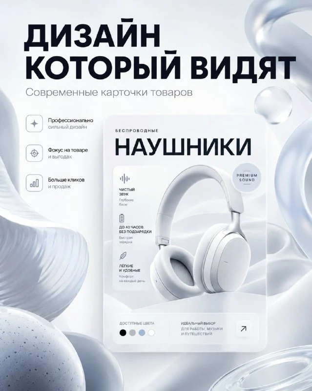
The author's public comment contains one prompt. It creates an advertisement for a marketplace product-card designer: a product card sits in the centre, surrounded by light abstract objects. The album's other previews do not mean their prompts are publicly available here.
Choose a real portfolio example that remains understandable when reduced. Remove the editor interface and unrelated neighbouring layouts. Viewers need to see the service's result rather than a desktop filled with tiny panels.
Prepare three short text lines: the service label, main message and explanation. This is your structure for the original placeholders. Do not promise numerical marketing results without supporting data.
The light advertising-setting prompt
A banner for a marketplace product-card designer
Create a modern advertising banner for a marketplace product card designer.
FORMAT:
— Vertical banner, 4:5 aspect ratio
STYLE:
— Abstract Product Marketing
— Modern Digital Design
— Creative Studio Aesthetic
BACKGROUND:
— Very light background
— White and gray gradients
VISUAL:
— Large abstract 3D shapes
— Smooth organic forms
— Glossy surfaces
— Semi-transparent materials
— Floating objects
— A modern product card in the center
TEXT:
“YOUR TEXT”
“YOUR TEXT”
Subtitle:
“YOUR TEXT”
STYLE:
— Behance featured project
— Creative studio advertising
— Modern typography
— Product marketing
— Ultra clean
— 4k
NEGATIVE:
luxury branding, gold elements, marketplace template, busy designThe TEXT block contains two identical “YOUR TEXT” entries and another under Subtitle. Replace all three with your own lines. Do not leave an accidental English phrase among the finished Russian text.
A modern product card in the center specifies the central layout. The prompt itself does not contain your project and can invent a generic card. To advertise your own portfolio, it is more reliable to insert the actual work in your editor after choosing the setting.
Make the card the main subject
Abstract objects should frame the card while leaving its image and structure visible. If a translucent shape crosses half the layout, the service becomes less clear. Specify an unobstructed area in front of the central card.
Check the scale. A tiny example gets lost among large dimensional shapes; an oversized one leaves no room for the message. Compare two card sizes against the same background with the text in the same position.
The negative block excludes gold, clutter and a standard marketplace template. These restrict the banner's visual style, not the card in its centre: the advertising setting and the demonstrated work have different roles.
Limit the abstract decorations
Smooth organic forms, glossy surfaces and translucent materials create a soft dimensional scene. Choose a few differently sized shapes rather than many identical spheres. This gives the central work a clear frame.
Examine reflections and shadows. Objects should occupy one space without random harsh highlights over the text. Keep the white-grey gradient quiet around the informational lines.
Behance featured project sets an aesthetic reference in the prompt. It does not prove the work received editorial recognition. Show your own portfolio in the finished banner and express the offer in your own words.
Assemble the service advertisement manually
Place the chosen setting in your editor, insert the real card and add checked text on separate layers. If the generated central layout is unsuitable, remove it and use the background as a base.
Check the banner at its intended display size. The service should read first, then the work example and the client's next step. Viewers should not need to examine tiny wording inside the card to understand the offer.
Save the background, portfolio image and text layers separately. The original uses vertical 4:5 proportions. For another format, redistribute the central card and clear space while retaining one understandable example rather than an expanding collage of work.
Assets for your next layouts
The final banner needs working images and separate elements. Browse Designer Pack's contents and choose materials for your advertising layout.