Prepare one word for comparison
The channel's wooden lettering collection has four separate prompts. Replace Your Text with the same short phrase in all of them. A long phrase complicates comparison: the model may shrink the letters, split the line or lose subtle material details. Start with four to six characters and the same image format.
The originals' white backgrounds help you assess shape and shadows. They do not mean the finished file is transparent. If you need the lettering over a photograph, first inspect the edges against white, then remove the background in your editor and check it against a dark backing.
Precision cutting: smooth surfaces and sharp edges
Precision CNC-carved wood
Create the text "Your Text" as precision CNC carved wood typography, clean sharp cuts, smooth surface, modern woodworking style, high accuracy details, isolated text, subtle shadow, clean white background, ultra detailed, 8k —ar 3:4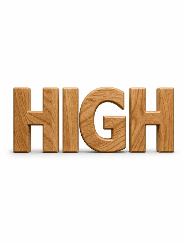
In the first version, precision CNC carved wood specifies clean machine processing. Even edges and consistent thickness suit this treatment. Compare the inner spaces with the outer contours: random splinters on half the letters would contradict the chosen manufacturing method.
The wood grain should remain visible even on a smooth surface. If the result resembles brown plastic, clarify the grain direction and natural variations in tone. Avoid adding rough chips: another prompt in this collection covers that treatment.
A thick wood cross-section: growth rings and substantial forms
Letters made from a thick wood cross-section
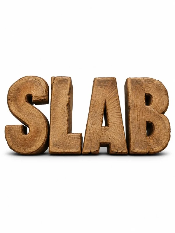
Create the text "Your Text" as thick wood slab typography, natural tree cut texture, visible rings and raw edges, heavy solid form, rustic material aesthetic, isolated text, clean white background, ultra detailed, 8k —ar 3:4The second prompt makes the letters resemble a thick wood cross-section. Visible rings and raw edges matter more than a uniform pattern. Examine how the rings run across the front surface: they should convey the material rather than look like identical stickers on each letter.
Thickness and contact shadows convey weight. If the word feels light, make the side surfaces more pronounced or choose a slightly lower viewing angle. Do not strengthen the shadow without changing the form: a heavy shadow beneath a thin object will not create convincing weight.
Veneer: thin layers instead of heavy timber
Letters made from thin veneer
Create the text "Your Text" as thin wooden veneer typography, layered wood sheets, smooth elegant surface, fine grain texture, modern minimal wood design, isolated text, subtle shadow, clean white background, ultra detailed, 8k —ar 3:4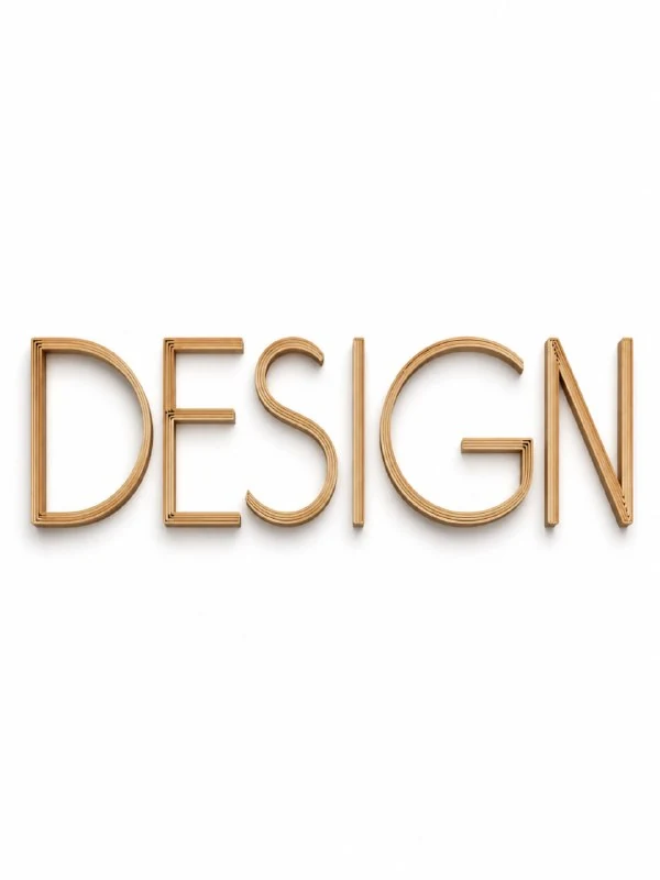
Veneer's most distinctive feature is its edge: thin sheets form a layered construction. Expect a quieter grain pattern on the front. Check that the layers have not turned into metal ribs or thick boards, which would be different materials.
This lettering works well with a light grid and a small caption or number. An overly rough background would compete with the thin layers. First leave clear space around the letters and add regular type for any information that must be readable without zooming in.
Rough boards: saw marks and irregularities
Letters made from rough boards
Create the text "Your Text" from rough cut timber planks, raw wood texture, visible saw marks, uneven edges, rustic carpenter style, natural imperfections, isolated typography, soft shadow, clean white background, ultra detailed, 8k —ar 3:4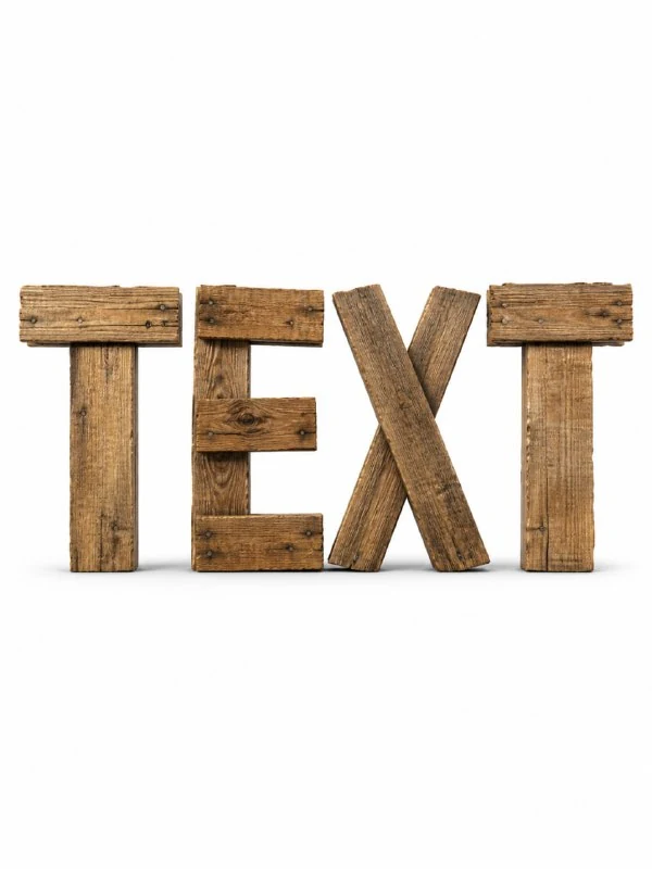
Here, visible saw marks and natural imperfections allow irregularities. But a random broken piece should not make a letter unrecognisable. Check stroke endings and internal spaces at a smaller size. If a long crack breaks an essential part of a character, reduce the defects' prominence.
Finally, compare all four versions side by side: smoothness, cross-section grain, thickness and edge quality should genuinely differ. Not every tool supports the original —ar 3:4 parameter; set the aspect ratio in the interface if necessary. Save the chosen prompt with its image so the next phrase uses the same wood treatment.
Select the inscription for the next layout
Creative AI Typography contains 823 prompts with examples, search and effect categories. Start by trying 40 options with your own text in the free demo.