Choose a short word with a clear underlying shape
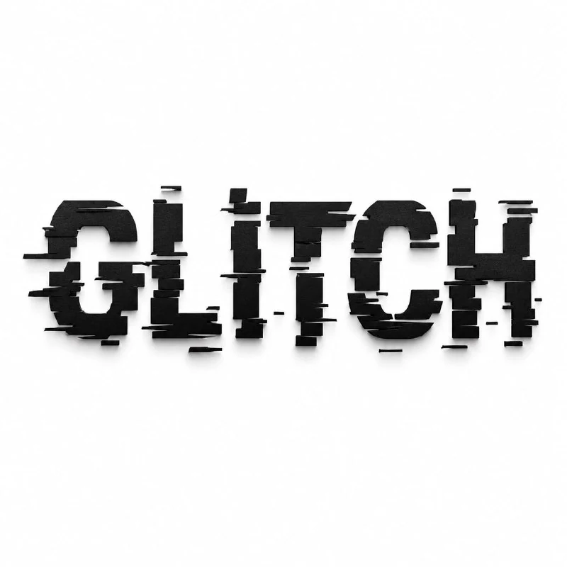
The second prompt in the experimental lettering collection uses GLITCH. For your layout, replace every mention of it. Start with a short word whose letters remain recognisable after a few cuts. A fifteen-character line is harder to control because the fragments become too small.
Keep black lettering on white for the first check. This contrast reveals cut boundaries and incorrect joins. Add a coloured background later, once you know the word reads on its own rather than relying only on familiarity.
The original prompt for cut-up letters
Geometric cuts and shifted letter fragments
Create the text "GLITCH" as black typography broken into offset fragmented pieces, digital glitch destruction style, sharp geometric cuts, modern streetwear aesthetic, isolated text, white background, subtle shadow, ultra detailed, 8k —ar 1:1The prompt specifies sharp geometric divisions and displaced fragments. A good result should therefore retain a relationship between a letter's parts. Imagine putting the fragments back to reconstruct the original character. If they become unrelated black shapes, the effect no longer explains the form.
Avoid adding several other forms of destruction at once: melting, cracks, blur and interference. They make the geometric displacement harder to assess. One clear treatment usually conveys a word's character better than a collection of unrelated defects.
Limit the displacement
Compare the lettering at full size and as a small preview. Does enough of the overall outline remain? Have neighbouring characters become confused? Check diagonal strokes especially carefully: after displacement, they can look like parts of the next letter.
If the word falls apart, reduce the displacement and number of cuts. Ask to preserve the main vertical strokes and limit disruption to the upper or lower area. For an important name, make a quieter version and keep the strong glitch treatment as an alternative.
Build the layout without competing interference
Leave enough space around the lettering so displaced fragments do not overlap supporting captions. Set the date and location in a regular readable font. Do not cut them up with the main word: the information needs to remain unambiguous.
Extend the geometric theme with one line, a small marker or a frame. Start with one additional element. If every corner of the page is filled with debris and noise, viewers see general chaos rather than a precise shift in the letters.
Adapt the result to the required format
The original square format suits a standalone card. For a vertical poster, move the lettering into your editor and add clear space for details. Simply stretching the square changes the proportions of the fragments and type itself.
A white background is not a transparent file. After removing it, zoom in on the sharp edges and check for white fringes. Finally, read the word letter by letter, compare it with the intended text and export a test preview. For a softer edge effect, explore lettering with a coloured halo.
Select the inscription for the next layout
Creative AI Typography contains 823 prompts with examples, search and effect categories. Start by trying 40 options with your own text in the free demo.