Understand the panel's structure
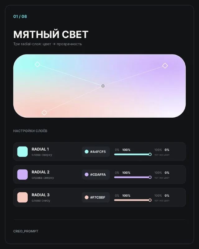
Post No. 644 shows eight Figma combinations. They use several Radial Fill layers rather than one gradient with a long list of colored stops. Each fill creates a separate soft area.
For the exercise, use a rounded rectangle and a calm light base. Recreate “Mint Light” first, then change the colors. This makes it easier to distinguish palette choices from center positioning.
Each source radial layer has two end stops: the color at 100% opacity and the same color at 0% opacity. The transparent edge lets layers overlap without harsh bands.
Colors in the first example
The “Mint Light” card lists three colors and position guides. Keep these values for the first exercise so you compare with the original rather than choosing everything simultaneously.
- #A4FCF5 — mint layer, center at the upper left.
- #CDAFFA — lilac layer, center at the upper right.
- #F7CBBF — peach layer, center at the lower left.
Set up the mint layer from full color to transparency first. Add lilac and peach using the same approach. Keep the transparent stop the same color as its layer, as the source card specifies.
Move the center rather than adding colors
If a bright patch sits in the middle and looks too abrupt, shift it toward the shape's edge. The post allows placing the center slightly outside the panel. A softer part of the colored area then remains inside.
Change one parameter at a time: center position, transition extent and opacity if needed. Moving all three layers simultaneously makes the result harder to understand.
If the last layer hides everything else, check its transparent edge and color-area size. A fourth color will not repair a fill that has already become almost solid.
Test another combination
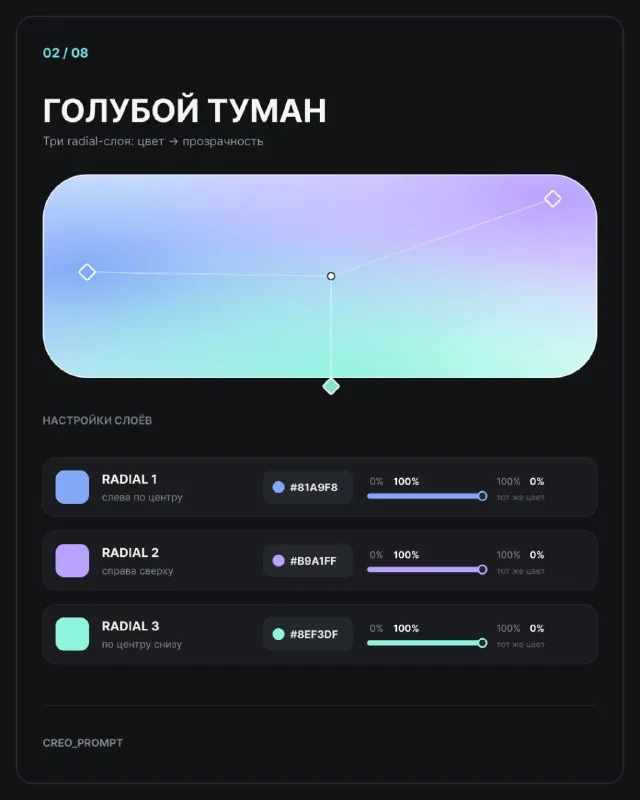
Repeat the steps for the second example using the values on its card. Compare color-patch positions as well as the overall hue. Similar colors can produce very different light distributions.
All eight examples are available in the free soft-gradient collection. No text prompt is needed here: the material demonstrates actions in a graphics editor.
Use the gradient behind text
Put a short label on the panel and check it over every colored area. Assess contrast where the text actually sits. Readability over lilac does not guarantee it over lighter mint.
If the background interferes, move the color center away from the label or weaken that layer. You need not darken the entire panel. Save an interface-card version with text and another without it to see how the background supports the composition.
The exercise produces an editable panel whose structure you understand. Adapt it to a project's colors without finding a new image: keep the layers and change values and color-area positions.
Assets for your next layouts
Designer Pack contains backgrounds, textures and other layout assets. Open the free gradient collection separately and recreate one of its examples first.