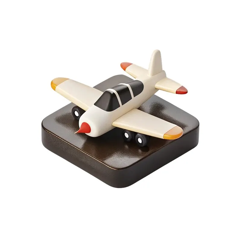
Download the free set of 48 icons
The set includes objects for travel, technology, food, finance, education, fitness and health. Each is a separate PNG with a transparent background. Start with one that directly relates to your offer: an airplane for travel, a camera for photography or a wallet for finance.
Open the free set on Yandex Disk. The original post is in the CreoPrompt Telegram channel. These assets are public; you do not need to buy the full pack to get them.
Start with the offer and format
Before choosing a background, write down what the reader should understand. For example, “A photoshoot for your brand” or “Weekend tours”. Add one useful detail: the city, date or what the service includes. Then decide on the action: visit a page, send a message or book.
Create a document at the size required for the ad placement. For practice, a 1080 × 1080 square is a convenient starting point. For publication, check the platform requirements and any areas covered by interface elements. Recompose the layout for each format rather than simply stretching it.
Place the PNG without an extra background
In Photoshop, add the PNG using Place Embedded; in Figma, drag the file onto the canvas. Transparency is preserved. A white background in the cloud preview does not necessarily mean the original file has one. Check the downloaded PNG against a colored background.
For the first version, give the object roughly half the available space and the text the other half. This is a starting point, not a fixed proportion. A detailed object can become an indistinct blob when reduced; enlarge it or choose something simpler.
Build a hierarchy: headline, detail, action
- Place a large headline in the free area. Keep it to two or three lines if the wording fits without losing its meaning.
- Add the detail in a smaller, readable size that does not compete with the headline.
- Give the action its own line or label. In a static banner, this is a visual cue, not an interactive button.
- Leave space between the object and the text. Nearby edges, highlights and letters can create accidental collisions.
3D icons already contain lighting, shadows and color. Start with a solid background and one font family. Add textures, glows or decorative lettering later if they serve the layout. Too many effects make the text harder to read.
Match color and light
Use a secondary color from the object for the background or an accent label, keeping the text contrast high. A warm icon can work on a calm cream background; a dark background can emphasize its lighter details. Compare both on the same layout.
Do not automatically add another large drop shadow. The asset may already have one. Check where its existing shadow ends before deciding whether you need more contact with the surface.
Check the banner at viewing size
Reduce the layout to its likely size in the feed. The topic, offer and action should be readable within a few seconds. If the decorative object dominates and the headline is hard to find, reduce the object, enlarge the text or remove details.
Before exporting, check spelling, margins and edge quality. Avoid enlarging the original icon several times over: transparency does not prevent quality loss. Save an editable project so you can adapt the banner later.
Next, read how to choose a background and keep text readable. All three public sets are in free materials.
Assets for your next layouts
Need other styles, backgrounds and objects? Explore Designer Pack 2026: 2,073+ assets and 14 editable PSD files. Get the complete collection for a one-time payment of ₽500.