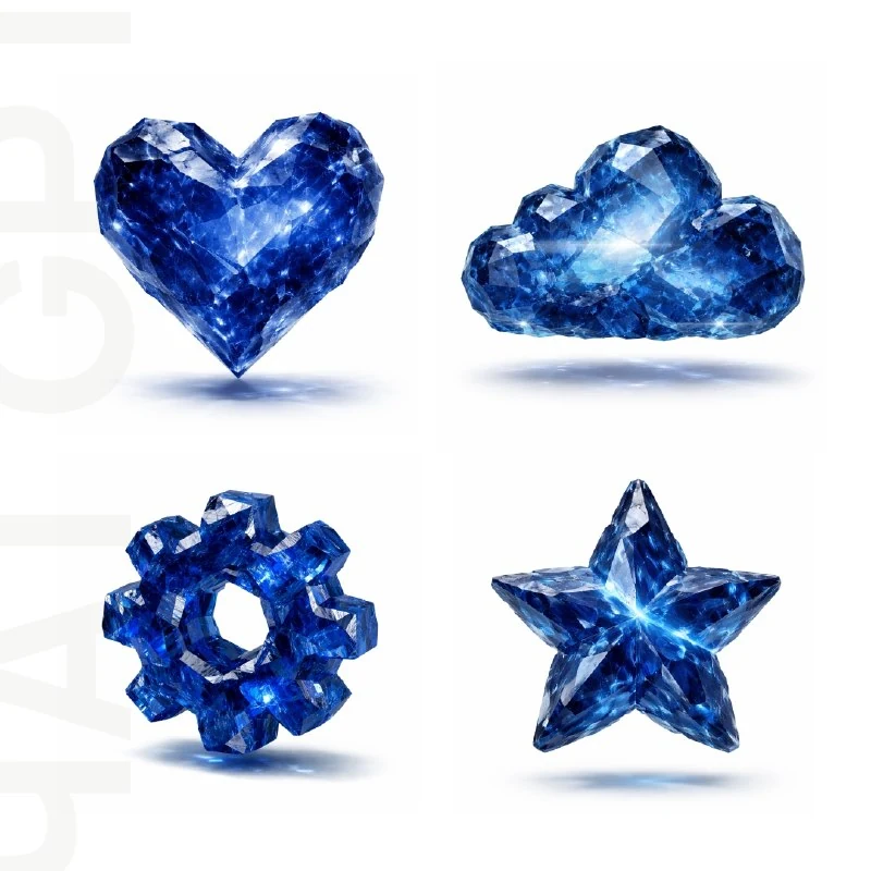
Choose an object with a recognisable outline
In the sapphire objects post, the original prompt includes the [OBJECT] field. Replace it with one specific object: a key, star, heart or another symbol with a clear outline. Avoid starting with an object whose meaning depends on tiny lettering, which can easily get lost among crystal facets.
For a set, first list three to five objects serving one purpose, such as symbols for service benefits or website sections. Keep the camera and image dimensions consistent. Change the object rather than the entire lighting setup, or the individual attractive pictures will not form a coherent set.
The original sapphire crystal prompt
An object made from blue sapphire crystal
3D image of [OBJECT], a recognizable silhouette carved from raw translucent sapphire-blue crystal,
rough gemstone geometry, sharp edges, hard angular facets, irregular asymmetrical planes,
volumetric form, thick crystal mass, realistic refraction, internal reflections, subtle dispersion,
bright specular highlights, floating in the air, centered composition, soft realistic shadow beneath,
studio lighting, clean white background, octane render, ultra-realistic, highly detailed,
no rounded edges, no smooth bubbly surface, no inflated shape, no jelly-like appearance, no plastic, no glossy app icon styleThe prompt combines recognizable silhouette with raw translucent sapphire-blue crystal. The first phrase defines recognisability; the second defines the material. If the object becomes an ordinary uncut stone, strengthen the description of its outline and identifying feature. If it becomes a smooth blue button, return to the wording about rough geometry and sharp planes.
No rounded edges is essential here. This treatment differs from inflated, glass and jelly icons: the edges are hard, surfaces angular and planes asymmetrical. Each object can have its own facets, but the overall material character should stay consistent.
Check transparency and refraction
White areas within the blue form may be reflections rather than holes. Check whether the object retains its volume between them. If bright patches remove an important part of the silhouette, reduce their area or choose calmer lighting.
Transparent crystal can show internal reflections and slight colour dispersion. Do not intensify rainbow edges on every facet at once: saturated blue should remain the defining feature. A few clear highlights serve a small symbol better than dozens of multicoloured lines.
Match spacing, scale and shadows
The original asks for an object hovering above a surface with a soft shadow beneath it. The distance between object and shadow indicates height. If one icon rests on white while its neighbour floats far above it, the row will look inconsistent. Compare the lower edges and shadow centres across the set.
Identical file dimensions do not guarantee identical visual scale. Compare a narrow key and a wide heart in the actual website section. Adjust their sizes so they feel equally important, rather than merely matching the width of their frames.
Prepare the icons for your layout
First check the set against white at its intended display size. When reduced, fine facets may disappear and a complex object may become a blue blob. Simplify the shape or enlarge the icons in the layout if that happens. Add captions in a regular font.
This prompt does not automatically create a transparent PNG. After removing the white background, check the translucent edges against several backings: the crystal may retain a pale fringe. For a predictable presentation, keep white cards and equal spacing around each object. Save the prompt and object names as a starting point for the next set.
Select the inscription for the next layout
Creative AI Typography contains 823 prompts with examples, search and effect categories. Start by trying 40 options with your own text in the free demo.