Choose a print-based or sculptural treatment
The two prompts create separate compositions. The knight sits with his head lowered and hands on the sword's pommel. The queen appears as a stone statue in profile. Before generating, decide what should define the atmosphere: rough ink or quiet stone volume.
The originals already specify THE LAST KNIGHT and THE SILENT QUEEN. These are fixed phrases rather than universal placeholders. For your project, replace the specific heading in the selected prompt and check its spelling after generation.
Keep the first comparison simple: one character, one heading and the suggested palette. Avoid immediately adding coats of arms, new figures and a detailed historical story.
The knight as an old print
The first selected prompt is in the comment about the knight.
A knight in an aged screen-print style
Vintage medieval graphic poster titled “THE LAST KNIGHT”, exhausted armored knight sitting with both hands resting on the pommel of a long sword, head lowered, heavy plate armor and torn cloak, image rendered like a black ink screen print and antique photocopy, pale blue-gray paper background, extremely high contrast black silhouette, rough halftone dots, distressed edges and ink splashes, large experimental condensed typography across the upper third, abstract calligraphic loops cutting through the title, small field-note captions positioned asymmetrically around the knight, minimal star-shaped gothic symbols, subtle registration errors, underground zine aesthetic, medieval archive meets contemporary fashion editorial, raw tactile print texture, restrained composition, 4:5 vertical poster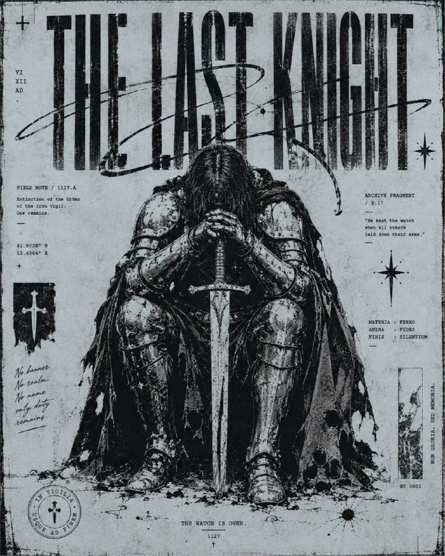
Black ink screen print and antique photocopy combines screen printing with an old photocopy. A high-contrast silhouette, halftone dots and slight print misalignment should support that look. If the armour becomes smooth coloured metal, the main print treatment has been lost.
Check the hands on the hilt and the sword's direction. Detailed paper texture cannot compensate for an extra hand or a broken object. Assess pose and silhouette first, then decorative ink defects.
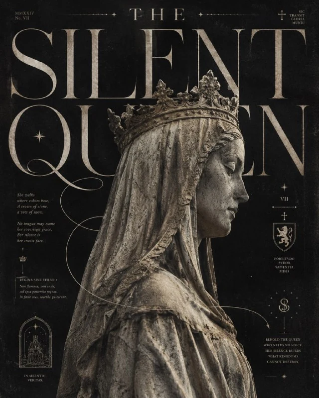
The queen in museum lighting
The second selected version is in the comment with the statue.
A stone queen in museum lighting
Editorial neo-gothic poster titled “THE SILENT QUEEN”, monumental medieval stone statue of a crowned queen shown in side profile, weathered pale limestone texture, closed eyes, long sculptural veil and draped fabric, dramatic museum lighting, monochrome charcoal gray and warm ivory palette, oversized elegant high-contrast serif typography extending behind the statue, thin ornamental calligraphic lines flowing across the composition, tiny editorial poetry blocks, small medieval symbols, stars and geometric marks, archival fashion magazine layout, subtle halftone grain, aged paper texture, slight ink imperfections, sophisticated negative space, premium art direction, dark romantic atmosphere, Swiss editorial structure mixed with medieval aesthetics, highly detailed, realistic sculpture texture, no modern objects, vertical poster, 4:5Weathered pale limestone texture specifies weathered light stone. The statue should differ from a living person in colour, surface and sculpted folds. If the result is an ordinary woman with pale skin, clarify the stone material itself.
Museum lighting reveals the profile and veil's volume. Check the crown, closed eyes and nose edge. Deep shadows can hide the main profile, while strong shine can make limestone look like polished plastic.
Make the heading work with the figure
The knight uses narrow experimental typography in the upper third; the queen uses large, high-contrast serif lettering behind the statue. Do not combine both treatments in one version: they create different rhythms.
Check overlaps. The head or crown may cover part of a word, but the name should stay understandable. Calligraphic loops should not become extra letter strokes or change the spelling.
The small notes and poetry blocks do not specify exact text. For an actual publication, replace arbitrary characters with your own short captions in the editor.
Refine the poster before exporting
Save the image without additional information and assemble a layered working layout. Add a date or explanation in a quiet area without covering the sword or profile. Compare text sizes in a small preview.
Keep grain, aged paper and print defects moderate around informational lines. Reduce the texture locally where needed while preserving its character on the illustration.
Both prompts specify a vertical 4:5 format. For another format, recheck the heading's top and the figure's edges. An accidental crop of the sword or crown can change the composition's meaning more than a different paper colour.
Select the inscription for the next layout
Creative AI Typography offers 823 prompts with lettering examples. The demo contains 40 prompts: compare different heading styles with your chosen illustration.