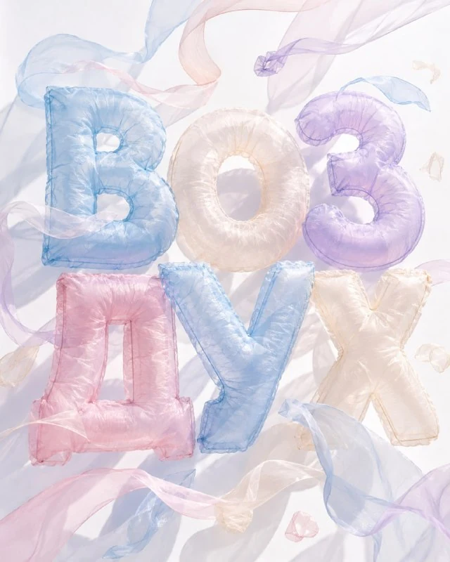
Choose a word and a light palette
In the author's comment, the letters are described as airy cushions made of translucent organza. For the first test, choose a short word with fairly broad strokes. Thin details can disappear through translucency, especially against white.
Replace TEXT with the required lettering, keeping its spelling and case. Start with the suggested pastel palette: light blue, lavender, pink and warm ivory. Too many saturated colours change the feel of lightweight fabric.
Decide which letter should be the main colour accent. The others can stay close in tone. This is an adjustment for your own word: the source does not assign a separate colour to every character.
The transparent fabric-form prompt
Translucent organza letters
Create an airy 3D typography artwork featuring the exact text “TEXT”. The letters are large inflated pillows made from translucent organza, with delicate stitching, soft wrinkles and lightweight rounded shapes. Use pastel shades of sky blue, pale lavender, soft pink and warm ivory. Light should pass through the fabric, creating transparent overlaps and gentle colored shadows.
Add several floating organza ribbons, thin fabric loops and small weightless textile forms, as if moved by a warm summer breeze.
Clean white background, natural sunlight, realistic fabric physics, elegant editorial composition, premium 3D visualization.
Vertical format 4:5, 1080×1350 px. Preserve the provided text exactly as written. No additional text, people, balloons, flowers, fruit or beach objectsTranslucent organza defines the material, while delicate stitching and soft wrinkles make it recognisable. The letters should look like fabric even while retaining rounded volume. A smooth shell without seams or folds looks more like plastic.
Compare the fabric joins and tension. Small folds near a seam provide a useful sense of scale. If the surface is covered in identical deep grooves, reduce the wrinkles: thin organza should not look like heavy quilted fabric.
Check light transmission and coloured shadows
Light should pass through the fabric asks for light to travel through the material. At overlaps, the letters may become denser and change hue. This differs from a white highlight on an opaque object: look for light within the fabric form.
Coloured shadows should stay soft and consistent with the light source. If each letter has a separate dark patch beneath it, the scene can resemble a group of pasted elements. Specify a shared lighting direction and the same surface.
Inspect the internal spaces in the letters. Translucency should not fill them with a solid pale mass. If a character no longer reads clearly, increase the gap between adjacent forms or reduce overlap while retaining the material.
Limit the ribbons around the lettering
In the original, ribbons and fine loops seem to move in a gentle summer breeze. They support the weightless feeling. A large loop in front of the word can look like an extra letter or hide an actual character.
Begin with a few ribbons at the edges. Check the lettering at a smaller size before adding any further decoration. Assess more than the large image: light, fine elements often merge with letters in a small preview.
The prompt explicitly specifies a white background. It does not mean the result is a transparent file. To place the heading on another backing, process the background separately while preserving the fine translucent edges.
Prepare the heading for your layout
In your editor, check the word character by character and align the overall scale. Do not boost contrast equally in every area: overly dark edges can destroy transparency. For a complex background, first compare the lettering against a quiet light area.
Set captions and terms in a regular font on separate layers. Organza works better as one large accent than as a material for all the small text. Save the image without explanations and a working version.
The prompt specifies 4:5 and 1080×1350. Check the result's actual dimensions when exporting. For a wide banner, rearrange the ribbons and word so an accidental crop does not remove fine edges and coloured shadows.
Select the inscription for the next layout
Creative AI Typography contains 823 prompts with examples of text effects. The demo offers 40 prompts to compare materials using your own short word.