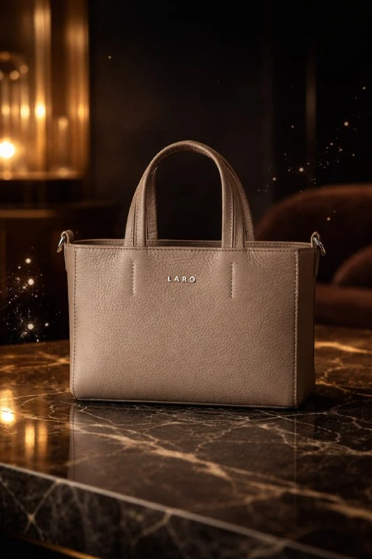
Prepare the product and assign the main emphasis
author's comment describes a dark scene with polished marble, glass and gold. It is built around an uploaded product image. Prepare an overall view that shows the actual color, material and proportions, and not just a single pretty detail of the packaging.
Select one dynamic accent in advance: small shards of glass, drops of thick liquid or golden dust. In the source code they are listed through or, that is, as options. If you leave everything at once and ask for additional splashes, the space around the product can easily become overcrowded.
Consider whether the emphasis matches the subject. Drops of liquid may be fine in a bottle, but near electronics they create an undesirable wet impression. This is a compositional choice by the author of the layout: the generator does not know which neighborhood will be clear to the viewer of your ad.
Prompt for a scene with a top margin
Product on dark marble
Hyper-realistic cinematic product shot based on the provided image, strictly preserving the exact design, proportions, colors, materials, and branding without any distortion. The product is placed in a refined luxury environment: dark polished marble with rich natural veining, complemented by elements of brushed gold and glass. The surface beneath is slightly reflective, creating a soft, elegant reflection. At the moment of visual emphasis, subtle dynamic elements appear around the product — fine glass shards, droplets of thick liquid, or particles of golden dust floating gracefully in the air, conveying a sense of controlled, premium energy. All elements are carefully arranged and never obstruct the product. The product remains perfectly clean, flawless, and fully visible — the absolute focal point of the scene. Sharp focus is locked on the product, while the background and secondary elements are slightly blurred to enhance depth of field. Advertising composition: the product is positioned slightly below center, leaving clean negative space in the upper area for text or branding. Shot from a slightly low angle to enhance presence, power, and prestige. Lighting is soft, directional, and cinematic with warm golden highlights: subtle specular reflections, delicate rim lighting outlining the product, and soft but deep shadows. The lighting emphasizes material quality and form, creating a premium brand feel. Color palette: deep dark tones (black, charcoal, dark brown) with warm gold accents and soft highlights. Style: high-end luxury advertising, ultra-detailed photorealism, premium aesthetic, 8K resolution. Vertical composition, aspect ratio 3:4The key indication is slightly below center, leaving clean negative space in the upper area. The product is positioned just below the center, and the top is for text. It is useful to check this before assessing the details: the free area should remain really quiet, without gold particles or bright veins.
Slightly low angle sets a small camera position from below. This angle increases the visual weight of the subject. Great exaggeration can hide the lid, change the appearance of the label, and make a small jar look like an architectural piece. If necessary, weaken the angle, maintaining the lower position of the product.
Customize Marble and Reflection
Dark marble is recognizable by its veins and polished surface. If the veins run behind the product name, they may make it difficult to read the outline and label. Refine the quieter area directly below the subject, leaving the active stone pattern closer to the edges.
In the request, the surface is slightly reflective, and the reflection is soft. The second sharp copy of the packaging under the product is distracting and sometimes contains occasional errors in the text. First of all, evaluate whether the object has contact with the surface; then check the strength and position of the reflection.
The gold details should match the light source. If there is a lot of yellow highlights around, the product may appear over-colored. Keep the edges and surroundings warm, and keep the front neutral enough to compare to the original photo.
Separate movement from the main subject
The original request requires that particles not overlap the product. Check it out in the large image and small preview. A translucent fragment can also cover the logo, even if it seems light and decorative.
The Sharp focus is locked on the product separates the edgy product from its softer surroundings. Blurring should apply to the background and secondary elements. If the lettering on the package has lost its sharpness, additional fog and glow will not help: refine the area of focus and reduce the movement near the label.
Compare the design, size, color and markings with the original. Request strictly preserving sets intent, but does not confirm accuracy. When a model changes its cover or design, correct the specific detail rather than just accepting the result as a nice presentation.
Collect the title in the space left
Open the frame in the editor and place the text in the top field. Start with a short title and one line of explanation. Check that the text does not cross the halo of light above the product: a bright area can reduce contrast even against a dark background.
Don't add gold to all letters, frames and buttons at the same time. One small accent will support the scene, and a regular light font will make the information readable. For a real product, indicate only verified characteristics and terms of the offer.
Save the working file with layers and a separate frame without text. The source has vertical proportions 3:4; For a different placement, check the composition again, especially the integrity of the free top. When cutting wide, decorative particles and support may be accidentally cut off, so the new format requires its own arrangement of elements.
Assets for your next layouts
The stage can be used as the basis for an advertising layout. The Designer's Pack contains materials for design; look at the composition and choose the appropriate elements for your project.