Choose the word's stable section
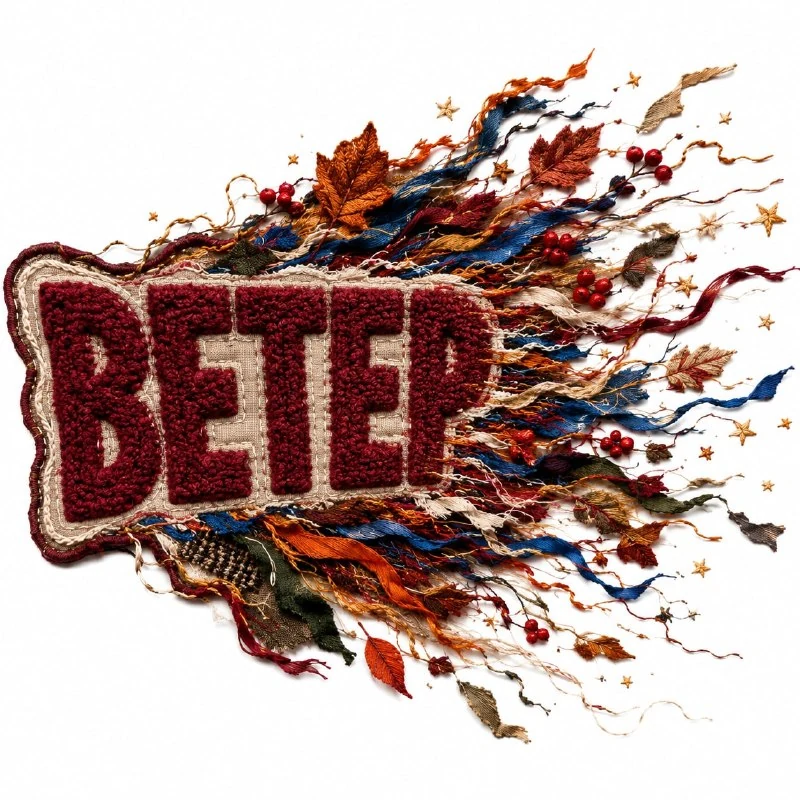
In the author's comment, one side of an embroidered patch seems to be pulled apart by a strong autumn wind. Start with a short word and decide which part should remain most intact. This gives the scene an anchor from which viewers can follow the movement.
Replace TEXT with the final lettering. For the first test, choose one direction for the flying fragments, such as rightwards. This refines the working version: the source specifies asymmetry but does not fix a particular side.
Do not turn every letter into tiny fibres immediately. First achieve a complete, readable word with a damaged edge, then increase the loose fragments. This makes it easier to control the point at which the effect starts obstructing the text.
The asymmetric-tear prompt
An embroidered patch pulled apart by wind
Create an experimental embroidered patch featuring the exact text “TEXT”. Use large plush chenille lettering while one side of the patch appears to be pulled apart by strong autumn wind. Add flying embroidered threads, ribbons, fabric fragments, leaves, berries and tiny stars stretching outward from the patch. Use an asymmetric fragmented silhouette and a palette of burgundy, burnt orange, cream, cobalt blue, moss green and mustard. Dynamic premium embroidery, realistic fibers, loose yarn and layered stitching, isolated on a clean white background. Keep the text bold and clearly readable. No additional text, logos or watermark. Square 1:1.One side of the patch appears to be pulled apart places the action on one side. If the patch is equally frayed all around, the wind direction will not read. Specify a quieter edge on the opposite side.
Asymmetric fragmented silhouette describes the overall outline. It should transition from a solid shape to dispersing fragments rather than resemble an even rounded sticker with a few threads. The source also asks for bold, clear lettering.
Arrange the dispersing fragments in layers
Threads, ribbons, fabric fragments, leaves, berries and small stars surround the patch. For the first version, keep a few different sizes. A large ribbon shows the direction, fine fibres support it, and small decorative details add rhythm.
Check where each fragment starts. If a piece of fabric looks like an independent object unrelated to the edge, the tear can become random decoration. Keep a few threads connecting the patch to the nearest pieces.
Avoid distributing every element evenly. Varying distances and densities show outward movement. If a tidy wreath forms around the patch, reduce decoration on the quiet side and extend the main direction.
Keep the letters readable beneath loose threads
The soft texture of chenille lettering supports the volume, but readability matters more. A thread crossing an internal counter can change a letter. Check the characters in order and remove overlaps that become extra strokes.
Assess the word's edge in a small preview. Individual fibres are visible at a large scale but merge into a dense patch when reduced. If the word's ending disappears, reduce threads in front of the letters while keeping dispersal around the silhouette.
The white background and shadow describe a still illustration of a moment. The wind description does not produce a finished animation. Choose a frame for its clear direction and tear shape rather than the number of added objects.
Prepare the edges for an advertising layout
In your editor, leave enough room in the direction of dispersal. A tight crop removes ribbons and makes the patch look merely damaged. Check where the movement leads relative to the heading and other blocks.
If removing the white backing, process the loose threads separately. They may become too fine against a new background or lose soft shadows. For a complex backing, first try a quiet area behind the entire object.
Add an explanation in a regular font outside the dispersing fragments and save the working layers. For another format, reposition the patch and information block while preserving the open side. The effect relies on asymmetry, so an automatic centred crop will not always work.
Select the inscription for the next layout
Creative AI Typography contains 823 prompts with examples. The demo includes 40 prompts to compare movement and materials using one short heading.