Assign different tasks to text blocks
Take a simple educational banner: a large word, a two-line explanation and an action. Write down what each block should do. The headline grabs attention and communicates the topic. The explanation clarifies the proposal. The last line tells you the next step. Different roles don't require three different typefaces.
Rate the decorative inscription as an image. Its visual size depends on the thickness of the letters, highlights and free margins, and not just on the boundaries of the file. So start by placing the already cut result. Until the background and text are ready, do not adjust the composition to a random size of the original image.
Get an accent lettering
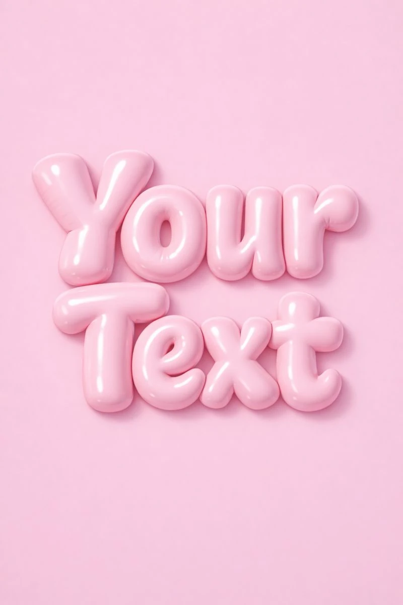
Soft inflated letters are suitable for this exercise. Generate a short word, check spelling and remove background. Leave the original prompt unchanged for the first test, then change the text or color separately.
Soft puffy letters
High-end commercial typography, “Любой Текст”, soft inflated 3D letterforms, tactile plastic texture, gentle highlights, pastel monochrome background, friendly yet premium branding style, clean composition, 3:4If the result has its own shadow, consider it when placing. Don't immediately add another stroke and shadow in the editor. First check if the original outline is enough on the selected background. Often complexity arises from the imposition of additional effects on an already saturated object.
Start with one regular font family
Choose a typeface with clearly visible letters and the required language symbols. For clarification, use a regular style, for the call to action, a heavier weight. This allows you to create differences without unnecessary visual noise. Check the presence of the Cyrillic alphabet on your phrase, and not just on the example of Latin letters.
Compare options of the same size and with the same content. If you change the size, line length and color every time, you won’t be able to choose a font meaningfully. There is no need to look for an exact repetition of the shape of three-dimensional letters: a calm explanation can support the title precisely by its simplicity.
Adjust the spacing around the title
- Leave a noticeable gap between the decorative lettering and the explanation.
- Break up the explanation according to its meaning, without a random single word on a new line.
- Check the distance between the lines: they should not merge when reduced.
- Keep the call to action close to its own block so that it is not mistaken for part of a neighboring caption.
Centering is useful for a short composition, but a long explanation is often easier to read from the left edge. First choose a common axis, then allow a conscious deviation for the image. Random mixing of multiple alignments makes even a small banner unstable.
Match color and saturation
It is not necessary to transfer all the shades of the volumetric inscription into regular text. Choose one accent color and a neutral color for the explanation. If the background is colorful, add a quiet area behind the text or change the framing. Constantly increasing the font weight does not solve the problem of weak contrast.
Finally, scale the layout down and compare it to the version where the title is in regular font. The decorative version should maintain a clear reading sequence. If the explanation becomes less noticeable, adjust the sizes and spacing. To work with words, analysis of a short title is useful, and for background control, article on readability .
Select the inscription for the next layout
In Creative typography, you can choose an accent inscription based on a ready-made example. The right effect is a start: then it needs to be coordinated with the text and composition of your layout.