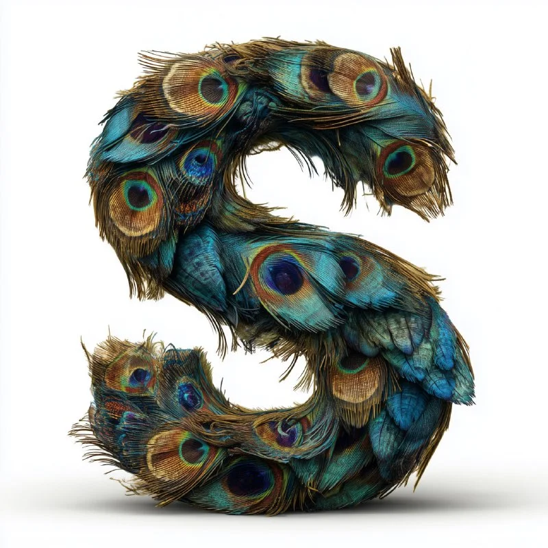
How does this alphabet differ from a font?
The alphabet of generated letters is a set of images of individual characters. It can be used for a large title, initial, or decorative word. But this is not a ready-made installable font: the pictures do not have customized letter spacing, character set, or behavior during normal typing.
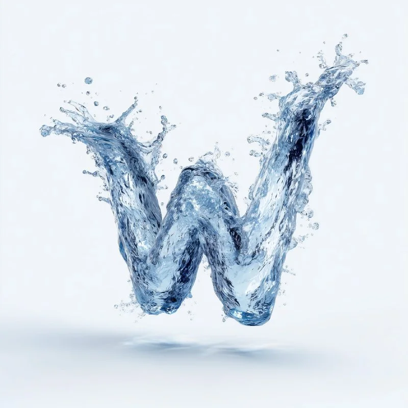
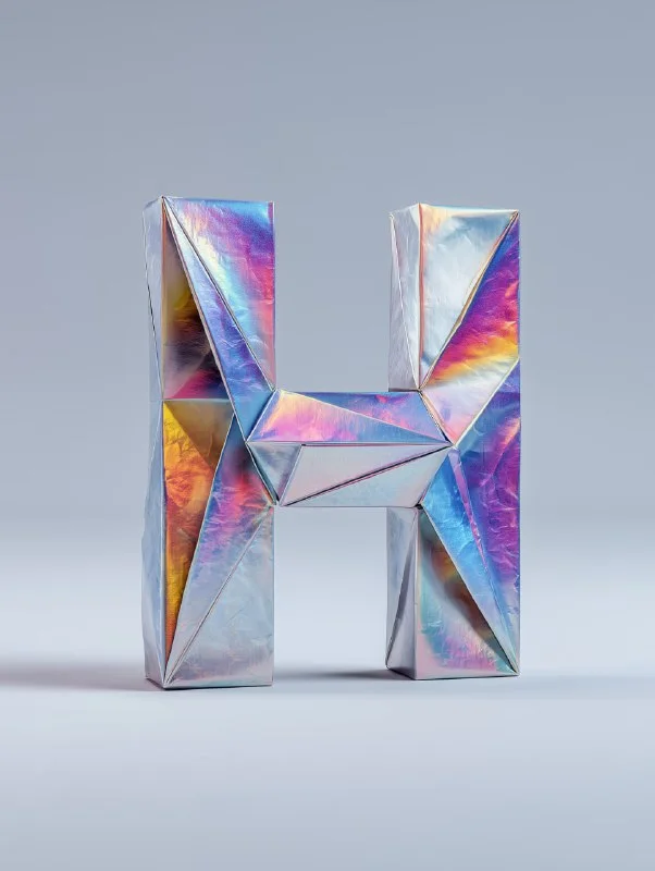
For the first task it is not necessary to create all the letters. Take a short word, such as the title of a category, and prepare only the necessary characters. This makes it easier to check the material and understand whether it suits the layout. If the result is successful, expand the set gradually.
Before generating, determine the background, the direction of light and the shape of the letters. The same material from different angles can look like several unrelated collections. Get one good letter first, then use it as a guide for the next ones if your tool supports references.
Letter made of silk fabric
Letter made of silk fabric
A capital letter 'X' made of silky fabric with wind gently shaping it, soft folds, luxurious texture, natural golden-hour lighting, minimal clean background, ultra-realistic 8KReplace X with the desired character inside the quotes. The request asks for soft folds and warm natural light. In this case, the folds should not destroy the recognizable contour. If the letter looks like accidentally crumpled tape, make sure to maintain a readable silhouette.
For a series, keep the same direction of light and degree of folding. One letter with a lot of fabric movement and another that is almost flat may not work well together. The inscription should maintain rhythm even when the characters have different widths.
Letter made of green moss
Letter made of green moss
A capital letter 'X' covered with lush green moss, isolated on pure white background, no forest, hyper-detailed 8K rendering, cinematic lightingThe phrase no forest is useful here: we need a separate letter, not a forest scene. Replace the X and leave the background white for easy assembly. If moss has closed the internal gaps, ask them to increase them or reduce the thickness of the vegetation.
Check the edges. Fibers that are too long may merge with the adjacent letter as you piece the word together. In this case, leave more space or adjust the outline slightly with a mask in the editor. Do not trim the entire texture to a perfectly smooth shape: the material will lose its meaning.
Letter made of volcanic stone and lava
Letter made of volcanic stone and lava
A capital letter 'A' sculpted from glowing molten lava, cracks of bright orange magma against black volcanic rock, heat distortion, cinematic lighting, ultra-realistic 8K, dark smoke background, high contrast shadowsReplace A with the desired letter. The original description has glowing magma, dark stone, smoke and contrasting light. This option is best assembled on a dark background first: bright edges and smoke are more difficult to accurately transfer to a white background.
If you need letters for one word, choose one of three materials. Mixing silk, moss and lava can be a special idea, but for a regular title it would add too much variation. Start with a consistent series and only then try exceptions.
Assembling a word in a graphic editor
- Cut out each letter and save it as a separate layer or file.
- Align characters to optical height. The lightest or most massive forms sometimes seem larger with the same dimensions.
- Place the letters on a common baseline and adjust the spacing manually.
- Check pairs with narrow clearances and diagonals. Mechanically, the same spacing does not always look smooth.
- Look at the entire word in the size of the future layout.
Words about high resolution in the source prompts describe the desired detail, but do not confirm the actual file size. Check pixels before large use. Don't enlarge a small picture just because the request says «8K».
For a long title, it is more convenient to try generating an entire volumetric inscription. Leave separate letters for tasks where you really need control over each character.
Select the inscription for the next layout
If it is more convenient to generate a whole word, look at Creative Typographics: the library has 823 prompts for inscriptions from different materials. A free demo will help you choose a direction.