First, determine what role the inscription plays
It is convenient to create 3D text in a neural network as a separate element: a short title, a discount number or a headline. This makes it easier to check the letters, cut out the background and change the composition. It is better to type small explanatory text, prices and contacts in a graphic editor: they must remain accurate and be readable from a phone.
Let's imagine a banner with the title «НОВАЯ КОЛЛЕКЦИЯ». For the first test, take one short word, for example «НОВОЕ». If it turned out correctly, move on to the full phrase. If you have a long lettering, you can assemble two lines separately: this will give you more control over the width and spacing.
Before generation, select one material, two primary colors and the format of the future layout. Do not mix glass, metal, fur and fire at once. In this example, we compare two calm volumetric effects that do not require a complex background.
Prompt for liquid 3D letters
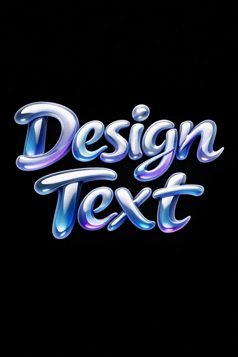
The first option specifies smooth shapes, a glossy surface and soft light. It is suitable for a header around which you want to leave some free space and add a product or photo.
Volumetric inscription made of liquid material
Modern commercial typography, “Любой Текст”, liquid 3D letterforms, smooth flowing shapes, glossy material, subtle gradients, soft diffused light, solid background for easy cutout, futuristic yet elegant branding style, 3:4Replace «Любой Текст» with your text, keeping the quotes. The phrase liquid 3D letterforms describes the shape of the letters, glossy material the surface, and soft diffused light the lighting. These are three separate levers: change one of them at a time to understand why the result has changed.
If you need a more strict heading, try using straight letters with a distinct outline instead of liquid shapes. If the brand color is important, add it next to the material description, for example cyan glossy material. Specify the background color as a separate phrase so that it is not randomly transferred to the letters.
Prompt for inflated volumetric text
The second effect has a soft shape and a tactile plastic feel. This is a different nature of the title: rounded letters are easier to combine with friendly visuals, home goods or a calm pastel palette.
Soft puffy letters
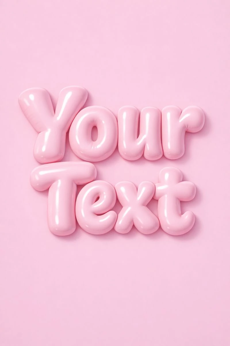
High-end commercial typography, “Любой Текст”, soft inflated 3D letterforms, tactile plastic texture, gentle highlights, pastel monochrome background, friendly yet premium branding style, clean composition, 3:4The main phrase here is soft inflated 3D letterforms. To make the comparison meaningful, use the same word, color, and format as the first option. It’s easier to choose between two images when the material is different, rather than the entire set of settings.
The preview in the article shows an example from the collection. The generator can construct letters, lights and backgrounds differently; We do not promise an exact repetition of the picture. If the service allows you to edit the image, you can upload the selected option and separately ask to change the color while saving the shape.
How to transfer an inscription to a banner
- Create a layout of the desired size in your usual editor. Immediately leave space for the required information: product, date, price or button.
- Remove the background from the generated inscription. The white background in the prompt does not mean transparency: it must be obtained separately and saved, for example, in PNG.
- Place the inscription in the layout and check the scale. If highlights or shadows run off the edge, scale down the entire element rather than cutting off the letters.
- Add a subtitle and details in regular font. Choose a calm style that does not conflict with the 3D heading.
- View the banner in a small size. Is the word readable? Is the proposal clear? Does the inscription merge with the product?
For your first layout, a title, one image, and a short explanation are enough. Add additional effects after the composition already works without them.
What to fix if the result is not suitable
The neural network mixed up the letters. Shorten the text, leave one line and add a requirement to reproduce the exact inscription. If the service supports local editing, correct the specific letter. It’s easier to type a long slogan in regular font.
The volume is almost invisible. Check the depth of the letters and the direction of the light. There is no need to add strong perspective, mirror material and complex shadow at the same time: first achieve a clear form.
The inscription is difficult to cut out. Ask for a plain background, free margins and the absence of unnecessary objects. It is better to immediately replace white text on a white background with a contrasting combination.
The picture looks good, but the banner doesn’t. Check the hierarchy: a 3D title should help you understand the sentence. To select a color, analysis of chrome typography is useful, and for composition – poster instructions .
The designations 3:4 and 4:5 in the request describe the desired proportions. If the service has a separate size setting, set it there. The words 4K and 8K in the prompt do not by themselves guarantee the resolution of the file.
Select the inscription for the next layout
If you need a different material for your next layout, check out Creative Typography. The complete library contains 823 prompts with examples: from metal and glass to fabric and floral letters.