What task do you need metal text for?
The chrome text is clearly visible thanks to the contrasting reflections. It can be used in a music release cover, a sports banner, or an accent headline. But reflections can also ruin reading: the light edge blends into the background, and the dark edge looks like part of another letter.
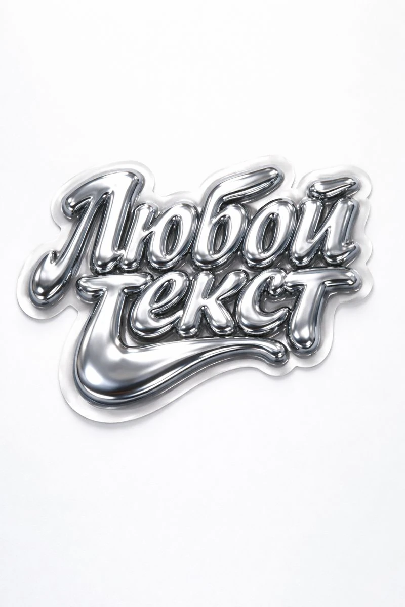
Before generating, determine what is more important: a calm mirror surface or a heavy volumetric inscription. For the first case, let's take smooth liquid chrome on a white background. For the second - massive silver letters with a chain on a dark background. These are different solutions, so it’s worth comparing them in one short word.
Select the background in advance. An inscription created in a dark studio may look alien when transferred to a white banner. If the final background is not yet known, start with a neutral environment and add decorative elements in the editor.
Prompt for liquid chrome
This request describes a fluid shape, a mirrored surface, and soft lighting. A white background helps you see the silhouette; The prompt also sets the outline of the sticker. If such a circuit is not needed, delete the phrase die-cut sticker edges.
Liquid chrome on a white background
liquid chrome typography "Your Text" mirror-like metallic surface, soft fluid distortions, die-cut sticker edges, glossy finish, subtle reflections, minimal white background, soft studio lighting, product photography, ultra-detailed, 8kInsert your word instead of Your Text. The phrase mirror-like metallic surface is responsible for the mirror nature of the metal, soft fluid distortions for smooth deformations of the shape. Start with the original version, and then change the color or degree of deformation separately.
If the letters are too blurry, remove the deformation and specify that the outline should be clear. For a quieter material, try describing polished metal with controlled reflections. Add the qualification next to the material, not in a long list of unrelated effects at the end of the request.
Prompt for silver lettering with chain
The second option is based on a different combination: wide, heavy letters, chamfered edges, noticeable depth and a steel chain. Here the chain is part of the image, so its position needs to be checked along with the text.
Metallic silver with chain
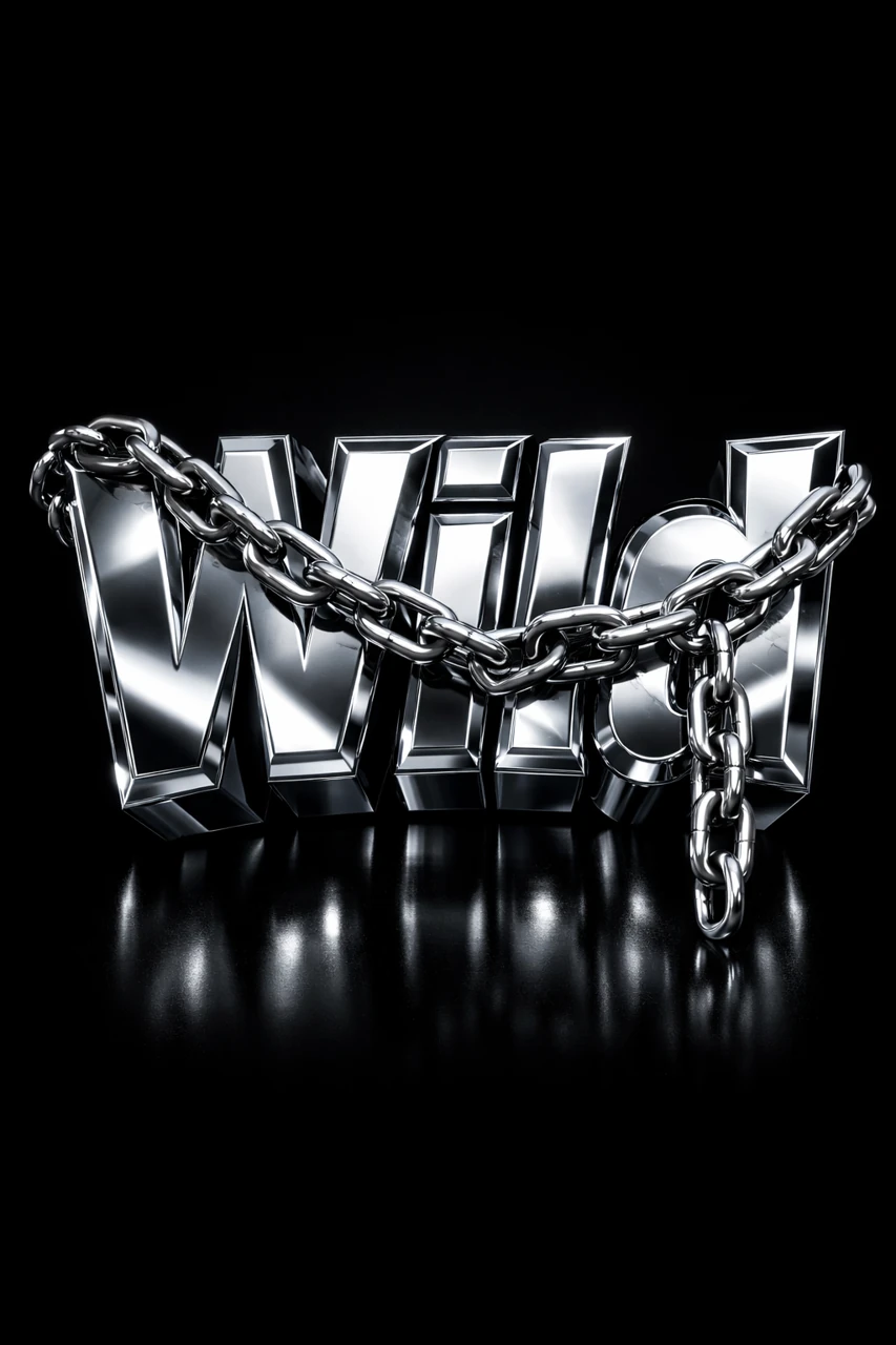
the text "YOUR TEXT", bold extruded chrome 3D typography, heavy metallic letters, polished silver metal, beveled edges, thick block letters, dramatic perspective, chrome reflections, metal chain wrapped across and hanging over the letters, realistic steel chain, dark black studio background, cinematic lighting, high contrast reflections, glossy metal surface, ultra detailed 3D render, centered composition, professional logo render, 4k 3:4The words bold extruded chrome 3D typography specify the volume. Beveled edges describes beveled edges, while high contrast reflections enhances the difference between light and dark reflections. For the version without the chain, remove the entire sentence about its position: otherwise, individual links may remain in the image.
The preview shows an example from our selection «Цепи и верёвки». If you repeat it with a long name, the chain may cover important parts of the letters. Ask to place it below the title block or create it as a separate element.
How to control reflections
- For a clean studio look, use bright surroundings and soft directional lighting. Be careful not to let the reflections turn the silver into an off-white plastic.
- For a dark banner, leave some distinct streaks of light. A completely black environment can make much of the metal invisible.
- If you want colored reflections, specify one color source. Several opposing shades can overload a small headline.
- For a series of images, keep the material and light, changing only the text. This makes it easier to maintain the general character of the selection.
The phrases in the prompt direct the generation, but do not act as fine-tuning of the physical material. The result depends on the model used; check each picture separately.
What to check before using in design
First, reduce the image to the size of the future preview. If the word is only readable on a large screen, reduce the reflections or choose a simpler letter shape. The metal header should retain a clear outer outline.
Then check the edges after removing the background. Light highlights and subtle shadows may be lost during automatic cutting. Look at the result on both light and dark backgrounds. If necessary, adjust the mask manually while preserving important reflections.
In the banner, leave the metal text as a single accent. Please type explanation, price and contact information in regular font. If the metal texture is already complex, a calm background will help to assemble the composition. The basic process is discussed in the article about 3D text , and an example of working with a title is in the poster analysis .
Select the inscription for the next layout
In Creative Typography you can compare metal, gold, glass and other materials using ready-made examples. This is convenient when you need to quickly select several directions for one cover.