What to generate and what to collect manually
For a poster with AI typography, it is not necessary to generate the entire poster. It’s more convenient to get one expressive title, and type the date, place, conditions and contacts in a graphic editor. Then important information can be corrected without a new generation.
Let's take a conventional poster for an evening event. It has four levels: title, short description, date and location, and action for the viewer. Before looking for a beautiful effect, lay out these elements on simple rectangles. If the layout is clear without decoration, typography will enhance the already working composition.
First, decide on the format: vertical poster, square post, or wide banner. These are different compositions. The same header may need a different width or line break, so don't rely on automatic cropping of the finished image.
First prompt: sporty street title
This option is suitable for large active inscriptions. It sets the character of the letters, but does not replace the precise assembly of the poster.
Street sports typography
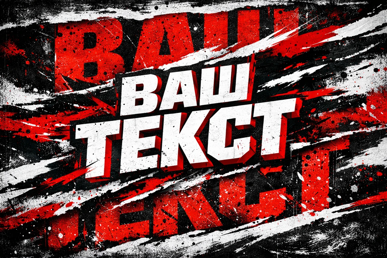
street sport banner typography "ВАШ ТЕКСТ",
bold aggressive letterforms,
oversized background typography,
text integrated into composition,
ripped brush strokes and paint splashes,
high contrast black white red palette,
editorial street design,
dynamic layered layout,
grunge texture, ink splatters,
rough print feel,
banner composition,
ultra detailed, 8k
Replace the text in quotation marks with a short title. For the first result, keep the original style. If the layout already has a busy background, ask for fewer decorative elements around the word. It is important to obtain a clear silhouette that can be placed in a given area.
If the result includes unnecessary signatures, remove them in the editor or clarify the query: only the desired word, without additional text. Check each letter, especially when using the Cyrillic alphabet. The inscription may look convincing from afar and still contain the wrong symbol.
Second prompt: black and white inscription with a gap
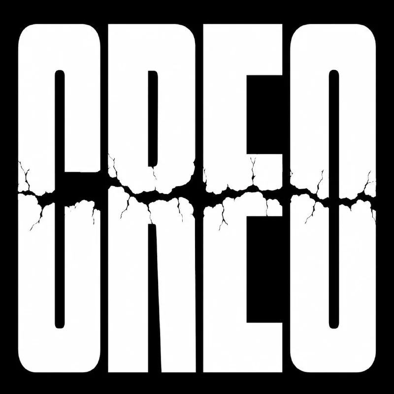
An alternative from Telegram - dense white letters on a black background. This option is easier to combine with a limited palette and simple design.
Contrasting lettering with a break
White bold brutalist typography logo spelling “Твой текст”, ultra heavy condensed block letters, tall squared sans serif font, tightly spaced characters, rough cracked horizontal tear cutting through the middle of the word, broken distressed fracture lines, subtle chipped edges, stark white text on pure black background, centered composition, high contrast monochrome streetwear graphic, dark punk poster aesthetic, minimal design, no colors, no gradients, no shadows, no 3D, clean flat vector-like print style, 1:1 square formatReplace Your text with the name of the event. The request specifically prohibits volume, gradients, and shadows: this helps describe flat, high-contrast graphics. The wording vector-like means visual similarity to a vector. It does not turn the generated image into editable vector paths.
If the gap goes through important parts of the letters and interferes with reading, reduce its severity. Don’t immediately add more scratches, scuffs and noise: first achieve the right word and a readable silhouette.
Assembling a poster in the editor
- Create a canvas of the desired format and designate safe fields.
- Place the heading in the main area, maintaining its proportions.
- Type the description in one calm font.
- Make the date and location a separate, prominent block.
- Add a link or short call to action.
Don't stretch the letters just to fill the canvas. It's better to change the size, line breaks or position. Leave space between the title and additional text so that they do not look like one dense spot.
To get started, one decorative lettering and one regular font will be enough. Create the difference between blocks by size, style and indentation. If you use several active effects at the same time, it will be more difficult for the viewer to understand what to read first.
We check the poster before exporting
Reduce the layout to match the size of the feed preview. The title should remain legible and the date should be accessible when viewed normally on a phone. Then open the image up close and check the mask, letter edges, and artifacts after removing the background.
Compare two options: with a decorative background and with a simple one. If the background interferes with the information, don't try to fix it with additional shadows. Sometimes it is enough to remove one texture or reduce its contrast. Export the image at the desired pixel dimensions, rather than relying on the word «4K» inside the prompt.
For a different aesthetic, try 3D Letters or Neon Text . The assembly scheme remains the same: one main visual and precise information that you control in the editor.
Select the inscription for the next layout
When the structure of the poster is ready, it is easier to match the effect of the letters to it. In Creative TyPography there are 823 queries with examples for different materials and moods. You can start with a free demo.