Neon inscription or text on fire background
In a request for neon text, it is important to clarify what exactly is glowing. This could be the outline of the letters, their surface, or the background behind the word. If you simply write «яркий неон», the generator can fill the entire scene with colored lights, and the inscription will be lost.
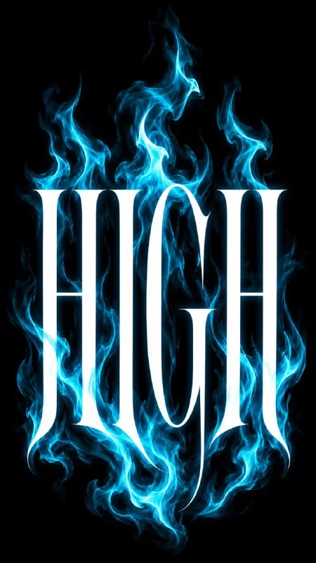
There are two separate solutions in this article. Neon graffiti creates an energetic headline with a colorful outline. White letters with blue flames leave the text itself light and the effect placed behind it. The second approach helps to maintain a clear silhouette, if you do not overload the flame with details.
Both options are convenient to use as the basis for a cover or music poster. The title should remain the main thing: the viewer reads it first, and then examines the texture. Check it out in a small preview before assembling the rest of the elements.
Prompt for neon graffiti
This request from the free demo combines 3D shapes, street typography, and neon lights. First try it without changes, replacing only the inscription.
Graffiti with neon outline
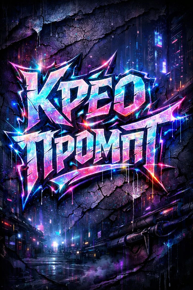
Cyberpunk graffiti lettering "Your Text" sharp torn edges, glowing neon outlines, holographic light leaks, deep purple and blue shadows, cracked synthetic paint texture, futuristic street art aesthetic, dark sci-fi city background, ultra-detailed poster, 3:4Replace Your Text with your word. Then select the main color of the glow. If you leave many competing shades, the effect will become variegated, and the outer contour may blend into the background. For the first adaptation, one primary and one additional color is enough.
If a long title is difficult to read, shorten the text or break it into two separately generated lines. Don’t ask for small captions inside the picture: it’s easier to type the date, issue number and author’s name accurately in the editor.
Prompt for white text with blue flames
The following example was published in our Telegram. It combines thin and thick font strokes with soft blue flames. The flame should support the word, not cover it.
White inscription with blue flame
Stylized fashion logo spelling “Your Text", elegant high-contrast serif typography with thin and thick strokes, stretched luxury editorial font, large white letters centered on a pure black background, layered over glowing turquoise-blue flames rising behind and around the text, soft airbrushed flame texture, smoky cyan fire, dark moody streetwear aesthetic, minimal but dramatic composition, high contrast, clean centered layout, no extra graphics, no mockup, no objects, no people, sharp details, 9:16The phrase large white letters specifies the text color, and flames rising behind and around the text specifies the position of the effect. To get a different shade of fire, replace turquoise-blue and cyan at the same time. Changing just one word will result in conflicting colors in the query.
The vertical format shown here is 9:16. If your generator allows you to select aspect ratios separately, configure them in the interface. The entry in the prompt does not always control the file size. For a square cover, change both the scene format and generation settings.
Why does glow spoil readability?
A bright halo expands the boundaries of the letters. In a small image, adjacent symbols may merge, and internal gaps may disappear. Therefore, evaluating neon only on a large screen is not enough.
- Reduce the intensity of the glow if the contours merge.
- Ask for a little more space between letters.
- Remove the fire in front of the text if it overlaps the strokes.
- Keep the background simple, without additional signage or objects.
Check the exact spelling and number of letters. Pretty light doesn't correct the mistake in the title. If the inscription is important for the brand and the generator distorts it, you can generate the background separately and type the name manually.
Assembling the cover without unnecessary effects
Place the image in the layout and leave a small margin around the glow: it is part of the visual. Do not cut the halo close to the edge of the letters. For your signature, use a calm font and color that is readable against a dark background.
Don't automatically add a few more neon strokes in the editor. First, compare the original version with the layout without additional glow. If the accent is already strong, the second effect will interfere. Also save the version with a larger title for small previews.
The sequence of assembling a full-fledged poster is described in the article how to make a poster with AI typography. There you can compare the glowing text with a more discreet black and white inscription.
Select the inscription for the next layout
The cover may require several different header options. Creative Typography contains 823 prompts with examples - you can choose an effect based on the image, rather than coming up with a request from scratch.