Prepare a name for the small circle
In the first author's comment a square typographic avatar is specified, designed for round cutting. Before choosing a style, determine what title should be inside. A short word or established abbreviation is usually easier to place large than a full, long phrase.
Replace YOUR TEXT with one final name. If a word needs to be split into lines, decide on the hyphenation in advance. The illegible abbreviation doesn't help either: the viewer should recognize the name, not just see a beautiful set of letters.
Make a simple draft in the editor: a square, a circle and a regular large word. It will show whether the text fits without a decorative effect. If already in this version some of the letters go beyond the circle, first correct the length and translation, then proceed to generation.
Yellow option: strong contrast and little detail
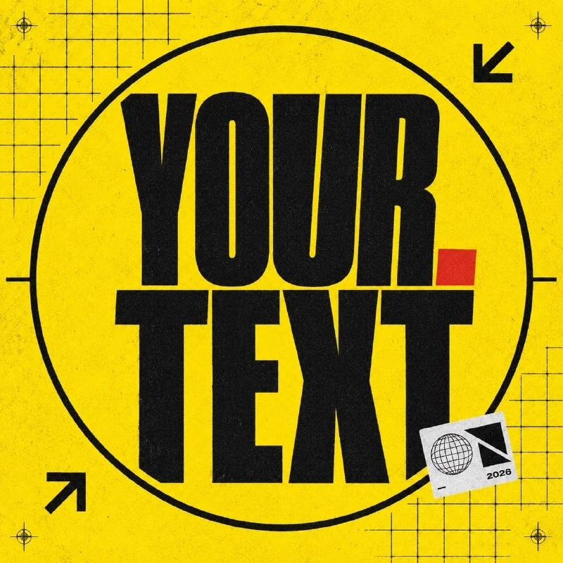
Yellow avatar with text and graphics
Create a bold neo-brutalist typography avatar for a modern creative project.
FORMAT:
— Square 1024×1024 px
— Made specifically for a circular social media avatar
— Keep the complete typography inside the central circular safe zone
— Corner graphics must remain secondary
STYLE:
— Neo-brutalism
— Bold graphic design
— Experimental editorial identity
— Strong contrast
— Contemporary 2026 aesthetic
BACKGROUND:
— Bright acid-yellow
— Black grid fragments
— Subtle rough printed texture
— Minimal imperfect ink effect
TEXT ON IMAGE:
Main name:
«YOUR TEXT»
TYPOGRAPHY:
— Massive black grotesque sans-serif
— Compact stacked composition
— Slight intentional distortion
— One small red accent
— High readability at thumbnail size
DETAILS:
— Thick black border inside the safe zone
— Small geometric sticker
— Minimal arrows positioned away from the text
— Printed registration marks
NEGATIVE PROMPT:
cropped name, text outside central area, excessive distortion, unreadable letters, too many stickers, random phrases, grunge overload, watermarkThis version combines an acid yellow background with a chunky black grotesque and a small red accent. Compact stacked composition offers compact string assembly. High readability at thumbnail size specifies the target to be checked against the reduced result.
The black frame is inside the safe area. She should not press the word to the edges and turn the circle into a tight box. Arrows, print marks and stickers remain secondary: remove some of them if they merge with the letters when reduced.
The source allows for slight intentional distortion. For a title with similar characters, it can be confusing to read. First, achieve clear writing, then compare the regular and slightly deformed versions at the same size.
Cobalt option: geometric white letters
The second parsed request was published in , the third comment by the author .
Digital avatar with text
Create a stylish typography-based brand avatar for a modern digital studio.
FORMAT:
— Square 1:1
— Exact size: 1024×1024 px
— Designed specifically for a circular social media avatar
— All important elements must remain inside the central 75% safe zone
— Corners should contain only background details
STYLE:
— Contemporary digital branding
— Modern software company aesthetic
— Clean 2026 visual language
— Minimal, bold and recognizable
BACKGROUND:
— Deep cobalt blue
— Subtle technical grid
— Fine digital grain
— Thin interface lines
— Soft cyan glow
TEXT ON IMAGE:
Main name:
«YOUR TEXT»
TYPOGRAPHY:
— Huge geometric sans-serif
— Wide bold letters
— White typography
— One electric-cyan accent
— Main name occupies approximately 70% of the central area
— Perfect readability at small size
DETAILS:
— Tiny rounded UI cards
— Minimal crosshair
— Small dots and coordinate marks
— Balanced circular composition
NEGATIVE PROMPT:
text near edges, cropped letters, tiny typography, random symbols, AI robot, mascot, chrome sphere, clutter, watermark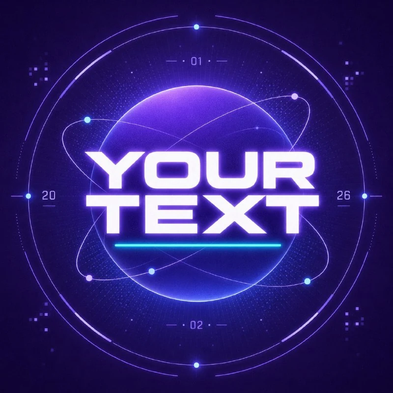
Here the basis is a deep blue background, large white letters and a small blue accent. The technical grid and interface lines create a digital atmosphere. They should not turn into additional inscription or cross thin areas of letters.
In the source, the important elements are placed in the central 75%, and the name occupies approximately 70% of the central area. These guidelines help explain the margin around the text, but are not a substitute for checking the actual framing. The size 1024×1024 is also described in the request; Check the actual file sizes when exporting.
Compare two more approaches from the selection
Paper version uses a beige backing, neatly cut paper letters and a coral accent. It is distinguished by shallow layer depth and soft shadows. For a small icon, it is important that the edges of the paper do not crush the main silhouette of the word.
Editorial version is based on a black narrow bold font, white paper and one blue letter or short word. The tight spacing and slight overlap of letters makes it expressive, but requires checking each character.
Select by project name. A narrow word may work well in an editorial version, but wide geometric letters may require two lines. The paper material itself does not improve the composition: first compare the width, contrast and position of the name, then the texture.
Check the trim and correct the text
Open your selection in the editor and place a circle on top of the square. All letters, including protruding parts, must remain inside. Corner decorative details can be cut off if they do not serve any purpose and are not part of the name.
Then reduce your avatar to the size of the icon in the chat list. Spell the word and ask another person to read it without prompting. If he sees a different name, remove the overlaps, increase the letter spacing, or replace the problematic character manually.
Save the clean square version and the profile file. For the project cover, use the same colors, but reassemble the composition: a small avatar and a wide title solve different problems. If you need to modify a single letter, will help you with the analysis of correcting errors in the AI inscription .
Select the inscription for the next layout
If the name of the project also needs to be placed on the cover, you can see other text effects in Creative Typography. Start with a demo and choose a technique based on the readability of your word.