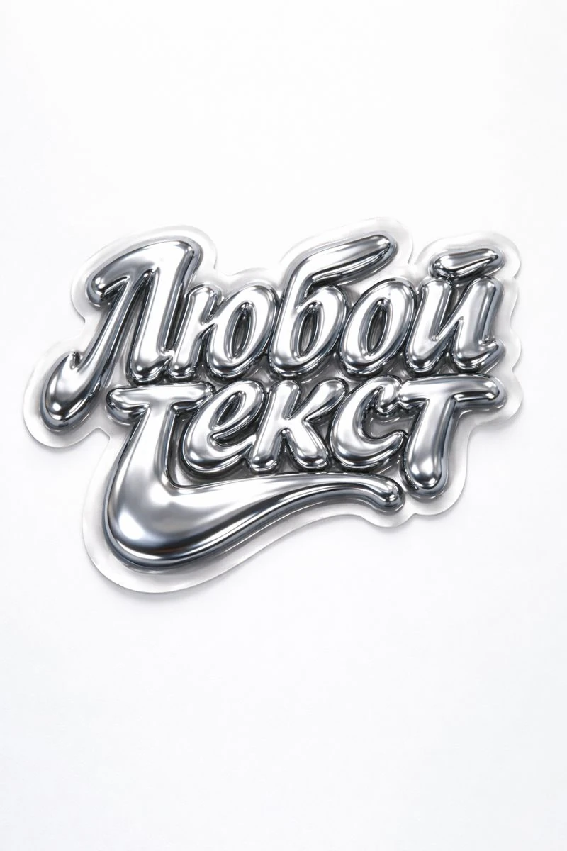
Check the text before the material
Immediately after generation, compare the inscription with the original phrase character by character. Don't rely on quick reading: similar letters and decorative connections can hide an error. Check for duplicate characters, word order, spaces, and signs. For a name, brand name or price, this check is especially important.
Save the original request and the successful option separately. If the problem is only in one letter, do not change the material, background and lighting at the same time. Otherwise, the next result will be difficult to compare with the previous one. First, determine the scale of the correction: one detail, an entire line, or the method of creating the inscription itself.
Make it easy to regenerate
Remove any non-essential text and leave one short phrase in quotation marks. Specify the requirement to reproduce it accurately. This is a model guide and not a warranty. Don't add a long list of contradictory requirements: it can make it difficult to achieve a clear form.
Liquid chrome on a white background
liquid chrome typography "Your Text" mirror-like metallic surface, soft fluid distortions, die-cut sticker edges, glossy finish, subtle reflections, minimal white background, soft studio lighting, product photography, ultra-detailed, 8kFor the exercise, use this prompt with a short word. Compare two results: the original phrase and the shorter version. If errors persist, try creating the rows separately. It is better to immediately type official text, contacts and terms of the offer in the editor in regular font.
Select local edit or line replacement
If the tool you are using supports editing a section of the image, select the problematic letter and formulate one task: replace it, preserving the adjacent letters, material and light. After editing, check the entire word again. The change may affect the edge of an adjacent character or the overall shadow.
When the erroneous section takes up half the title, a separate edit can be more time-consuming than a new line. Don't try to save an option just because you like one highlight. Evaluate the result in the size of the future layout: some small details will still not be visible there.
Assemble text from parts in the editor
- Take versions with the desired letters and similar angle, light and material.
- Cut out suitable fragments on separate layers with masks.
- Match the height of the letters and the base line, maintaining natural proportions.
- Adjust spacing manually: The original image margins are not equal to the letter spacing.
- Check seams, reflections and overall shadow against the background of the final layout.
This method works better with separate letters. Coherent handwriting is more difficult: connecting strokes can look artificial. In this case, it makes more sense to replace the whole word or choose a simpler form. Don't stretch a single letter too far in width to fill a space.
Determine your stopping point in advance
Select a limited number of attempts, such as three options, and compare them for accuracy and readability. If neither one fits, use a regular font and add material in another way. The goal is to get the correct design, and not necessarily to preserve the original generation.
Before exporting, ask another person to read the text without prompting. Then check it again with the approved text. For Russian words there is a separate procedure for working with Cyrillic , and the cut result can be prepared using the background removal instructions .
Select the inscription for the next layout
A ready-made prompt helps describe the material and presentation, but the final letters still need to be checked. Creative Typography has examples for choosing an effect and 40 free prompts for the first test.