Separate the label from the effect description
There are two different parts to a request: what should be written and what it should look like. The description of the material, lighting and environment can be left in English, and the desired word can be indicated in Cyrillic in quotation marks. Do not automatically translate the Russian title if the Russian version is needed in the layout.
For the exercise, take a short word, such as «ЛЕТО», and then a longer phrase. First compare the accuracy of the characters using a simple example. Success with one word does not mean that a long lettering will turn out the same. Material and shape complexity can further hide errors.
Start with a short test
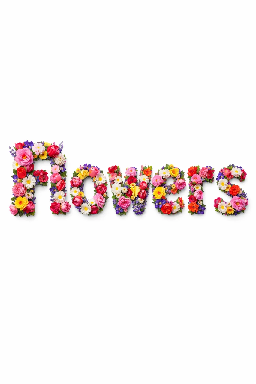
A prompt with floral letters shows well how texture affects reading. Replace only the original inscription. Do not immediately add a long slogan, logo and small captions: the test requires one testable task.
Letters made from fresh flowers
Create the text "YOUR TEXT" where each letter is entirely formed from real flowers (roses, tulips, lavender, peonies, daisies and other varieties). Dense floral arrangement, different species and colors, natural color transitions, rich petal texture, realistic depth and dimension. Soft, diffused lighting, natural shadows within the letters only, high detail, sharp focus, photorealistic style. Background: pure solid white (#FFFFFF), completely clean and uniform, no gradient, no texture, no bokeh, no decorative elements, no floor, no surface, no scattered petals. High contrast between the floral letters and the white background. Clean, well-defined edges for easy background removal. Centered composition with generous white space around the text. 3:4After generation, write down what happened: correct letters, missing character or extra word. Evaluate the text before choosing the most beautiful flower. If the shape has become illegible, simplify the texture or choose denser letters. Often readability is more important than fine detail of the material.
Check similar symbols
Some Latin and Cyrillic letters are similar in appearance, but the generator can build them according to different familiar forms. Carefully compare the entire silhouette of the word. Separately check «Д», «Л», «Ж», «Ы», soft sign and «Ё» if they are in your text. A decorative stroke should not replace an important part of the symbol.
- Check the number of letters with the original phrase.
- Read the word by symbols without guessing it by its first letters.
- Check for whitespace and line breaks.
- See the thumbnail image: patterns can merge and change the reading.
- Ask another person to read the result without prompting.
For trade names, check the approved spelling. Do not replace «ё» with «е» for a better design without approval. If the inscription looks ambiguous, do not expect the viewer to reconstruct it from the context: correct the form or change the design method.
For a long phrase, change the process
Try creating separate lines with the same material description and light. Collect them in the editor, matching the height and spacing. This will give you more control over the composition, but will require you to check the consistency of the generations. Don't stretch one line too much horizontally just for the sake of equal width.
If decorative text is constantly wrong, type the phrase in a regular font and leave the AI to the background or a separate object. Name, price and contact information must be accurate. A neural network is one of the tools for the task; It is not necessary to generate every word in the image.
Save a successful example along with your request
Place the original prompt, the final image and the approved text in one project folder. For the next work, repeat the test: a similar phrase may give a different result. If there is already an error, use the order of correcting the letters , and a short advertising text can be prepared using parsing the title .
Select the inscription for the next layout
The prompts of Creative Typography are written in English: you can change the text in them to your own. Be sure to check each letter before use, especially in titles and short slogans.