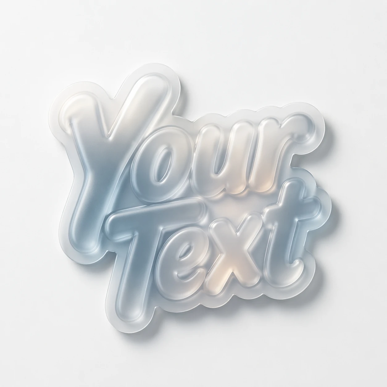
The background in the prompt and the transparency of the file are two different things
A white background helps create a calm environment, but does not make the image transparent. Even if the text appears isolated, there may still be white pixels around it. Check the file itself on a color substrate. A checkerboard pattern drawn by a generator also does not mean true transparency.
For a teaching example, let's take glass letters. They have a particularly noticeable problem: some of the material may be almost the same color as the background. After rough cutting, the letter loses volume or becomes torn. It is better to save the source and work with a separate mask that can be corrected.
Frosted glass lettering
frosted glass typography "YOUR TEXT", glassmorphism style, semi-transparent letters with soft blur, die-cut sticker edges, glossy laminate, subtle inner glow, clean white surface, soft shadow, premium product photography, ultra detailed, 8kDecide which part of the image to save
Divide the object mentally into letters, highlights and a falling shadow. Letters are required. A shadow is needed if the inscription will be on the surface. If it becomes an independent element on top of the photo, it is sometimes more convenient to remove the original shadow and create a more suitable one in the layout.
Reflections of a transparent or mirror material are associated with the surroundings. After being transferred to a radically different background, the inscription may look unnatural. Sometimes it is more correct to repeat the generation to a similar color environment than to spend a long time correcting the cut out object. Transparent PNG preserves the edges, but does not rearrange the light inside the letters.
Start with an automatic mask
- Place the original image on a separate layer and save a copy of it.
- Create a mask using the available object selection or background removal tool.
- Place a contrasting solid color under the layer that is not in the inscription.
- Consider the outer outline, the holes inside the letters, and the space between characters.
- Adjust the mask with a soft or hard brush depending on the nature of the edge.
Don't apply the same blur to the entire path. The hard edge of a letter and the soft shadow require different processing. Strong softening may hide the white border in a close-up view, but turn the lettering into a hazy blur when zoomed out. Regularly return to the size at which the finished post will be viewed.
Check white border and missing parts
Remnants of the white background are visible on a dark backing. On a light backing, overly harsh dark edges become visible. Switch between both backgrounds and compare with the original. If thin elements disappear, restore them on the mask rather than adding arbitrary thickness over the material.
For glass, complete separation from the background is not always suitable: the view through a transparent letter is already calculated in the original picture. If the result needs to look convincing in a complex photograph, use a neutral or less transparent material. Another option is to leave the image in a separate panel with its native environment.
Export and check again
Save the working file with layers. To transfer the caption separately, export a format that supports transparency, such as PNG. Then open the export in a new document and put it on the final background: checking the working draft does not replace checking the finished file.
Do not trim free margins close to highlights. Make the text smaller in your layout and make sure the word remains legible. If the subject looks alien, go back to the light and background, not just the mask. After preparation, you can combine the inscription with typed text or assemble a poster .
Select the inscription for the next layout
Creative typography has prompts for different materials. First, select an effect according to the example, then prepare the resulting image for the background of your banner.