Separate title and practical information
Let's present an educational poster for an evening meeting with music. The name, date, time, place and method of registration are different parts of the message. Collect them into a short list before working with the images. If the event is real, get confirmed data from the organizer: beautiful placeholders are easy to forget to replace.
The title may be the largest element, but the date and location should be right there. Select a separate block for them. It is better to include a long program and list of participants in the description of the publication or on the event page if they interfere with seeing the basic information.
Select one effect for the title
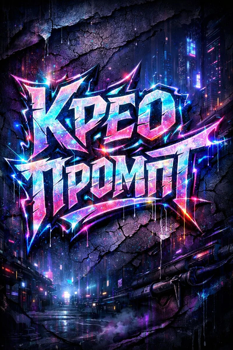
Graffiti with a neon outline is suitable for an energetic presentation. This is a specific visual solution, and not a universal style for any poster. For a quiet lecture or family event, compare it to a simple typesetting title before spending time on the details.
Graffiti with neon outline
Cyberpunk graffiti lettering "Your Text" sharp torn edges, glowing neon outlines, holographic light leaks, deep purple and blue shadows, cracked synthetic paint texture, futuristic street art aesthetic, dark sci-fi city background, ultra-detailed poster, 3:4Replace the text in the request with a short title. Don't include the date, address, or the entire list of speakers. The prompt sets the character of the image; Check the final spelling and the absence of unnecessary characters using the finished result. If the title is long, try two separately created lines.
Build your layout on a simple grid
Divide the work area into an upper part with a title and a lower part with information. Start with the date, place, and action all having the same left margin. This support makes it easier to read even with free-form decorative letters. The glow should not overlap the informational text.
- Put a title and leave some margin to the edges of the image.
- Add the date and time on one line or in a clear pair of lines.
- Indicate the venue below. If the address is long, separate the venue name from the street address.
- Complete the block with an action: register, buy a ticket, or go to details.
Don't assign each row to its own corner for no reason. The reader must go from title to date to location. For the first version, one regular font family with two styles is enough. Calm text will support a complex headline.
Control the brightness, not the amount of decor
On a dark background, a neon outline may be the only noticeable element. Check that the date and location remain distinguishable. If they get lost, weaken the halo around the title or increase the light information block. The extra glow around each line usually only complicates the picture.
Take one color from the title for a little accent: a divider or timestamp. Leave the rest of the details neutral. First, achieve a clear structure without background objects. Then add one if it explains the theme of the event or helps set the mood.
Check out the poster in two sizes
In the large view, check the letters and the edges of the cut-out lettering. In the small view, check the title, date and venue. If you need to enlarge the image to understand it, remove secondary details and reorganize the information. Before publishing, double-check the address and time against the original list.
A separate advertising version may contain less detail than the main poster. Do not reduce the entire layout to the desired format: adapt the arrangement of blocks . For a more formal cover, check out the musical layout with metal letters .
Select the inscription for the next layout
For the next poster, you can choose a different treatment for the title: metal, glass, fabric or calm lettering. In Creative TyPography, effects are presented by prompts and examples.