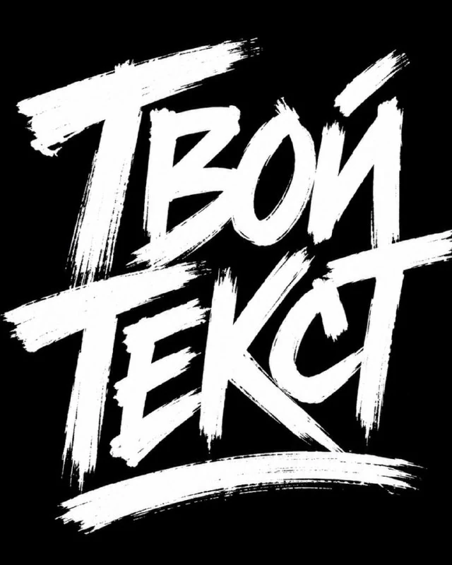
Start with a simple black and white problem
In the selection of text prompts there are different characters of the inscription. What we need here is a white wrist tag on a black background. This is a separate technique: it is based on the trace of paint and contrast, and not on three-dimensional material or a complex scene.
Choose a short word that you can confidently read using large strokes. A long phrase will have too many overlaps and will require a more relaxed structure. To begin with, it is convenient to compare the name or title of five or six letters with the same text typed in regular bold font.
Original request
White dry brush graffiti
White graffiti brush lettering logo spelling “TEXT", aggressive hand-drawn street tag style, bold rough paint strokes, sharp angular letterforms, dry brush texture, distressed edges, uneven ink coverage, thick underline brush stroke beneath the word, high contrast black background, centered composition, minimal monochrome design, raw urban graffiti typography, punk streetwear logo aesthetic, no extra symbols, no colors, no shadows, no gradients, clean vector-like silhouette, 9:16 vertical poster formatReplace TEXT with your inscription. In the original, the opening and closing quotes are different; when editing, you can bring them to one pair around the word. It is more important to keep the formulations dry brush texture, distressed edges and uneven ink coverage - they are responsible for the dry brush mark.
Thick underline brush stroke adds a wide underline. It should support the direction of the word and not cover the bottom of the letters. If there is no air between the lettering and the line, reduce the thickness of the underline or move it lower, maintaining the overall center of the composition.
Where texture helps and where it hinders
Small paint gaps and torn edges create a handmade character. But continuous breaks in the main strokes can turn one letter into several random lines. Check that verticals, diagonals and internal gaps remain visible.
It is useful to see the result on two scales. In the enlargement you can see the quality of the edge, in the small preview you can see the overall readability. If beautiful detail disappears after reduction, reduce the frequency of small breaks and strengthen the main strokes without adding 3D shadows.
Why You Should Keep Color Limits
The request specifically excludes colors, shadows, and gradients. They help produce clear monochrome graphics. If you need a red accent, add it later as a separate element in the editor, rather than mixing it with each stroke. This way you can compare the clean silhouette and the decorated version.
The phrase vector-like silhouette describes the appearance. It doesn't promise a file with editable vector paths. The generation result remains an image; for a full-fledged vector, tracing or manual redrawing will be required, after which it is worth removing unnecessary nodes and checking small holes.
Use in layout
Place the word on a calm background and add supporting information in a regular font. Don't make the date, price and address so blunt: they should be easier to read. The white tag works well as one large accent, but repeating the texture across all the lines creates chaos.
Save the clean lettering, the transparent version, and the editable layout. If you plan to print, check the image in actual size and check the file preparation with the selected manufacturer. For more complex genre letters, you can compare this technique with game logos for jungle and ice.
Select the inscription for the next layout
For other inscriptions and materials there is Creative AI Typography: 823 prompts with examples, search and sections. In the free demo you can test the approach on your own text.