The title should work like a silhouette
The publication about gaming typography has options for different game worlds. For the first exercise, choose a short name and compare the tropical and icy versions. The point of the exercise is to see how one geometry changes mood through edges, palette and depth.
Both queries use the words in the same style as the reference. If you have a reference image, please include it. If you are working only with text, remove the link to the non-existent example and leave a detailed description below. Otherwise, part of the job will indicate material that the generator did not receive.
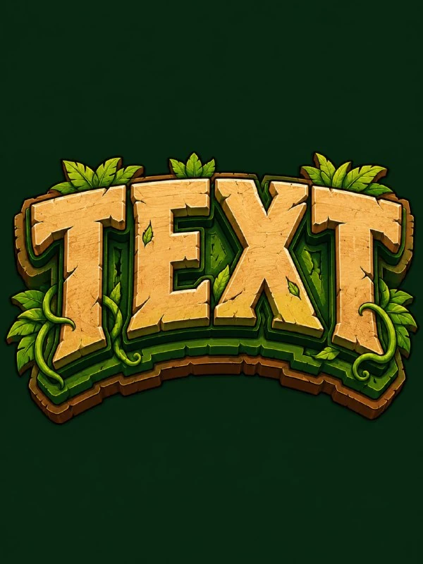
Adventure lettering for the jungle
Adventure gaming logo
Create a bold jungle adventure wordmark logo in the same style as the reference. The text should read: “TEXT”. Use thick uppercase letters with organic carved edges, leafy shapes, vine-like extensions, and subtle wooden adventure-game proportions built into the typography. Make the word slightly arched upward for a heroic exploration title feel. Use a tropical color palette: warm sand main fill, deep jungle green shadow layers, lime green highlights, earthy brown offset outlines, and thin dark outlines for definition. Add stacked offset layers beneath and behind the letters to create a dimensional adventure poster effect. Place the logo on a solid dark forest green background. Add small carved cracks, tiny leaf-like details, and subtle grain texture inside the letters while keeping the word highly readable. Flat graphic illustration style, adventurous, bold, tropical, highly readable. Do not add any extra text, symbols, characters, logos, or icons. 3:4Replace TEXT with the name. Thick capital letters, organic edges, small leaf shapes and vine extensions create an adventurous feel. A warm sand wash separates the word from the dark green background, while additional green and brown layers show depth.
The phrase keeping the word highly readable is important. Leaves and small cracks should remain inside or along the edges of the letters, and not take up the place of the main strokes. If the word begins to look like a continuous bush, reduce the decorative extensions and maintain large interior spaces.
Ice gaming logo
Ice gaming logo
Create a bold ice power wordmark logo in the same style as the reference. The text should read: “TEXT”. Use thick uppercase letters with frozen jagged edges, sharp icicle-like extensions, and faceted angular shapes built into the letterforms. Make the word slightly arched upward for a powerful fantasy game-title feel. Use a cold color palette: bright icy white main fill, pale cyan highlights, deep blue shadow layers, turquoise offset outlines, and thin dark outlines for definition. Add stacked offset layers beneath and behind the letters to create a dimensional frozen poster effect. Place the logo on a solid dark blue background. Add small frost cracks, speckled snow-like texture inside the letters, and subtle icy shine while keeping the word highly readable. Flat graphic illustration style, cold, sharp, magical, highly readable. Do not add any extra text, symbols, characters, logos, or icons. 3:4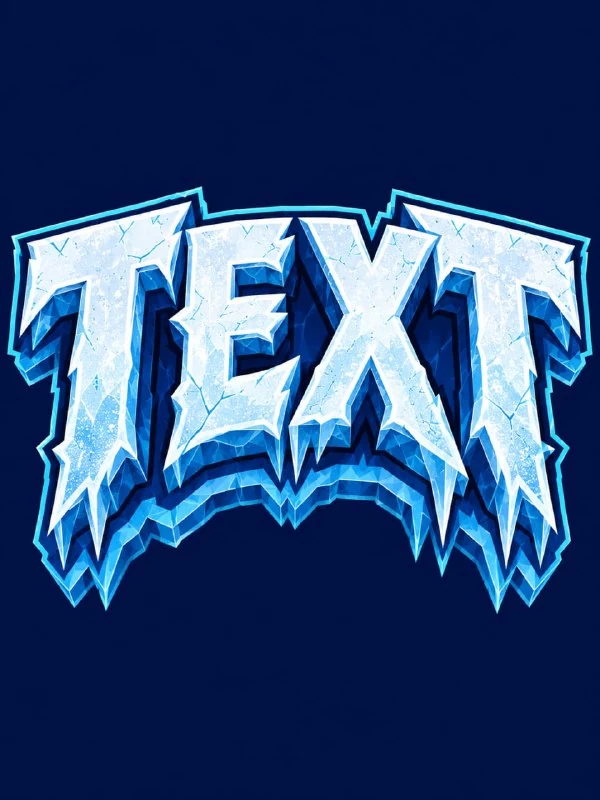
The second request uses sharp edges, icicles, a white base and blue shadow layers. This is a flat graphic illustration with a sense of volume, and not necessarily a photorealistic ice object. Don't add mirror images of the entire environment if you want to maintain the original poster presentation.
Acute endings work well on the outside of a word. Inside letters, they can cover gaps and create false strokes. Check to see if «Е» has become similar to «F», and «О» has become similar to a star. To correct, first reduce the number of internal chips, then adjust the thickness.
How to control a multi-layer contour
Layers should have one clear direction of displacement. If some of the shadows move to the right and some to the left without connection with the light, the inscription begins to disintegrate. Look at the edge of the entire word and appreciate how all the letters are connected, especially when the line curves slightly upward.
Don't raise the arch height too much. The name may look heroic, but the outer letters will be noticeably smaller or rotated so that they are no longer readable. For long text, two lines with a clear hierarchy are better than one narrow arc.
Preparation for use
Reduce the logo to fit the intended cover width. Small leaves and crystals should disappear before the main word. If the name is lost, keep the large silhouette and remove secondary elements. At this stage, do not add characters or weapons: they will hide the problem.
The generated image does not itself become a vector logo. For scaling and further editing, you can redraw the main contours in the editor, saving the selected image. It is better to type the explanation, platform and release date in regular font. For another graphic character there is black and white dry brush lettering .
Select the inscription for the next layout
For other inscriptions and materials there is Creative AI Typography: 823 prompts with examples, search and sections. In the free demo you can test the approach on your own text.