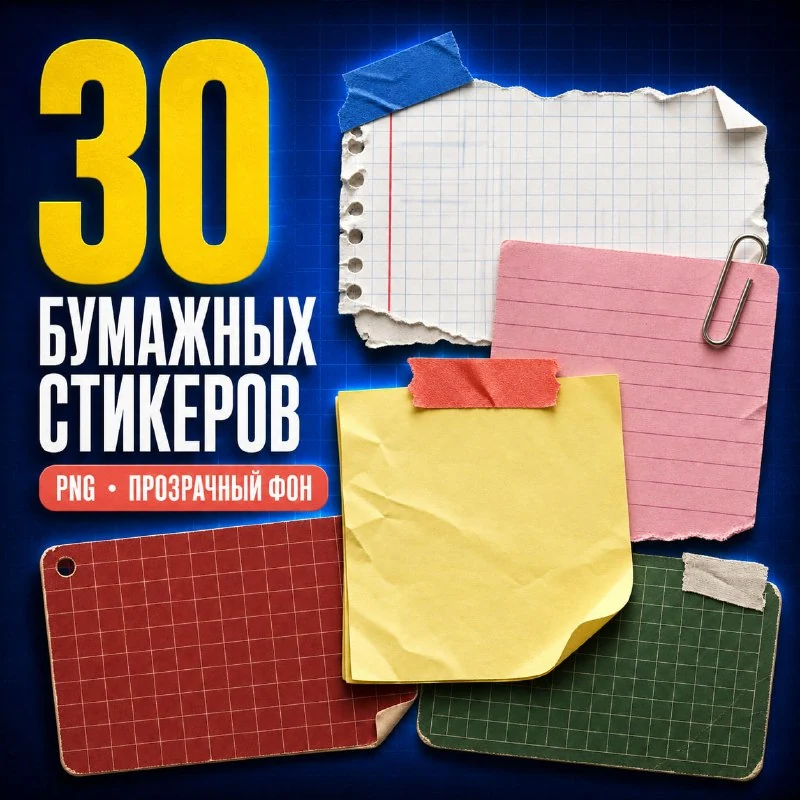
Where to find the original paper elements
The channel post contains thirty separate PNGs with transparent backgrounds: sheets, cards, labels, torn paper, tape, paper clips and clamps. The archive is in the post's comments. The website also has a page for the free set, with previews and a link to the original post.
For this exercise, choose one fairly large sheet, a small label and two fasteners. Avoid placing all thirty elements at once: that makes the composition harder to assess. Prepare a heading of a few words and a short note that the viewer should read first.
Make the sheet a foundation rather than a random decoration
Place the main sheet on a quiet background. It should occupy most of the card while leaving room for text inside. Avoid a steep angle at first: build a straight version, check the margins, then rotate the whole group slightly.
Keep the text on a separate layer. Make the margins inside the sheet larger than the incidental gaps between decorations outside it. A torn edge can visually reduce the usable space, so work within the intact inner surface rather than the paper's furthest protruding edges.
Tape and clips give the collage a clear structure
Position the tape as though it actually holds the sheet in place. Half of a strip can sit on the paper and the other half on the background. A clip should connect to an edge rather than float in the middle of the text. These small connections make the composition clearer than simply adding more details.
Check the layer order. Hide part of a clip behind the sheet with a mask to make it appear to grip the paper. Tape usually sits on top and overlaps the edge slightly. Set up these overlaps before adding shadows: a shadow alone cannot fix an incorrectly placed object.
How to match lighting and shadows
The original PNGs may already include a shadow. Inspect each element's transparency rather than automatically adding another equally strong shadow. Compare the light direction on the sheet, fastener and label. If they differ, reduce the existing shadow or choose another element.
Keep the depth subtle. A large soft shadow beneath a thin sheet makes the paper look as if it is floating above the background. A clip can have a slightly stronger shadow, but it should sit near the point of contact. Check the result at the card's normal size, as well as zoomed in.
Add a small note and check the hierarchy
Put a date, number or short caption on the label. It should not be larger than the main message. Choose a readable font for the main text, and use handwriting only where it suits the note and remains clear.
Reduce the layout to preview size. The large sheet's content should read first, the small note second, and the fasteners last. If bright tape draws attention first, reduce its size or contrast. Save an editable group so the next card needs new text rather than a new structure. For a different accent behind a heading, try these fifty PNG paint strokes.
Assets for your next layouts
Designer Pack 2026 includes icons, backgrounds, textures, objects and editable source files. Browse its folders if you need materials for a series of layouts; you can start this exercise with the free set in this article.