Download the set and choose a direction
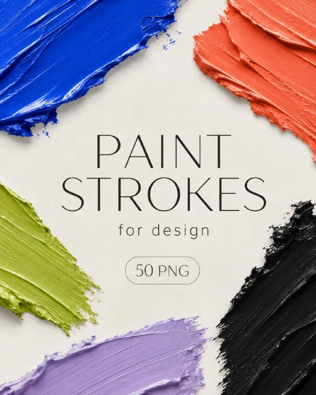
The CreoPrompt post offers fifty paint strokes in PNG. Find the set in the comments; the website also has a dedicated page. For this exercise, choose one broad horizontal stroke and one narrower diagonal stroke.
Open them against a contrasting background. This reveals transparent edges, gaps in the paint and the actual shape. Check the original file dimensions before enlarging it significantly: PNG is a raster format, so inspect the quality before stretching a long stroke across a huge banner.
Create a backdrop for one message
Type a short phrase in a regular bold font, then place the broad stroke behind it. The paint's solid central area should sit beneath the letters, while its rough ends extend beyond the word. Do not force the line to follow every irregular edge: composition matters more than filling the shape exactly.
Light gaps within the paint can reduce text contrast. If they run through several letters, move or resize the stroke, or add a small plain backing between the paint and the text. A strong shadow on every character often makes the design heavy without resolving the busy background.
A diagonal stroke creates movement
Another use is a loose accent next to a photograph or heading. Position the diagonal element to support the composition's direction. For example, it can lead from the image towards a short caption without crossing a face or an important part of the product.
Compare versions with and without the stroke. If neither the meaning nor the direction changes, the element may only be filling empty space. Try removing it or assigning a clearer role: separating a date, highlighting an action or linking two adjacent blocks.
Keep colour and texture under control
Change the colour with a separate adjustment or mask while preserving edge transparency. Do not paint over the original file's entire rectangle: that would remove the dry gaps and the feel of a real brushstroke. Check that translucent edges have not picked up a muddy tint against the new background.
Choose one accent colour from the layout's palette. If the photograph already contains many saturated colours, a single-colour stroke can bring the composition together. Several differently coloured marks around every block create additional focal points and make reading harder.
Do not stretch a single stroke indefinitely
Changing the proportions can make a stroke look unnatural: thick paint becomes a thin strip and a rough edge becomes a repeating pattern. For a long line, find a more suitable original element or split the message into two lines. Keep alternatives instead of repeatedly distorting one file.
Assess the layout both at thumbnail size and at working size. The word and the overall gesture should remain visible in the preview, even if fine texture disappears. Keep the stroke and text on separate layers, and reuse the finished group as the basis for the next card. For a quieter physical backing, try paper sheets and stickers.
Assets for your next layouts
Designer Pack 2026 includes icons, backgrounds, textures, objects and editable source files. Browse its folders if you need materials for a series of layouts; you can start this exercise with the free set in this article.