Separate style from material
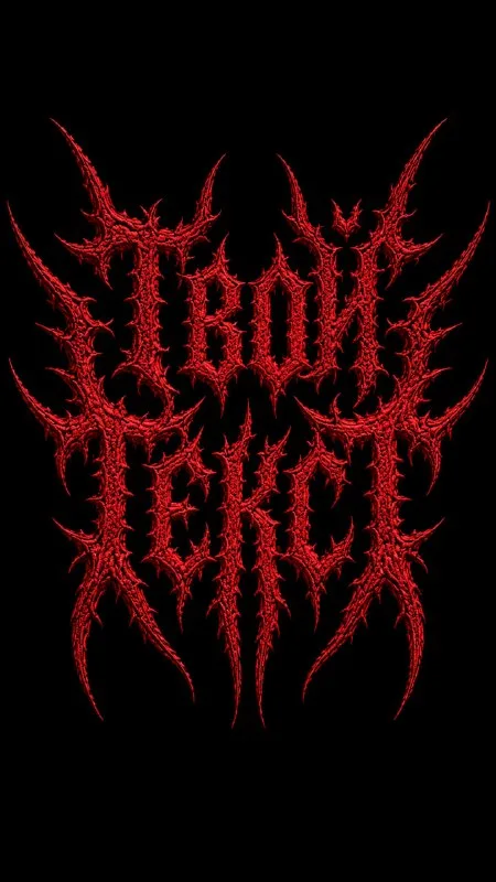
Post No. 405 contains an aggressive lettering prompt: long spikes, symmetrical composition, a red fuzzy surface and pure black background. Metal refers to the musical aesthetic of the letter shapes.
For the first exercise, use a short fictional project name. A long line with many thin extensions quickly becomes ornament. Check that the basic letters are readable before increasing spikes.
The generated result is an image of lettering. Even if the prompt says logo, it does not make the file a finished vector mark tested at every size. For brand use, refine the shape separately in an editor.
The source request
Embroidered lettering in an extreme-metal style
Dark extreme metal logo spelling “Your Text”, sharp demonic death-metal typography, highly stylized custom letterforms with long pointed spikes and thorn-like extensions, symmetrical aggressive composition, red textured letters with rough fuzzy embroidered or velvet-like surface, subtle depth and tactile texture, centered on a pure black background, sinister gothic black-metal aesthetic, dramatic high contrast, no extra symbols, no additional text, no gradients, no glow, no shadows, clean isolated logo, detailed but readable, 9:16Replace Your Text entirely. The source explicitly excludes extra symbols, text, gradients, glow and shadows. Do not add an opposing instruction such as strong neon glow if you want to test this effect.
Readability should survive the spikes
View the lettering at a small size first. If the word cannot be read without a hint, request clearer core letter shapes and fewer thin extensions. A large image can hide the problem behind attractive texture.
Check repeated letters. They should share a logic of thickness and shape even in a decorative composition. When one “А” is recognizable and another becomes a web, the name looks like a random drawing.
The source's symmetry applies to the whole composition. It does not require mirroring every letter. A balance between left and right helps but should not produce extra signs just to match widths.
Keep the embroidery texture
The red surface should show short fibers or a thread structure. If it becomes smooth and metallic, refine embroidered or velvet-like surface without changing color or outline.
Texture is naturally less visible on thin spikes. Look for it on wide strokes instead. Do not increase fur until it fills gaps and connects separate details.
A black background intensifies red, but an excessively dark surface can disappear. Try slightly lighter letters rather than glow. This keeps the source constraints and does not replace embroidery with neon.
Prepare lettering for a poster or merchandise
Place the image on black in your editor and add a date and venue using a simple font. Do not use spikes for supporting information: it needs to read quickly.
For textile printing, check fine-detail thickness at actual size and the production requirements. An embroidered photo effect is not a machine-embroidery pattern: the image contains no stitch paths or technical settings.
Save two versions: a rich decorative one for a large poster and a simpler one for a small preview. If you want reflective metal rather than the music aesthetic, try retro chrome, where surface shine is specified directly.
Select the inscription for the next layout
Creative AI Typography offers other lettering styles with examples. The free demo needs no sign-in; purchase opens the full library.