Decide what matters most
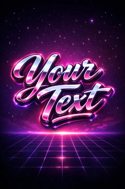
Post No. 215 includes a short 80s retro-typography prompt. It combines chrome script, pink-purple reflections, a glowing edge and a dark grid-and-stars background.
Use a one- or two-word name for a fictional music night. Leave the long event description to your editor. The generated lettering provides the visual identity; date, venue and terms should remain regular readable text.
Do not start by adding cars, palm trees and a sunset. The prompt already contains several expressive elements. Establish a hierarchy first: a large word, a quieter grid and small background stars.
The chrome retro-text prompt
Retro lettering with chrome and neon
Design "Your Text" as retro 80s chrome typography, bold script with pink and purple reflections, glowing edges. Background: dark synthwave gradient with subtle grid and stars, cinematic neon lighting, 3:4.Replace Your Text with the name. 3:4 suits a vertical practice poster, but mentioning it in the prompt does not replace the generator's size setting. Check the resulting file's actual aspect ratio.
Separate reflections from glow
Pink and purple reflections describes colored reflections on metallic faces. Glowing edges describes the luminous contour. Intensifying both may turn the lettering into a bright patch with no visible letter shapes.
Chrome reads through alternating light and dark areas. Keep darker faces so the surface does not become uniformly pink. Check script connections: a highlight should not cover a narrow join.
If white glow merges neighboring characters, reduce its intensity first. Then assess letter width and spacing. Extra sharpening cannot repair a shape where two characters are already joined.
The grid should support depth
The source calls the grid subtle. It provides a quiet perspective beneath the headline. When lines are brighter than the lettering or cross it at the same contrast, the background competes with the text.
Keep the vanishing point clear and inspect the poster's lower area. Dates and addresses often go there, so darken the grid or place a calm panel behind them. Avoid important numbers at the brightest line intersections.
Stars work better as a few background points. If they become sparks around every letter, remove them from the prompt and add a few manually during assembly.
Make two poster versions
Keep the full grid scene in the first version and put chrome lettering on a simpler dark background in the second. Add the same date and venue in your editor. Compare reading speed, not effect count.
View the poster at phone size. If the name is clear but the date is hard to find, reduce decorative lettering or quiet the background. For another metallic surface, try liquid gold: attention goes to drips rather than the neon setting.
Select the inscription for the next layout
Open the Creative AI Typography demo for other lettering treatments. In the full version, search effects by material and style rather than building every prompt from scratch.