Specify a short word
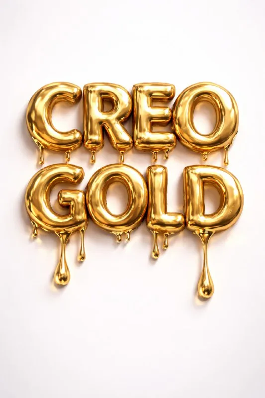
Post No. 230 includes a dimensional liquid-gold text prompt. It specifies flowing metal, warm reflections and a light minimal background. Try “Gold” or a short series name for the exercise.
Start with wide letters. On thin lettering, liquid material may form accidental bridges, and small drops may replace character parts. A short line lets you test the effect without excessive density.
Think about suitable drip positions. The lower edge of a wide letter is clear; a thin crossbar or interior opening is risky. The visual should remain a word rather than become a puddle suggesting characters.
The gold-lettering prompt
Letters made of liquid gold
3D typography, liquid gold letters,
molten gold flowing and dripping,
luxury metallic shine, warm reflections,
soft studio lighting, minimal light background,
ultra detailed, photorealistic,
text: "Your Text"Replace Your Text with your wording. The source does not ask for a completely golden scene: the letters are metal and the background stays light. This separation keeps the main object clear.
Distinguish liquid metal from yellow plastic
Check reflections on wide faces. A metallic surface contains both bright and dark areas. Uniformly yellow letters with identical highlights may read as plastic.
Warm reflections adds warm tones without requiring an orange halo around the object. Liquid gold does not have to glow like neon. Start with the soft studio lighting already in the prompt.
For comparison, keep the word and camera angle and change only the degree of flow. Use a few small drips in one version and more obvious flowing areas in another. Choose by readability, not drop count.
Check the logic of drips
Drops usually read better when their direction makes sense relative to the letters' position. Drips pointing in every direction suggest decorative spikes rather than liquid metal.
Inspect connections between neighboring characters. A shared gold bridge may remove their separation. This is especially noticeable with rounded pairs and tight script. Refine spacing without changing the entire material.
Check the bottom of the scene too: a drop should either hang or rest on a surface with a consistent shadow. If it both floats and reflects like a resting puddle, depth becomes unclear.
Apply the effect in a layout
Put the lettering on a calm background and add one regular caption. Keep small text, terms and prices editable. If the entire banner consists of gold and highlights, viewers struggle to find information.
Assess the result on a phone screen. The main headline should read even where fine metallic texture is no longer visible. For print, check file dimensions separately: ultra detailed does not guarantee adequate resolution.
For metal without drips, compare retro chrome. For a metallic product scene, examine a ring on an animal's paw: scale and contact matter there rather than letter shapes.
Select the inscription for the next layout
Liquid gold is one way to style short lettering. Creative AI Typography collects other textures and styles; start with the free demo.