Choose a photo with a clear silhouette
For the exercise from post about hand-drawn treatments , take a portrait with one figure and recognizable clothing. The face must be visible well enough so that after simplification the hairstyle, head shape and expression are preserved. A complex background can be left, but it will give additional lines and distract from comparison.
Both requests start with Turn this photo, so they must be sent along with the image. Text alone is not enough to stylize a specific person. If your tool of choice has an image editing mode, use the photo as a reference rather than as a random decorative example.
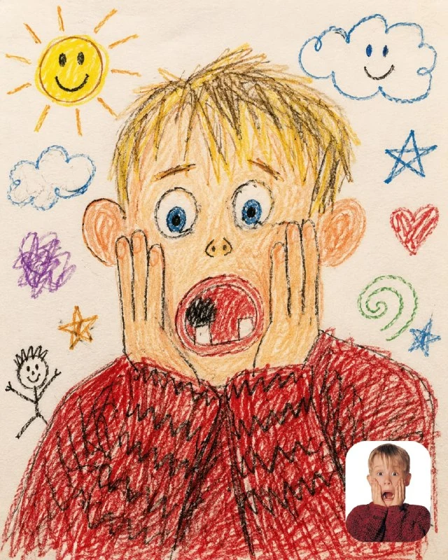
Naive drawing with crayons
Naive drawing with crayons and pencils
Turn this photo into a messy child drawing, crayons and colored pencils, bad proportions, funny face expression, crooked lines, simple cartoon background, naive kid art style, messy coloring, random doodles around the character, hand-drawn sun and clouds, cute awkward aesthetic, paper texture, 4:5 composition, 8kThe words bad proportions, crooked lines and messy coloring intentionally make the drawing uneven. Therefore, this request is not suitable for an accurate academic portrait. His goal is a simple, recognizable figure, a funny expression and a feeling of drawing on paper.
Look at how large features have been preserved: the color of the jacket, the length of the hair, the glasses, the position of the hands. If they are lost, add to your request a requirement to retain specific details. Don’t ask for perfect anatomy and incorrect proportions at the same time: it’s better to determine what kind of freedom you allow in the face and what kind of freedom in the figure.
Sun, clouds and random doodles are already included in the request. For a calmer card, remove some of the surroundings, leaving the crayons and naive line. This is especially useful if there is a short heading next to it and you don’t want competition between the inscription and the picture.
Unfinished pencil sketch
Pencil sketch on paper
Turn this photo into a rough pencil sketch from an old notebook, hand-drawn graphite shading, messy sketchbook aesthetic, construction lines, scribbles and notes, unfinished drawing style, dramatic pencil shadows, paper texture, art student sketch vibes, raw hand-drawn feeling, 4:5 composition, 8k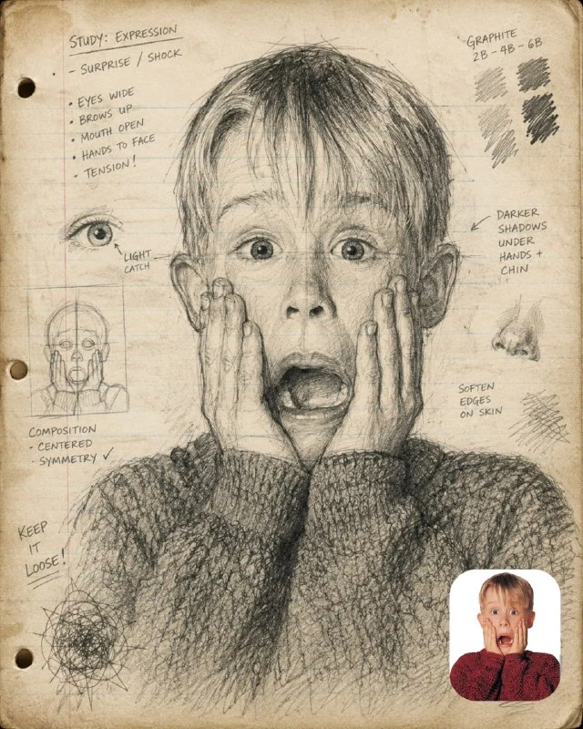
The second request uses graphite, construction lines, shading, and unfinished areas. The important difference here is between a shadow and a smudge: the strokes should add volume to the face, and not cover the entire image equally. Check the nose, cheekbones and neck - the direction of the shading is especially noticeable on them.
Phrases scribbles and notes allow random markings. If you want a clean illustration without pseudo-text, remove the mention of notes and add a ban on readable captions. It is more convenient to put the date, project name and real comments in separate layers in the editor.
What do paper and unfinished edges mean?
The paper texture should not be brighter than the drawing itself. Evaluate it after reducing the image: too contrasting fibers will create noise around the eyes and lips. For a digital card, you can weaken the background and leave the thickest strokes on the face and hair.
Incompleteness works when it is clear where the focus is. The face is drawn more densely, the clothes can go into free lines, and the background into separate hints. If all parts are equally finished, the effect of the educational sketch disappears; if everything falls apart equally, a person is lost.
Two options in one layout
Place the drawings next to the original photo and label them in regular font. Compare style, not random differences in framing. For the cover, choose one option and leave a quiet paper area around it for the title.
Save the source and query along with the result. This way the next photo will go through the same technique, and not through an approximate memory of it. For a tighter hand line, there is a separate portrait prompt with a blue ballpoint pen .
Select the inscription for the next layout
For other inscriptions and materials there is Creative AI Typography: 823 prompts with examples, search and sections. In the free demo you can test the approach on your own text.