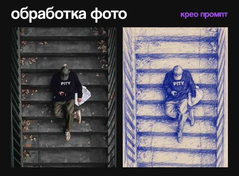
What is the difference between a pen and a pencil filter?
In the selection of photo processing , this option is described as ballpoint-pen scribble portrait. This is not just a blue tint to the finished photo. Volume is created by layers of lines, pressure, loops and cross-hatching. The light areas remain the color of the paper, and the dark areas gain the density of the pattern.
Select a photo that shows the direction of the lighting. Light side light will help separate the cheek, nose and neck. A heavily overexposed face provides little information for shading, and a deep, solid shadow can turn into a large, illegible blur.
Original request from comments
Portrait with blue ballpoint pen
Transform the uploaded photo into an expressive ballpoint-pen scribble portrait. Preserve the person’s recognizable facial features, hairstyle, pose, clothing and original composition. Draw the image using energetic blue biro lines, layered cross-hatching, loose looping strokes, pressure variations and visible handmade imperfections on warm off-white paper. Keep the face carefully rendered while allowing clothing and background edges to dissolve into freer sketch marks. No additional people, no text, no logo, no watermark, vertical 4:5 format, ultra detailed, 8kSend it along with a photo. Inside, there are already requirements to preserve recognizable features, hairstyle, pose, clothing and composition. They set a task, but the result still needs to be compared with the source: the wording itself does not guarantee exact similarity.
The phrase energetic blue biro lines is responsible for the blue lines of the pen. Layered cross-hatching adds intersecting stroke directions, and loose looping strokes adds free loops. If you get a smooth outline without an internal pattern, check exactly these features, and not just the degree of detail.
The face is denser, the environment is freer
The request suggests that the face should be drawn more carefully, and the edges of the clothing and background should be dissolved in looser marks. This transition helps keep your gaze on the person. Check to see if important parts of the chin, ears or hairstyle have disappeared along with the edges.
Compare the eyes and lips in magnification. The lines should support the shape, and not accidentally add wrinkles, change the smile, or combine different details into one shadow. If the error is local, correct a small area in the editor. If the entire face has changed, go back to the request and the original photo.
Paper and line color
Warm light paper creates contrast with the blue pen. Don't enhance its texture right away: first see if the strokes are legible enough. Fibers that are too pronounced can look like a second layer of the design and interfere with the face.
For a black pen, replace the description with blue, maintaining the technique. For a two-color version, determine in advance the role of the second color: for example, several accent lines on clothing. Random red streaks throughout the frame will change the mood and make it harder to control the likeness.
How to make a cover from a portrait
Leave some free space on the side or top of the paper. If the original frame is tight, expand the background in the editor while maintaining the size of the head. Place the title in a separate text layer: the request excludes inscriptions, logos and watermarks.
Reduce the layout to preview size. Dense shading can merge into dark spots; in this case, weaken the background contrast and leave the most expressive lines on the face. Save the unframed version so that the portrait can be used in another format. For a freer drawing presentation, compare the result with the pencil sketch and the naive drawing .
Select the inscription for the next layout
For other inscriptions and materials there is Creative AI Typography: 823 prompts with examples, search and sections. In the free demo you can test the approach on your own text.