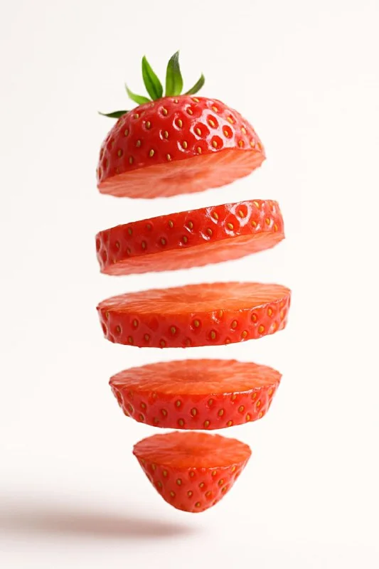
Why separate the fruit into layers?
Cutaway fruit with floating layers reveals color, juiciness and internal structure. Such a composition can become an accent in a drink advertisement, seasonal menu or recipe cover. Let's take an orange lemonade banner: the fruit will be a large visual element, but the name and description will remain separate text blocks.
First, select one object. Orange, kiwi and strawberry differ in their internal structure, so it is useful to give the query an exact name. If you list several fruits at once, the neural network may mix up their attributes. For a collage, it is more convenient to prepare each element separately and assemble them in the editor.
Determine the orientation of the future layout. A vertical stack of slices fits well in a narrow arrangement, but will require space at the top and bottom. For a horizontal banner, leave space for text next to it. Take this into account before generating, so as not to cut off important details later when cropping.
Prompt for floating slices
Fruit with floating layers
Generate a hyper-realistic 3D render of a [fruit or vegetable] sliced into multiple horizontal layers, with each slice floating in mid-air at slightly different heights. The object should appear freshly cut, showcasing detailed and juicy cross-sections. Capture the scene from a soft, low-angle perspective to emphasize the floating effect.
Use soft, diffused lighting coming from the upper left to create gentle shadows beneath each slice while maintaining vibrant illumination. The background should be clean, pure white (or light pastel) for maximum contrast.
Employ a natural and fresh color palette that highlights the object’s realism — rich, saturated tones with subtle reflections and moisture details on the cut surfaces.
Render in a photorealistic, cinematic style, with precise focus on textures and material properties. Add slight depth of field for a professional studio look.Instead of [fruit or vegetable], enter a specific fruit or vegetable. The rest of the description specifies horizontal cuts at different heights, a low shooting point and soft light from the top left. A white or light pastel background helps separate the subject from its surroundings.
If the slices are too far apart, reduce the distance between layers in the description. If the fruit has become like a stack of identical disks, make sure that the external silhouette and natural structure are preserved. First adjust the composition, then experiment with the background color and the number of drops.
It is not necessary to do all the options completely from scratch. Keep the successful description of the light and angle, change only the name of the object. Then compare the results as elements of a future series. This makes it easier to notice that one fruit needs a different scale or fewer cuts.
Checking the internal structure
Beautiful flesh may be implausible. Enlarge the image and see where the seeds, skin and center are located. Sections of one fruit should belong to the same object: the same material and color, a clear continuation of the shape between the layers.
Pay attention to the direction of the cut. The query specifies horizontal layers, but the result may add whole slices or a longitudinal slice. If this changes the task, please clarify your request. For an advertising illustration, a convention is possible, but such a frame should not be used as an exact botanical diagram.
Check the shadows too. Each floating layer should not lie on an invisible surface. Too heavy dark spots can create the feeling of a pasted collage. Soft light and moderate depth of field help keep the entire stack legible.
We use the result in the banner
- Choose a frame with the right shape and enough open space.
- If necessary, remove the background and adjust the mask on the peel, drops and thin edges.
- Place the fruit next to a real image of the drink. Do not cover the label or main title with it.
- Add the title, explanation, and terms of the offer in regular text layers.
- Check the banner at a small size and reduce details that interfere with reading.
If a fruit illustrates the taste or composition of a particular product, check its actual description. Don't add other ingredients to your ad layout just for the sake of a pretty palette. When multiple flavors are required, keep the item layout the same and rotate the corresponding fruit.
Preparing a series without unnecessary noise
For three banners, fix the background, title position and packaging size. The differences can be left in the color of the pulp and the short name of the taste. If each option gets a different angle, light, and composition, the series no longer looks cohesive.
Leave the working images on separate layers so that you can change the proposal later without re-generating it. For a more rigorous subject presentation, compare the floating slices with the item inside the ice cube .
Select the inscription for the next layout
You can add a separate decorative inscription to the subject visual. Creative TIPography contains 823 prompts with examples; Try the appropriate effect first in a free demo.