Define the natural lettering task
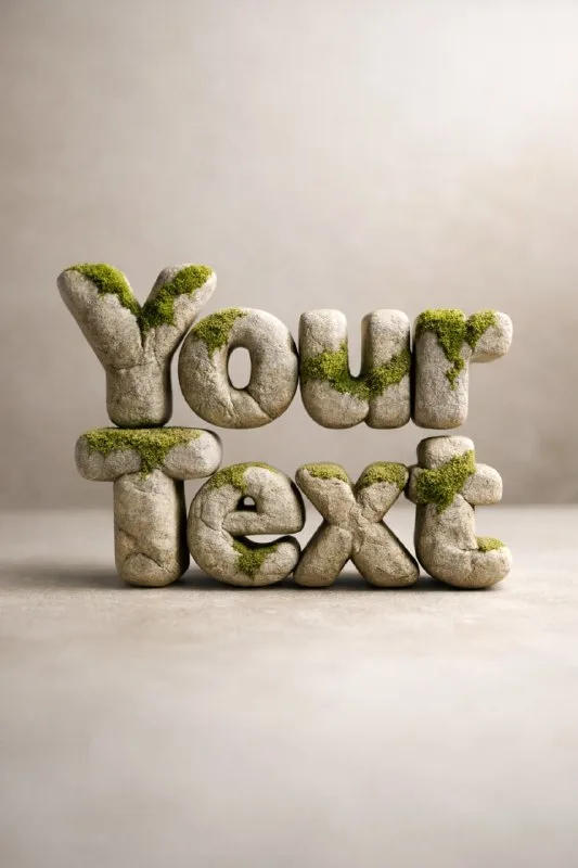
Post No. 337 includes a Zen nature typography prompt: smooth stone and moss letters, earthy tones and soft natural light. It provides a starting point for a calm visual, such as a cover about rest or natural materials.
Use a short word such as “Пауза” for the exercise. Do not request a forest, stream, candles and interior immediately. Isolated lettering is easier to inspect and later place in a banner.
Decide the moss's role in advance. It may occupy small stone areas or cover much of the surface. The first state reveals more stone; the second emphasizes vegetation.
The stone-lettering source prompt
Stone letters with moss
Zen nature typography "Your Text", letters carved from smooth stone and moss, calm spa aesthetic, neutral earthy tones, soft natural light, hyperrealistic 3D, macro textures, isolated typography, premium minimal product shotReplace Your Text with your word. Isolated typography and minimal product shot keep the scene simple. If a whole forest appears, specify no additional objects and retain a neutral background.
Separate hard and soft surfaces
Stone should retain clear faces and weight. Moss should have small irregularities rather than resemble smooth green paint. If both surfaces shine identically, their difference disappears.
Check transitions. The green texture may follow the stone and gather in recesses. Floating moss or long stems growing from every letter changes the scene.
Compare two versions with the same wording: some moss along edges and denser coverage of front faces. Keep the background color unchanged to see where greenery starts affecting readability.
Soft light should still show volume
The prompt specifies soft natural light. Stone letters still need shadows and visible thickness. Completely even lighting turns volume into a flat texture within a silhouette.
Check for a small difference between front and side surfaces. A shadow below the text shows contact with the base. Letters standing at different heights without a reason disrupt the calm composition.
An earthy palette also needs contrast. Beige stone can disappear against beige. A small change in background lightness may be enough to retain a warm palette. A black background and harsh spotlight create a different mood.
Assemble a calm cover
Add a small regular caption in your editor and leave room around the main word. Do not repeat stone texture in the button, subheading and every icon: one expressive headline establishes the material.
View a reduced cover. Interior openings should remain clear, and moss should not become an accidental green blot. Then enlarge the image to inspect surfaces separately.
For lighter green styling, see grass sticker lettering. It uses a different approach: a thin cutout contour and flatter placement. Comparing them helps choose between a heavy stone object and a lighter decorative accent.
Select the inscription for the next layout
Creative AI Typography includes other material combinations for text. Try the free demo's ready-made prompts with your own short headline.