Choose a short green accent
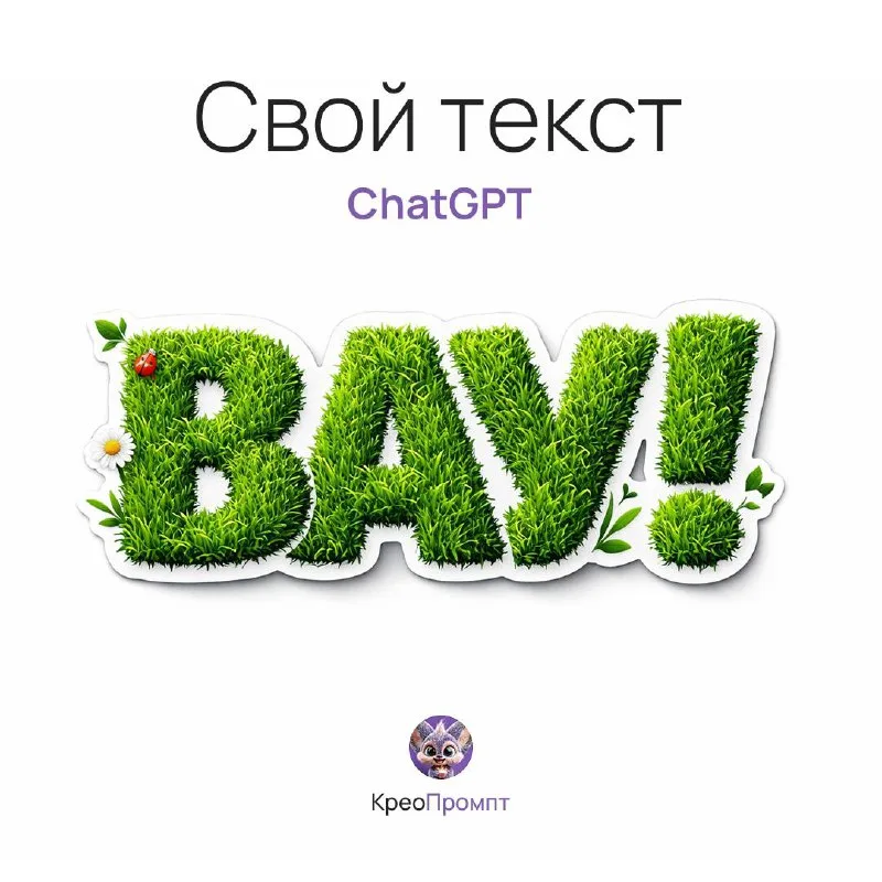
Post No. 197 includes a separate grass sticker typography prompt. It specifies fresh green grass, cutout edges, a slight outline and glossy laminate. This differs from heavy stone letters covered in moss.
Use “Вау” or a short summer-collection name for the exercise. The sticker may sit beside the main cover text, so it needs to remain clear at a small size.
Make one element on white first. Do not add a field, trees or lawn: they obstruct checking the cutout contour. The sticker's overall shape should be visible independently of its future setting.
The source grass-sticker prompt
Grass lettering with a sticker outline
grass sticker typography "Your Text", letters made of fresh green grass, die-cut sticker edges, glossy laminate, subtle outline, eco playful branding, small organic elements around letters, text only, isolated typography, subtle shadow on white surface, product photography, ultra detailed, 8kReplace Your Text entirely. Die-cut sticker edges defines the cutout edge and glossy laminate the coating. These are image requirements, not proof that the finished file is prepared for physical sticker printing.
Separate grass blades from the outline
Grass should form the letter surface. If the word becomes a scattering of long stems, specify a dense letter base and shorter texture. The outline should retain the characters in a small preview.
The outer sticker edge has a different purpose: uniting the text into one object. If large separate white islands remain between letters, decide whether you want one sticker or independent characters.
Check internal openings. They may stay white, but should not be randomly filled with grass. “А” needs its opening; “В” needs separation between rounded sections. Material often causes the greatest shape problems there.
Avoid turning grass into plastic
Laminate can add a broad highlight without completely hiding grass texture. If every letter becomes a smooth green bubble, the material has disappeared under gloss.
Compare two versions with the same text: subtle and more obvious coating shine. Keep color and outline thickness. This reveals when the sticker looks deeper and when it merely stops resembling grass.
The source already includes small organic elements around letters. Limit them if they disrupt the unified shape. One clearly placed leaf can work better than random branches around every character.
Prepare the element for a cover
Check transparency in your editor and remove the background if necessary. The prompt's white surface is part of the image, not automatic transparency. Keep contour and soft shadow separate if you plan to change backgrounds.
Place the sticker on light and dark backgrounds. Look for a dirty fringe left after cutting out. Then reduce the element to its actual layout size and check wording without zooming.
For a heavier natural headline, see stone letters with moss. For related particle work, see sand lettering. Comparing these effects helps choose a material for its compositional role.
Select the inscription for the next layout
Open the free Creative AI Typography demo for other lettering textures. The full library provides examples, search and prompt copying.