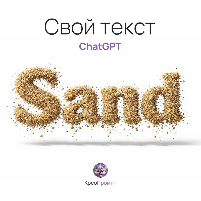
Choose a word with wide letters
Post No. 197 includes a sand suspension typography prompt. It describes suspended sand forming dimensional letters. This differs from writing traced on a beach: the shape itself consists of separate particles.
Use a short word such as “Лето” or “Sand”. Wide strokes leave room for a dense center and looser edge. A thin script may lose its connections as particles disrupt the shape, making the word hard to read.
Before generating, decide where the lettering will sit in the layout. A central shape on white is convenient for assembly. Do not add a beach, sea, shells and person immediately: obtain the material first.
The sand-particle lettering prompt
Letters made of suspended sand grains
sand suspension typography "Your Text", 3D floating sand particles forming letters, frozen in time effect, realistic granular physics, hyperrealistic 3D, photoreal material rendering, physically based rendering (PBR), ray tracing, global illumination, cinematic studio lighting, macro details, micro surface imperfections, text only, isolated typography, subtle shadow on white surface, product photography, ultra detailed, 8kReplace Your Text with your word. The source already uses text only and isolated typography to limit the scene to lettering. If the model still adds a shore, reinforce the requirement for a separate object on a white surface.
Distinguish sand from a solid sculpture
Check for individual grains, small gaps and an uneven edge. A perfectly smooth surface looks more like sandstone or clay.
The letter also needs a dense core. If it consists entirely of sparse dots, floating becomes more obvious but readability falls. Compare the same word with denser strokes and more scattering around the edge.
Do not increase scattered grains across the whole scene. They can become noise and interfere with later text. An advertising headline only needs slight breakup around the outline if the main silhouette stays stable.
What the technical terms mean here
PBR, ray tracing and global illumination describe the desired realism of material and light. They do not prove that the model calculated a physical scene or created a three-dimensional model.
Assess the visible result: letter volume, consistent shadows and highlights on grains. 8k also does not mean the downloaded file will have that width. Check actual image dimensions for print.
Frozen in time separates suspended sand from motion blur. If particles become long trails, specify that they are stationary and should keep sharp edges.
Checks before assembling a layout
View the word as a small preview and read it without a hint. Then enlarge it to check grains, edges and shadow. These are different checks: attractive close-up detail cannot compensate for an unreadable headline.
Add a subheading in a regular font, keeping sand only for the main line. For a seasonal pair, create snow text with the same composition. For a flatter green element, the same post offers another technique: a grass sticker.
Select the inscription for the next layout
Try other headline textures in the free Creative AI Typography demo. The full library contains 800+ prompts with examples.