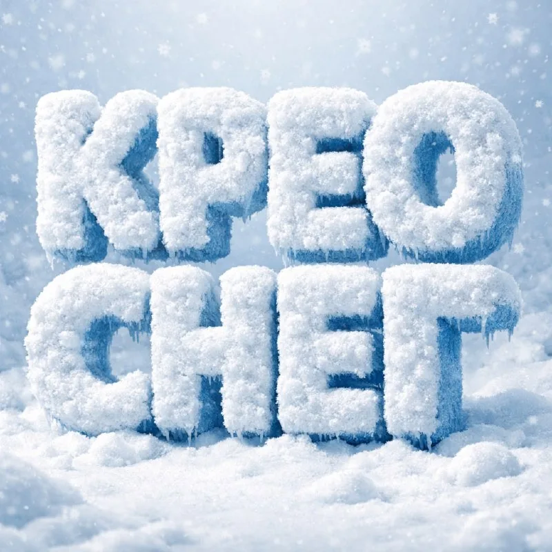
Start with a short winter headline
Post No. 188 offers a compact snow-typography prompt. It specifies volume, soft powdery snow and cold light. Use it for “Зима”, a winter promotion name or a short card headline.
Avoid a long phrase for the first version. More letters leave less room for openings, and loose snow may connect neighboring signs. Four or five letters make it easier to test the material and shape.
If the layout needs a date, terms and button, keep them out of the snow composition. Apply the effect to the main headline, then add supporting information in your graphics editor. You can change the date without generating another image.
The source snow-lettering prompt
Dimensional snow letters
3D snow typography, fluffy snow-covered letters,
soft powdery texture, frozen edges,
cold winter light, light snowy background,
ultra detailed, photorealistic,
text: "ВАШ ТЕКСТ"Replace ВАШ ТЕКСТ entirely, retaining quotation marks. After generating, read the word letter by letter: texture should not hide misspellings or an extra character.
Snow and ice produce different surfaces
Soft powdery texture describes loose snow, while frozen edges describes frozen edges. Increasing transparency and smooth shine can make the result icy even though the task was snow lettering.
Check the main material in the middle of a wide letter. You should see soft irregularities, small deposits and matte areas. Glassy highlights across the entire surface change how the material reads.
For comparison, keep the word's shape and change only the snow condition: freshly fallen or more densely packed. This shows which version reads better at your intended size. Changing the background, angle and font together makes choosing harder.
Make white letters visible
The prompt specifies a light snowy background. Separate the letters with lighting and shadows rather than simply adding a black panel. A side face slightly darker than the front conveys thickness.
If the text merges into its surroundings, specify cold-light direction and a soft shadow below the letters. Do not immediately add a black outline: it may turn realistic snow into a cartoon contour.
Pay particular attention to openings inside “А”, “О” and “Р”. Snow should surround them without filling them completely. The difference between an “О” and a solid snowball is obvious in a small preview.
Prepare the image for a banner
Leave a clear area beside the lettering when defining the composition. Add a regular caption and promotion terms afterward. Choose the supporting text color for background contrast, not merely because pale blue feels wintry.
Before exporting, view the layout at phone size. Snow dust around the letters should not compete with the date and button. For another granular surface, compare it with sand lettering: the outline also risks breaking apart, but lighting and material density differ.
Select the inscription for the next layout
Creative AI Typography offers other materials and lettering effects. The free demo lets you test ready-made prompts with your own text.