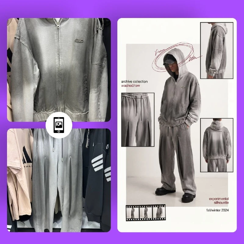
Prepare photographs of one garment
The prompt in the author's comment builds a lookbook from uploaded clothing photographs. Prepare front, side and back views if those angles matter. Save separate images of prints, fasteners and fabric details that should appear in the small panels.
Use one version of the product. Different colours of the same model or photographs of different sizes can mix together in the collage. Name files by role: overall view, back, sleeve detail. This helps define the structure but does not itself ensure accuracy.
Decide what the central figure should explain: the overall silhouette, an outfit or the fit of one jacket. Then choose details for the supporting shots. If all panels repeat the same print, viewers learn less about the garment.
The magazine-layout prompt
A lookbook from clothing photographs
Create a high-fashion experimental streetwear editorial collage from the uploaded clothing photos. Style: futuristic archive fashion, cyber streetwear, Japanese avant-garde lookbook, raw luxury campaign aesthetic. Composition: asymmetrical magazine layout with multiple cropped frames showing front, side, and back angles of the outfit. One large full-body central figure and 3–5 smaller detail panels around it. Model pose: relaxed, slightly slouched, hands in pockets, hidden face, anonymous styling. Outfit fit: oversized silhouette, long sleeves, wide shorts/pants, heavy footwear. Accessories: dark cap, partially hidden eyes, hood up. Background: clean light gray or off-white studio backdrop with minimal shadows. Effects: - heavy film grain - scanned magazine texture - subtle blur and bloom - washed colors - soft vignette - distressed print effect - faded airbrush graphics on clothing - noisy texture overlay - low contrast fashion photography look Graphic design elements: - thin editorial borders - handwritten scribble circles around head - small contact-sheet style image strip - minimalist typography - lowercase text - collection/drop naming - subtle red/burgundy accent lines matching outfit tones Lighting: - soft diffused studio lighting - muted highlights - slightly underexposed shadows Color palette: burgundy, black, off-white, dark gray, faded red. Output should look like: a luxury underground fashion campaign, combining editorial magazine layout + experimental streetwear poster + vintage scan texture. Important: Use the uploaded clothing item exactly as reference. Keep the garment design accurate. Do not redesign the clothes. Generate realistic fabric folds and oversized proportions. Maintain a consistent fashion-editorial aesthetic across all frames.The original specifies one large figure and 3–5 smaller detail panels. Start with three clear shots: a side view, the back and a close-up detail. This lets you check consistency before making the grid more complex.
The model's face is hidden, the pose relaxed and the hands in pockets. These instructions support an anonymous presentation. But a pocket or hand must not hide a key clothing detail. If buyers need to see it, change the pose or show that area in a separate panel.
Resolve the loose-fit conflict
The prompt asks both to preserve the garment's design and to create oversized proportions. If the actual clothing has a different fit, these requirements conflict. Set the priority before generating: for a specific product, its real length and volume matter more.
The effects also include faded airbrush graphics on clothing, which can add artwork to the garment itself. If those graphics are absent from the reference, remove that instruction. Apply magazine texture to the overall page instead, leaving the product without new decoration.
Compare sleeves, hem, shoulder width and collar shape. An attractive silhouette does not confirm that the original model is shown. An artistic version can work for presenting an idea; correct differences when depicting a specific garment.
Check consistency across all panels
Compare the central figure with the small shots. Prints, pockets, seams and fasteners should belong to the same garment. A common problem is similar-looking clothing in the wide shot but a different pattern in the close-up.
Examine the angles: a side panel should show the actual side and a back panel the rear. If generation merely repeats the front photograph with a different crop, it adds no useful distinction. Replace that panel with your original photo in the editor if needed.
Grain and blur suggest a scanned magazine but should not hide the product. Reduce them around important details. Check small typography especially carefully: arbitrary words do not become a collection name simply because they look convincing.
Refine the page in your editor
Arrange the selected images on a separate base and adjust spacing. Keep one large figure and align the smaller panels to a clear rhythm. Frames and red lines should connect the images rather than cross necessary details.
Type the collection name and captions manually. Add one overall print effect after assembling the layout so it affects the panels consistently. Save a version before adding textures for use with a different treatment strength.
For a single clothing shot, see the guide to placing a reference T-shirt on a model. Here, the additional task is to align several product views on one page and give each shot a useful role.
Assets for your next layouts
Refine the collage with textures and graphic details in your editor. Browse Designer Pack's contents and choose materials that support the selected style.