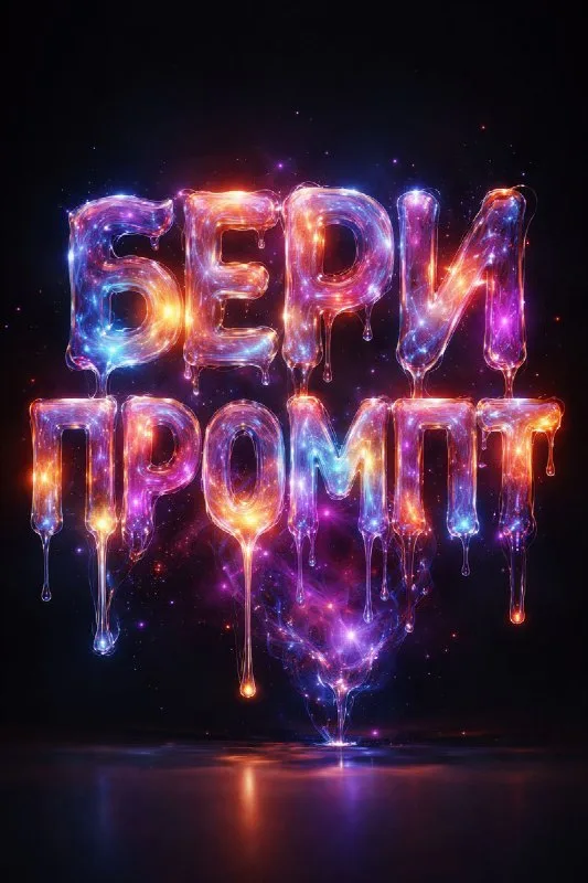
Start with one word on a dark background
Post No. 117 includes a molten-cosmic-gas lettering prompt. It combines translucency, organic drips, galactic color transitions and a clean dark background.
Use a short fictional project name such as “Orbit” for the exercise. Do not immediately add planets, astronauts and spacecraft. First check whether the word's shape survives the glowing material.
Plan the headline's position on the future cover. Isolated lettering is easier to assemble than a scene already packed with objects. A dark background gives contrast for the first comparisons.
The cosmic-lettering prompt
Letters made of glowing cosmic gas
3D typography of the words "YOUR TEXТ" in a molten cosmic gas style, semi-transparent dripping nebula-like letters, glowing edges with colorful galactic gradients, hyper realistic fluid organic shapes, glossy luminous surface, dramatic studio lighting, on a clean dark background, ultra detailed, cinematic, 8k renderReplace the entire YOUR TEXТ phrase inside the quotes. The last source character resembles a Latin T but is Cyrillic. Replacing the whole placeholder is easier than editing individual letters and accidentally leaving source wording behind.
Keep the shape within the glow
Semi-transparent dripping nebula-like letters describes letters with a gas texture. If you get a nebula with a barely recognizable word, specify a dense core shape and clear interior openings.
Edge glow should separate letters from the background rather than join neighboring signs. Inspect narrow gaps, which often lose contrast first. Stronger glow does not always improve visibility; it can blur boundaries.
Check translucency in wide strokes. If the whole surface becomes opaque glossy plastic, the gas effect is lost. If it almost disappears, increase shape density while keeping soft interior transitions.
Limit palette and drips
Galactic gradients may produce many colors. For a cover series, choose two or three main tones, such as cyan, purple and pink. Keep them consistent across generations for meaningful comparisons.
Drips add movement but can alter the letters' lower shape. If their tails cover the line beneath the headline, shorten them or leave more space around the lettering. This concerns composition, not image resolution.
Cinematic and 8k render describe the desired presentation without guaranteeing downloaded-file dimensions. Check pixel size and edge quality before printing or using a large display.
Assemble a cover with regular captions
Add a small date or description in a calm font in your editor. Choose an area without bright glow. Important information should read even where the decorative letter surface looks like a colored patch.
Check the layout on a small screen against the actual dark background you will use. If the lettering fills everything, reduce it and make room for a caption.
For a glowing effect with a firmer surface, compare retro chrome. Metallic faces support its shape; gas density and glowing-edge contrast support this one.
Select the inscription for the next layout
Creative AI Typography offers other glowing and transparent materials. The free demo needs no login and lets you try prompts with your own text.