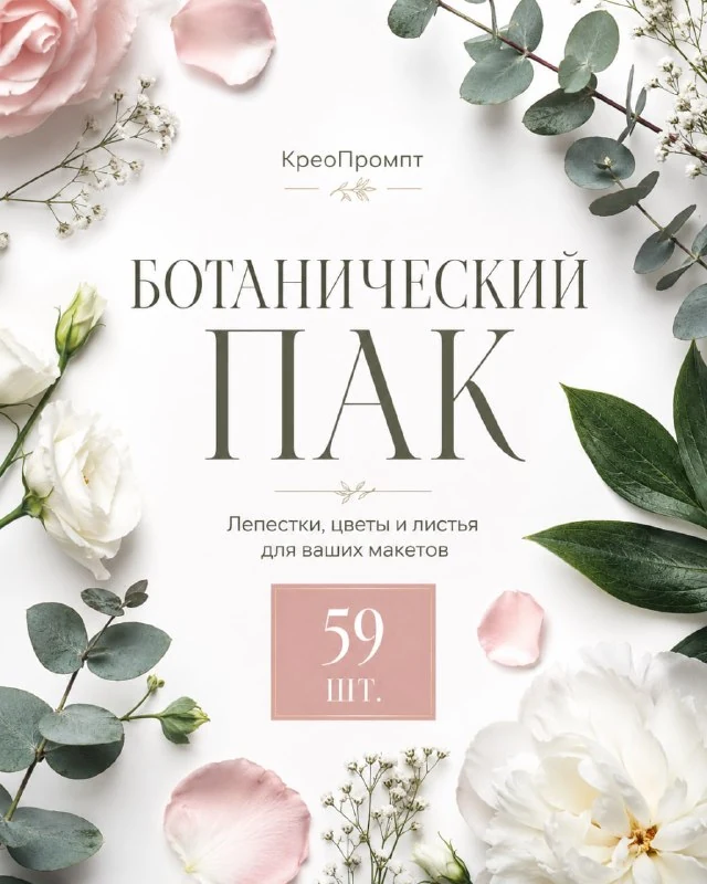
The set and a task for your first layout
The channel post contains fifty-nine petals and leaves. The website has a page for this collection linking to the original materials. Before starting, inspect the available files and select a few elements with similar lighting and surface characteristics.
Prepare a short heading, one explanatory line and a quiet background for the exercise. It could be a seasonal collection announcement, an invitation or a greeting card. Position the text before adding decoration: the plant elements should support an already clear structure rather than replace it.
Build a frame that leaves the centre clear
Place two or three elements near the edges. A larger leaf can enter from a corner, with another balancing the opposite side. The frame need not be symmetrical: balance around the main message and clear space around the letters matter more.
Check the frame's inner edges. A pointed leaf aimed at a line of text can create an unwanted overlap or look like an arrow. Rotate it or move it towards the edge. Do not cover the start of the heading or important numbers with decorative details.
Scale creates depth
A large element near an edge looks closer; a small one looks further away. Use this difference deliberately. If every leaf has the same size and rotation, the frame will resemble a repeating ornament even when the source files vary.
For a first test, keep three sizes: a large corner element, a medium side detail and a small petal. Remove extras that add neither depth nor direction. A simple arrangement adapts more easily to another card aspect ratio than a dense scattering around every line.
Lighting connects the elements to the background
Look at the highlights and shadows already present in the materials. If one leaf is lit from the left and another strongly from the right, they can seem to belong to different scenes. Choose a better-matched pair or reduce individual elements' contrast with adjustment layers.
Add shadows only where they explain positioning. A petal resting on a surface needs a small contact shadow; an element imagined as floating in front of the background can have a softer shadow or none. The same large shadow on every detail does not produce convincing depth.
Colour should not compete with the message
Choose the background for text contrast, then assess the plant colours. Green leaves may disappear against a bright green backing, while pale petals can blend into pink. Change the background or positioning before increasing every object's saturation.
If the card includes a product photograph, use its palette as a guide. One repeated hue can connect the scene while the others remain neutral. Do not colour each word to match a different petal: that creates several competing accents.
Check the card at a smaller size
Read the heading without zooming in, then examine the decoration. If a large leaf catches the eye before the message, reduce its area or contrast. The hierarchy should hold in both square and vertical formats.
Keep the elements separate from the text and background so the next version only needs different content. To compare a different decorative accent, try PNG paint strokes: there, a brush gesture sets the direction; here, it comes from the leaf shapes and petal placement.
Assets for your next layouts
Designer Pack 2026 includes icons, backgrounds, textures, objects and editable source files. Browse its folders if you need materials for a series of layouts; you can start this exercise with the free set in this article.