What to determine before generating a mascot
An AI mascot starts with deciding who it represents and what task it performs. A children's store, a coffee shop, and a sports team require different images. Before generating, write down three characteristics of the character: appearance, mood and noticeable detail. For example: fox, calm smile, small green scarf.
Select the material separately. The plush surface gives a soft toy look, and the knitted surface gives a noticeable texture to the loops. Don't mix them in the first request. First, evaluate the shape of the head and the recognizable detail, then increase the complexity of the surface. This will make it easier to compare options and choose a base.
One picture does not make a character a system for a brand. For further work, you will need other poses, stable proportions, consistent colors and rules of use. These examples are suitable for a first concept and a single ad image.
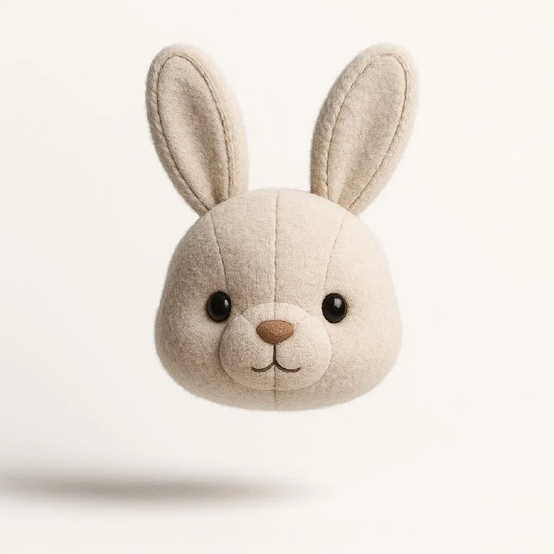
Plush character portrait
Plush Character: Portrait
Create a stylish 1:1 minimalist poster featuring a highly detailed 3D render of an adorable plush [animal] head floating mid-air against a clean white background. Emphasize ultra-realistic textures-visible stitching, fabric seams, and soft fur-with soft studio lighting that enhances its cute, huggable charm. The composition should be sleek, modern, and heartwarming, balancing hyper-detailed craftsmanship with irresistible 'kawaii appeal. Use subtle shadows for depth, ensuring a premium, high-quality aesthetic.Replace [animal] with the animal of your choice. The original query clearly specifies a head floating on a white background. So don't expect him to be a full-length character. If you want a full silhouette, change the description of the head and add a pose while maintaining material and light.
For the first test, just add a scarf of the desired color or other simple detail. Do not overload your character with glasses, a hat, a bag, badges and several items at the same time. In a small size, most of these elements will disappear, and the image will become more difficult to repeat.
Check the eyes, ears and stitches. Random asymmetry sometimes looks expressive, but it must be conscious. If the character will appear next to text, try leaving more white space on one side of the image.
Knitted character in winter scene
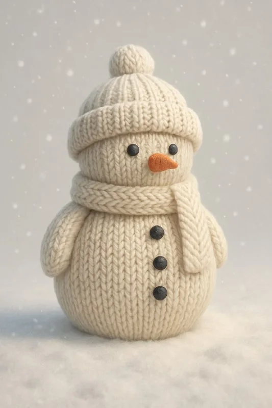
Knitted character in winter scene
Create a minimalist CGI poster with a [3:4] aspect ratio, featuring a [knitted Christmas angel] as a stylized 3D model. The angel should have a realistic knitted texture, with visible yarn details and soft folds, making it appear cozy and handmade. The knitted fabric should look soft and warm, with intricate stitching visible on the surface. Place the angel on a snowy winter background, with soft lighting to highlight the texture of the knitting. The scene should have subtle snowflakes falling, creating a festive and inviting atmosphere. Use soft shadows to enhance the three-dimensional appearance of the knitted object, ensuring it feels both realistic and charming.To change an angel into another character, replace its name in all sentences of the request. One edit inside the brackets is not enough: further the text again talks about the angel. If you don't want a winter scene, change the snow, falling snowflakes, and background separately. The yarn material can be saved.
It’s useful to test a knitted look against a plain background first. Small loops, folds and snow can hide the silhouette at the same time. When the form itself is complete, return the environment. For a series of images, save the successful result as a visual reference if the tool you are using supports this.
Preparation for branding
- Choose one image and write down its permanent characteristics: head shape, color, accessory and facial expression.
- Check out the character in small size. It should remain recognizable without studying the texture.
- Cut out the background and fix the mask near the fur or yarn. Do not leave a light halo on a contrasting substrate.
- Put together one real layout: a cover, a banner, or a welcome card. See how the character interacts with the title.
- Only after this move on to new poses and emotions.
If the new generation has changed its muzzle, scarf color or ear length, compare it with the selected standard. Sometimes it's easier to manually correct a small area than to change the entire query again. The consistency of the series is more important than the number of beautiful individual pictures.
How to separate the concept from the finished result
Save the original generations, the selected option and the processed file separately. For discussion with the team, show the character on a white background and in one working layout. This way it will be clear whether it suits the brand, and not just whether everyone liked the texture.
For a character with several emotions, you can see preparation of a sticker pack based on photo. It's especially noticeable there why the same face shape must be maintained between images.
Select the inscription for the next layout
Once a character is chosen, there needs to be a title next to it that supports the composition. Creative typography has 823 prompts for decorative lettering; You can try the options in the demo first.