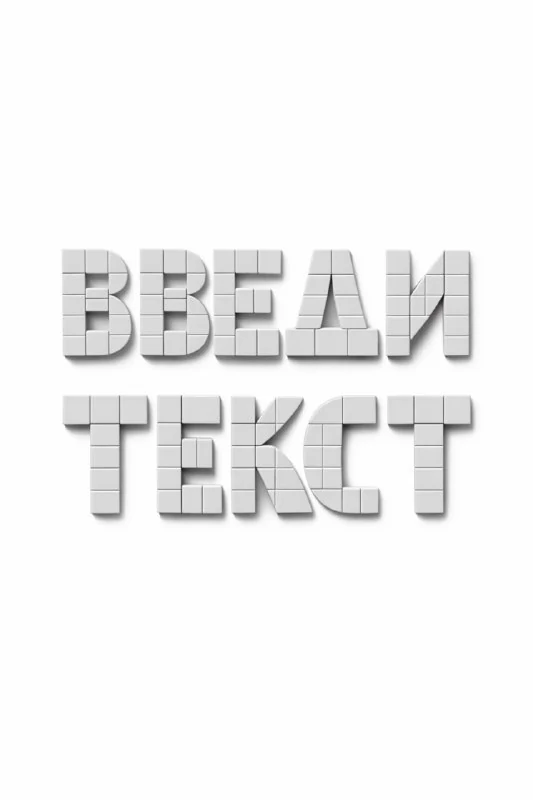
Choose the word and module size
For this exercise from the geometric collection, choose a short word with different letter types: straight, rounded and diagonal. This shows how one principle works across different forms. Put the word in YOUR TEXT, keeping the other requirements unchanged for the first comparison.
Imagine a notional grid before generating. How many identical parts make up a letter's height? Which module forms a corner, curve or stroke ending? The prompt describes a system in words but does not provide an editable vector grid. You will need to check its consistency in the image.
The original prompt with repeating elements
Letters made from geometric modules
Create the word "YOUR TEXT" using a modular typographic system. Letters constructed from repeated geometric units, strict grid logic. Material: solid plastic or matte ceramic. Lighting: clean studio lighting, neutral shadows. Background: minimal. Systemic, graphic, design-driven typography. Aspect ratio 3:4.The phrases repeating geometric units and strict grid system describe the construction. Assess them before the lighting. If every letter uses its own set of shapes, the result is decorative lettering without a unified modular principle. Specify equal element sizes and repeated angles.
Parts can rotate within the word but should not change thickness without explanation. Follow one module from a straight stroke into a curve. A missing segment or a thin accidental bridge often goes unnoticed in a large preview but becomes an obvious error in the actual layout.
Choose one surface treatment
The original suggests rigid plastic or matte ceramic. Choose one material for the first result. Plastic can have a more even highlight; matte ceramic produces a softer surface. Do not try to combine mirrored, translucent and grainy parts at once: the material differences would compete with the grid.
Keep the word and camera fixed when comparing. Save the plastic and ceramic versions side by side. Decide based on how the material makes individual modules understandable, rather than on the number of highlights. Lighting should separate neighbouring planes while preserving the letter shapes.
Check counters and spacing
Shrink the image to the heading's intended size on the poster. The enclosed spaces inside letters should remain open. If they merge with shadows, enlarge the opening or reduce the depth. Check letter spacing too: identical measured gaps can look uneven beside curved and straight characters.
Generate a problematic letter separately with the same modules. This makes its construction easier to assess than asking the model to fix the whole line at once. If the lettering is intended as a brand mark, use the image as a sketch and construct precise shapes in a vector editor.
Build a poster around the structure
Keep the modular lettering as the only large dimensional element. Set event details, the date and caption in a regular font. You can align those lines to the same notional grid without repeating geometric letters in every block.
Compare the layout on a phone and at full size. A missing letter, incorrect character order or closed counter matters more than an attractive material. Save the original word, selected surface and successful prompt. For another approach to letter construction, explore four wood treatments.
Select the inscription for the next layout
Creative AI Typography contains 823 prompts with examples, search and effect categories. Start by trying 40 options with your own text in the free demo.