Select textile effect before generation
An inscription with an embroidery effect can look like a patch on clothing, three-dimensional letters made of threads, or flat stitches on fabric. If you ask for everything at once, the neural network can mix different techniques: show loops, smooth fabric and plastic edge in one letter.
For a layout, first define the element's role. The patch is convenient to use as an independent icon or as an accent on the cover. The looped text can be placed in a large headline, where the viewer will have time to see the texture. In both cases, it is worth starting with a short word and fairly thick letters.
Here we are creating a textile effect image. It is not a file for an embroidery machine: for actual production, separate preparation of the design and technology will be required. Use the generation as a visual, idea or reference for further work.
Prompt for a 3D embroidered patch
The first option from our free demo combines soft stitches, volume and a pastel palette. The request includes laces and a badge shape, so the result may be more decorative than a simple fabric message.
Oversized embroidered patch
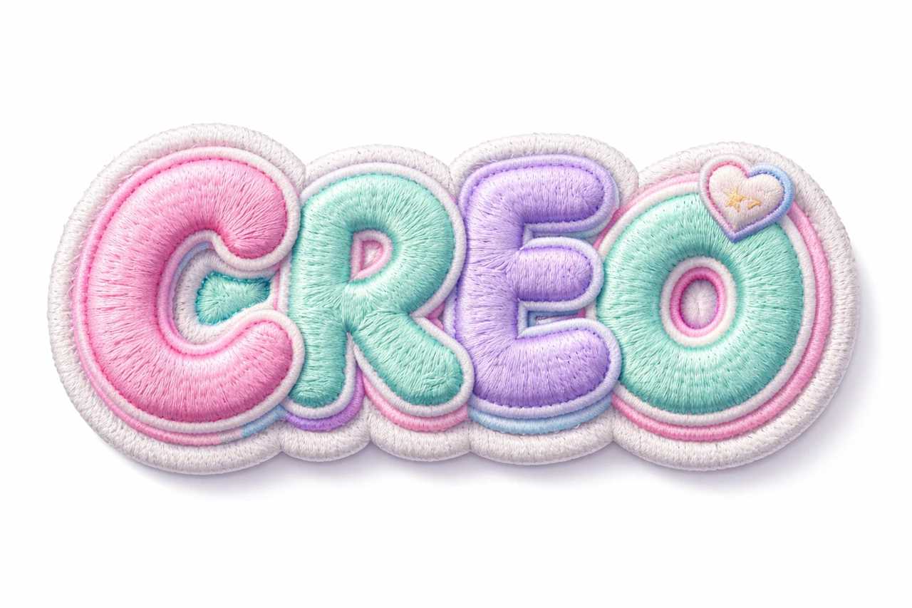
shoelace patch typography "ВАШ ТЕКСТ",
puffy embroidered badge,
raised soft stitching,
candy pop color palette: bubblegum pink, mint green, lavender,
3D textile volume,
highly detailed fabric texture,
visible woven fibers,
kawaii streetwear style,
text only, isolated typography,
subtle shadow on white surface, product photography, ultra detailed, 8k
Replace YOUR TEXT with your inscription. Description puffy embroidered badge sets the shape of a 3D patch, raised soft stitching - raised stitches, visible woven fibers - visible fibers. If laces are not needed, remove shoelace and leave the description of the embroidered patch.
For a different palette, replace the entire list of colors rather than adding a new palette to the end. For example, for a calm visual, you can leave cream and dark blue. For a small icon, two distinct colors are more useful than many close pastel shades.
Prompt for letters made from loop yarn
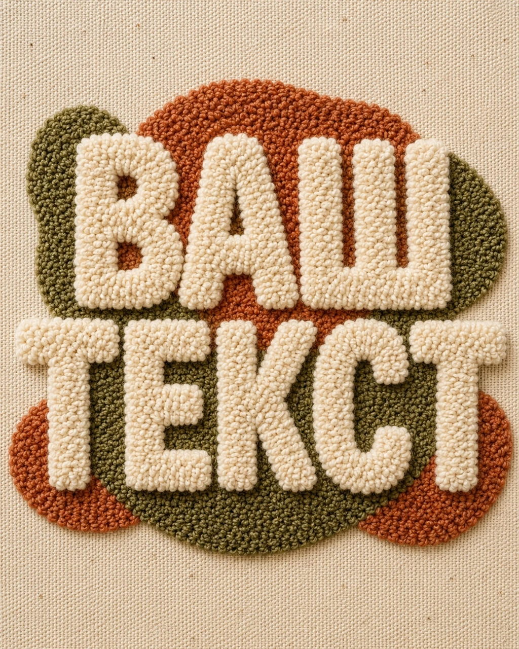
The second example from section «Вышивка» uses the description punch-needle embroidery. It directs the generator towards the tight loops of yarn and soft pile. The shape of the letters here is more important than the outer frame: the inscription should be read as a word, and not as a set of textile spots.
Loop embroidery letters
Create the exact word [TEXT] as bold punch-needle embroidery, thick looped yarn densely tufted into clearly readable letterforms, soft tactile pile with visible height variation, rounded edges and cozy handcrafted texture, cream, terracotta and muted olive palette on natural canvas, contemporary textile-design aesthetic, clean centered composition, no additional text, no logo, no watermark, vertical 4:5 format, ultra detailedInstead of [TEXT], write the desired word. You can leave the square brackets or replace them with quotes; the main thing is to clearly separate the inscription from the description of the material. The colors of cream, terracotta and muted olive and natural canvas set a warm, calm palette.
If the pile is blocking the gaps, check for thick but clearly visible letters and clear internal spaces. If the shape is too smooth, reinforce the description of the loops and differences in pile height. Change the texture separately from the color: this makes it easier to choose a truly suitable option.
How to Maintain Readability
- Use short words. Small embroidery details are difficult to distinguish when trying to fit a long slogan into a small block.
- Watch for gaps in the letters. Thick yarn can cover holes and make similar characters indistinguishable.
- Separate the color of letters and fabric. Close shades look soft, but the word may get lost in a small preview.
- Check the shadows. A shadow that is too hard can sometimes make soft text look like plastic or rubber.
This article shows a published example and does not guarantee an exact result for any word. The texture and spelling may differ for different generators. For important inscription, always compare the result with the original text letter by letter.
How to use embroidered lettering in a layout
If you need a separate patch, ask for a simple, solid background with clear margins around it. Then remove the background in the editor. Don't automatically cut out the entire soft edge: fine grains help maintain the feel of the fabric.
If the canvas background already suits the composition, you can use the picture as a solid block. Add regular typography around it: title, description, or date. Support the textile theme with one or two details, rather than a new texture for each element.
For a store cover, a craft card, or a seasonal banner, this headline can be the focal point. Test the composition without decorations first, then add additional elements. If you want a lighter texture, check out the article on floral letters .
Before exporting, evaluate the inscription in the size of the actual placement. Detailed generation is not a substitute for checking the final file: resolution, edges and readability are determined by the image itself and the layout.
Select the inscription for the next layout
In this article, we opened one example from the «Вышивка» section and a prompt from the free demo. Other textile effects, patches and materials can be viewed in the full Creative Typography.