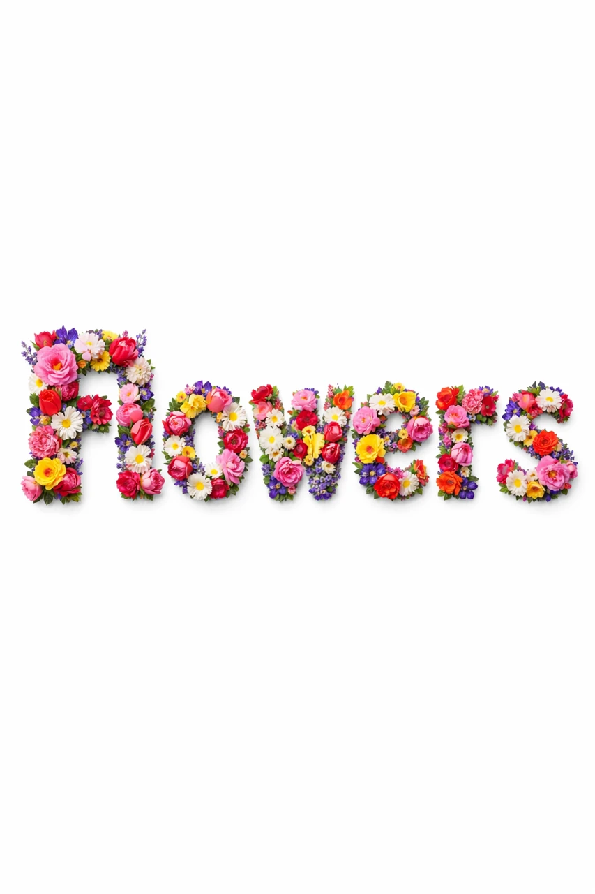
Flowers should form letters
When you need text made from flowers, the most important thing is to indicate that the flowers make up the very shape of the letters. The wording «надпись с цветами» can result in a regular font with a bouquet next to it. For the desired result, in the prompt we separately describe the dense filling of the letters and the preservation of the silhouette.
This typography is suitable for a greeting card, event poster, flower shop design or seasonal cover. For the first test, choose a short word: name, greeting or title. It is better to divide long text into a decorative title and an explanation in regular font.
Before generating, decide how you will use the background. Pure white is convenient for later cutting. A composition with petals and stems can work as a finished image, but will require more attention when adding your own information.
Prompt for letters of different colors
The first request asks for letters made entirely of fresh flowers. Roses, tulips, lavender, peonies and daisies are listed inside. The background is specially described in detail so that decorative elements do not fill all the free space.
Letters made from fresh flowers
Create the text "YOUR TEXT" where each letter is entirely formed from real flowers (roses, tulips, lavender, peonies, daisies and other varieties). Dense floral arrangement, different species and colors, natural color transitions, rich petal texture, realistic depth and dimension. Soft, diffused lighting, natural shadows within the letters only, high detail, sharp focus, photorealistic style. Background: pure solid white (#FFFFFF), completely clean and uniform, no gradient, no texture, no bokeh, no decorative elements, no floor, no surface, no scattered petals. High contrast between the floral letters and the white background. Clean, well-defined edges for easy background removal. Centered composition with generous white space around the text. 3:4Replace YOUR TEXT with your word. The phrase each letter is entirely formed from real flowers sets the basic principle of construction. If you want a calmer palette, shorten the list of plants and select similar shades. To get a uniform texture, you can leave one type of flower.
For easy cutting, scattered petals, vases and background decorations are prohibited here. Do not add the request «украсить всю сцену цветами» at the same time: it will conflict with this restriction. A white background is not the same as a transparent background, so you will still need to remove the backing.
Prompt for an inscription made of bright gerberas
The second example from the full collection is more intense. Gerberas cover the front and sides of the dimensional letters; leaves, stems and individual petals are allowed nearby. It is convenient to consider such an image as the basis of an advertising composition.
Bright inscription from gerberas
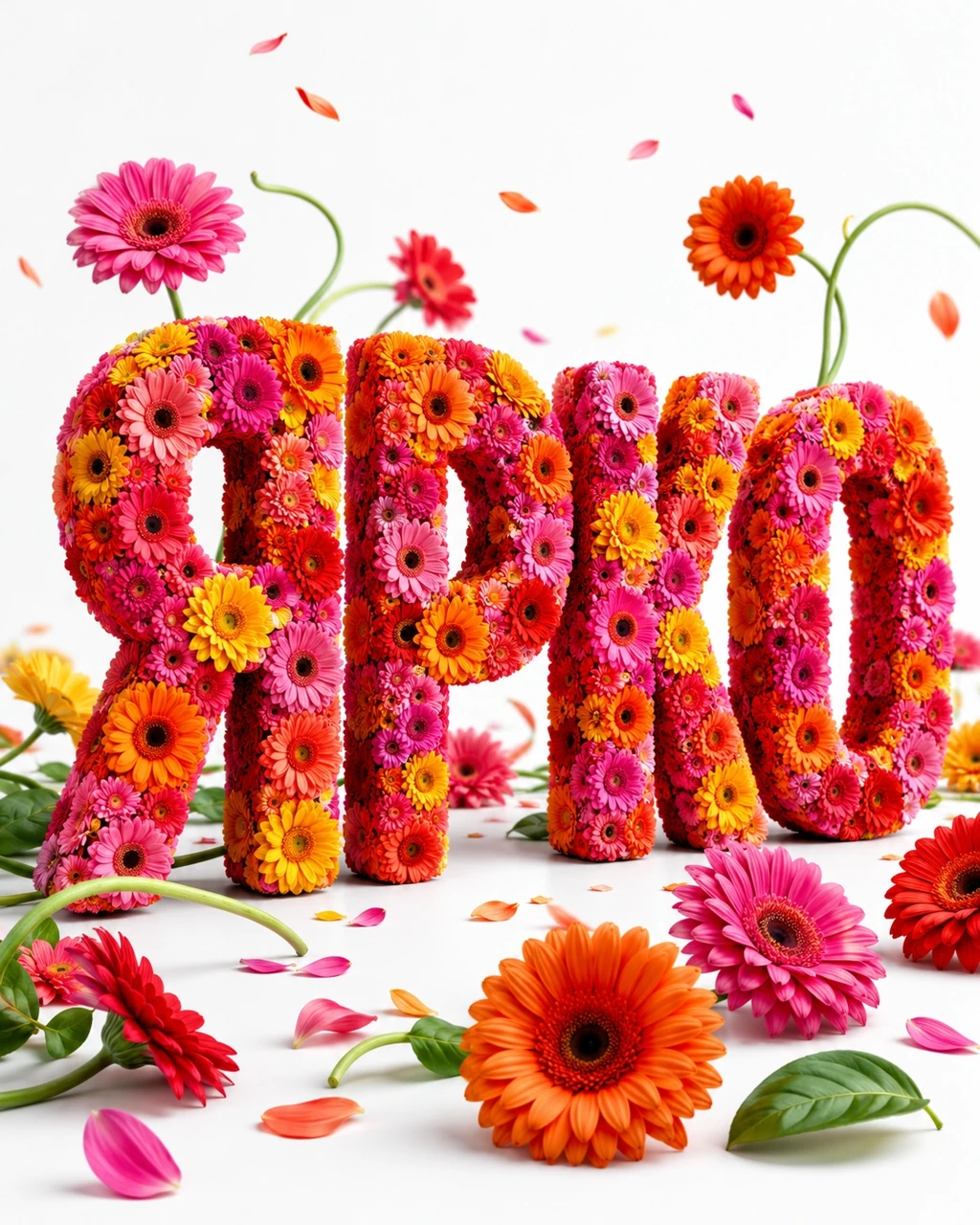
Create vivid summer 3D typography with the exact text "YOUR TEXT". Oversized chunky readable letters entirely formed from tightly packed fresh gerbera flowers. Use hot pink, bright orange, coral, red, yellow and magenta blossoms. The flower heads must cover the front and sides of every letter while preserving a clean silhouette. Arrange several gerberas, loose petals, green leaves and curved stems around the word. Add only a few petals and small blossoms suspended in the air. Place some flowers in front of and behind the typography to create depth without clutter. Bright energetic advertising poster, saturated colors, clean studio lighting, soft realistic shadows, pure white background clearly visible, photorealistic, ultra detailed, vertical 4:5 composition. Only the specified text, no extra words, no vase, no wrapped bouquet, no landscape, no logo, no watermark.Start with the original palette to get a feel for the effect. Then replace the entire color list with your own. If the background needs to remain free for text, reduce the number of individual colors around the word. Specifying without clutter helps express intent, but the finished result still needs to be checked with your eyes.
Why is the word sometimes hard to read?
In flower letters, the outline consists of many small elements. A separate petal can block a gap or connect adjacent symbols. This is especially noticeable in long words and when the image is zoomed out.
- Ask for a wide, readable silhouette and slightly more letter spacing.
- Remove leaves and stems that cross the title block.
- For the first option, use one line and short text.
- Check the letters in a small preview: some errors are invisible in a large invoice.
If precise spelling is not possible, you can leave the flower picture as decoration and type in the important information manually. This is a reasonable working option when the brand name or name cannot be distorted.
Assembling a postcard or banner
First, put a floral header in your layout and evaluate its width. Then add a short greeting, date, or description of the offer in regular font. The text should not fall on the motley texture: leave a calm area of the background for it.
The color for additional typography can be taken from one of the colors already present in the image. At the same time, choose a shade that contrasts with the background, and not just matches the palette. Check the layout at the final size: bright pink on white may look different than on a large working canvas.
If the letters are cut out, carefully add a new shadow. The generated light already sets the volume, and a second mismatched light source can make the composition unnatural. It's easier to choose a background that supports the existing lighting.
For other tactile material there are instructions for embroidered inscriptions . If you need a more neutral title for the product, compare it with the volumetric plastic text .
Select the inscription for the next layout
Full Creative Typography features floral, botanical, and seasonal effects for text. Compare ready-made examples to choose the right presentation for a postcard, poster or banner.