Decide what should be in the image
Choose one publication and reduce its topic to an understandable phrase. For example, an article about cutting out an object gets a cover about removing the background, not the abstract «Новый полезный пост». The headline should explain the content to a person who has not seen previous publications and does not know your internal headings.
Do not transfer the entire text of the post to the cover. The list of steps and clarifications will remain in the post caption. The image helps to select a publication, but does not have to replace it completely. For the first version, a theme, one related object and a small channel designation are enough.
Choose an object that makes sense
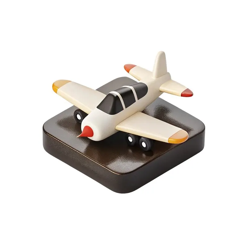
If the post is about shooting, the camera is clearer than a random beautiful ball. For practice, the free set of PNG icons is suitable. It was published by in the CreoPrompt channel. If the desired topic is not among the items, use a fragment of the working layout or a screenshot of the result.
An image with text already typed may interfere with your headline. First, check that there are no random words or small unreadable details in the frame. Don't add subject matter just to fill a void: sometimes a clean text cover looks clearer and is faster to read.
Create a simple template
- Define the margins and large header area.
- Place the item in the free part of the composition, keeping the margin up to the letters.
- Designate one space to designate a channel or category.
- Limit your colors and styles so that subsequent covers can be repeated.
- Save the option with a long topic, where the object takes up less space.
For the tutorial file, you can start with a square composition. Please view the actual publication in the selected format: cropping and viewing size may vary by image and device. Don't consider the boundaries of a large layout to be a guarantee of how it will be seen in the feed. Leave some free space at the edges.
Separate the category from the post title
A small label like «Практика» helps identify the type of content, but does not replace the specific topic. The size difference should be noticeable. If the category label is more prominent than the post headline, make it smaller or weaken the color. The reader first needs to understand what the publication is about.
For different categories, you can change one accent color while maintaining the grid. Do not change all elements at once. Check out the three covers side by side: they should feel like part of the channel, but differ in content. If the topic is determined only by the caption under the image, the title should be clarified.
Check reading and repeatability
View the cover thumbnail and open a test export on your phone. Is the topic readable? Is the item too big? Does an important word disappear next to a highlight? Then replace the text with another real heading and make sure the template can handle it without reducing the font too much.
Save a working copy with layers and title length rules. For a wider range of publications, use three social media templates . If the material requires sequential explanations, it is more convenient to arrange it with a carousel, rather than overloading one cover.
Assets for your next layouts
For new themes in the 2026 Designer's Pack, you can select objects, icons and backgrounds. The cover system will become more convenient if the materials obey the general rules of composition.