Select three publishing tasks
Take real texts of future posts: news, useful tips and service offers. Don't start with the same short placeholders. The template must accommodate content of varying lengths. For each post, write down the main idea and what you want to see in the image without reading the caption.
An announcement needs an event or news and a date. For advice - a topic and a short example. The proposal is a specific result of the service and action. Different tasks can use a common grid, but have different proportions of text and images. There is no need to force everything into one universal card.
Establish a common foundation
Choose the tutorial layout size, margins, background color, text styles, and small brand symbol position. This is a permanent part of the system. Create a base file, then three variations of it. When actually publishing, check the format and areas of overlap with the interface of the selected site.
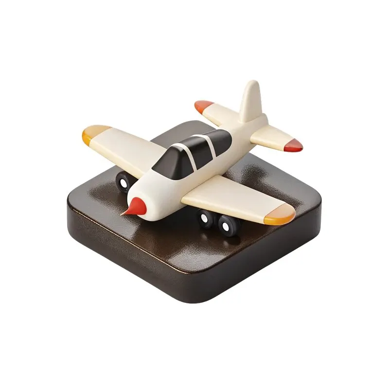
For the first images, you can take 48 free PNG icons. Choose an object based on the meaning of the message. The plane will support the theme of travel, the camera - filming. If there is no suitable item, use a simple photo or text option instead of a random fancy icon.
Collect three options
- In the announcement, highlight the title of the news and the date. Leave details for the caption if they overload the image.
- In your advice, give more space to content: a short example, diagram or comparison.
- In your proposal, put the outcome of the service and one clear next step.
- Keep margins, alignment rules, and typography consistent across all variations.
Subjects may differ, but their visual scale must be consistent. An icon with a large empty field inside the file is not the same size as a tightly cropped photo. Compare the apparent shape of an object, not just the width of the frame. This is especially noticeable in the general publication grid.
Check long text in advance
Substitute the longest title that you actually plan to use. If it doesn't fit, set a reasonable line limit and provide an option without a large object. Don't reduce text to an unreadable size to save a picture. The content is more important than an exact match with the original sketch.
Make a test run of six cards, two for each template. Check them out side by side. The overall system and task differences must be recognized. If all the cards look the same, change the distribution of text and images. If they are too different, go back to common margins, colors and styles.
Prepare templates for regular use
Name the layers by content: title, explanation, date, image, action. Separate permanent elements from replaceable ones. Save a blank working copy and sample sample. This will help you avoid deleting an important part of the layout the next time you post.
Test the export in a small size and open the finished files separately. For additional formats, use banner adaptation , and for a consistent explanation of the topic, use eight-slide carousel . Other open sets are in the materials section .
Assets for your next layouts
To expand the system, the 2026 Designer Pack contains icons, backgrounds, objects and 14 PSD sources. First, test the three templates on your texts, then select additional materials.