First decide the theme of the illustration
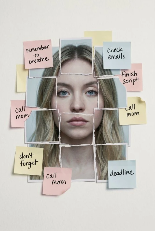
In author's comment the face turns into a mosaic of paper squares and pastel stickers. This technique helps visually communicate multiple reminders, memory, or task fatigue. It remains an artistic metaphor: the image does not allow one to determine the human condition.
Choose one topic for a specific material. For an article about forgotten deeds, short reminders are suitable, for a personal story - individual memorable words. Do not mix dozens of plots at once: it will be difficult for the viewer to understand what connects the paper details.
Prepare a frontal photo with visible eyes and a calm expression. In the original request, the portrait is centered. A profile shot or a wide smile will conflict with this setting and require additional text changes.
Prompt for face and paper notes
Editorial portrait with paper reminders
Centered frontal portrait of the person from the input photo, expression quiet and introspective, fragmented into a mosaic of torn photo squares and scattered pastel sticky notes, each bearing handwritten reminders in urgent, looping script. The background is a muted, off-white surface with a faint paper texture, minimal and clinical, allowing the layered elements to emerge with haunting clarity. Lighting is soft and diffused, with no harsh shadows—just a cool, ambient glow that flattens the space and enhances the stillness, making the face appear pinned in time like an emotional bulletin board. The composition is tactile and textured, with subtle film grain and the delicate curl of paper edges creating a sense of quiet chaos and psychological weight. The overall mood is editorial and emotionally restrained—evoking themes of memory, burnout, and fractured identity with a visual language both poetic and meticulously controlled.Quiet and introspective sets a restrained expression, and torn photo squares describes fragments of the photograph itself. If only decorative stickers appear around a solid face, the main mosaic technique has not yet been completed. You need to see several paper parts inside the portrait.
In the request, pastel notes carry handwritten reminders. Their task is to create the impression of thoughts and unfinished business. To post with specific words, don't rely on random generation of captions: leave the paper spaces blank or replace the text in the editor.
Keep the composition calm
The background is described as a muted light surface with a subtle paper texture. It should have different layers and face. An overly bright palette, large arrows or aggressive marker designs will change the mood and distract from a quiet setting.
Start with a few stickers around the edges of the face and an overlap or two on the inside. This is a working way to simplify the scene, not a set number from the source. It is important that the notes do not cover both eyes and the entire mouth at the same time: then the portrait quickly loses its supporting features.
View the image in a reduced size. If only colored squares are visible, enlarge the main parts of the face and loosen the paper decoration. If the face is completely solid, add clear joints between the photo squares. Check the structure before the fine texture of the edges.
Paper and light must work together
Soft and diffused provides soft lighting without harsh shadows. The deep black shadows of each sticker make the scene feel heavy and object-like, although the source material strives for a flatter, still feel. To correct this, reduce the shadows between layers, keeping the paper volume light.
Curved edges help differentiate materials. But the same strong curl on each note looks artificial. Compare flat and raised areas, sticker sizes, and lighting direction. A couple of distinctive edges usually give more information about the paper than dozens of identical curls.
Check the face joints. The eye, nose and lips may be separated by paper borders, but should not become additional organs. Refine a specific fragment if a second mouth or a displaced eye appears, maintaining a calm expression throughout the portrait.
Add meaningful captions in the editor
After selecting the illustration, type the desired reminders on separate layers. Choose a handwritten font with clear lettering and limit the number of words. For the thumbnail, it is more important to distinguish the nature of the notes; for a large spread, you can add readable short phrases.
Place the title of the article next to it or in a separate field. Avoid putting long text over eyes and paper joints. Leave a visual hierarchy: first the person, then the topic of the material, then small notes.
Save the original photo, the version without semantic inscriptions and the working layout. For a more energetic approach with neon patterns and intentionally mismatched facial details, compare it to the urban collage portrait . Here, frontal positioning and a restrained rhythm of reminders remain the mainstay.
Select the inscription for the next layout
The editorial illustration can be supplemented with a separate title of the material. Creative typography has prompts and examples of inscriptions; Compare the decorative version with the regular font and start with a demo.