Choose the word the arrows point to
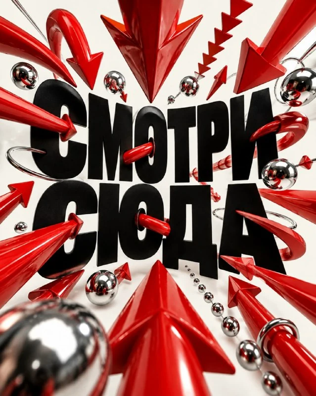
In , the first author's comment describes a poster with large black typography and red volumetric arrows. They are directed towards the lettering, passing next to the letters and creating depth. First, choose one short word to be your main message.
A long sentence will complicate the scene: shooters will have to interact with several lines and many small spaces. For the first exercise, keep one name, command or title. Add explanations, dates and conditions in the editor after selecting the image.
Replace TEXT with the final label. Don't change a word every time you test a composition. On the same text, it is easier to notice which arrow improved the direction of view, and which obscured the desired letter.
Prompt for 3D arrows around text
Poster with text and red arrows
Create a visually addictive conceptual advertising poster in vertical 4:5 format. Exact main text: “TEXT”. Make oversized black typography the central structure of the poster and surround it with a choreographed swarm of glossy red 3D arrows, chrome spheres and directional graphic elements all physically pointing toward the words. Some arrows should pierce through letter counters, wrap around the typography, cast realistic shadows and project toward the camera using exaggerated perspective. Use an off-white background, brutal black type, vivid lacquer-red objects and small chrome details. Strong fisheye-like depth, studio flash, extremely clean product photography, controlled chaos, bold negative space and a contemporary Japanese advertising feel. The poster should look like an actual campaign visual designed to stop scrolling instantly. No people, no extra readable text, no logos, no watermark.Oversized black typography makes the word the basis of the composition. The red arrows and small chrome spheres should support it. If the central object is a huge sphere, make it smaller or remove it, leaving the main interaction between the arrows and the label.
The source contains advertising language about visibility and stopping scrolling. They describe the desired experience rather than the measured outcome of the campaign. To evaluate the poster, use specific features: the word is read quickly, the direction of the arrows is clear, there is room for secondary information.
Check where each object actually points
All physically pointing toward the words requires directing volumetric arrows to the text. Look separately at their tips. Sometimes the generation maintains a nice red motion, but a few arrows point out of frame or into a random empty area.
It is useful to leave different distances around the word. One arrow may be close and large, the other small and further away. If all the objects are the same scale and form an even wreath, the perspective weakens and the poster becomes flatter.
Don't correct the wrong direction by adding another arrow. Remove the disturbing object or turn it around, maintaining the overall rhythm. The more directions there are in a scene, the harder it is to know which focal point you've chosen.
Overlaps and perspective should not break letters
In the request, the arrows pass through the internal gaps of the letters and wrap around the inscription. This creates the feeling of a physical scene, but may obscure an important part of the symbol. Check the letters in order: each one should still have a recognizable outline.
Exaggerated perspective and greater depth enhance close objects. If the tip takes up half the word, loosen the perspective or move it to the edge. Don't shrink the entire title for one thing, because then the arrow will start to control the layout instead of the text.
Look at the shadows. They should show which arrows are in front of the letters and which are behind them. An occasional dark line across a word can look like a new stroke and change the spelling. Correct such overlap before adding secondary signatures.
Collect the final message on a calm field
A light background and free space are provided in the source code. Use them for one explanatory line or small action. Do not place signatures at each tip: then the arrows will begin to be perceived as a diagram, although the main technique is associated with one word.
In the editor, check the text with the desired spelling. If the generator has changed the symbol, restore it or assemble the inscription separately, saving the arrows as an illustration. For this task, is suitable for analyzing the correction of letters in the AI inscription .
Save the information layer separately from the image. The original frame has vertical proportions 4:5; When adapting to a different size, watch the arrows extending towards the edge. Accidentally cutting the tip changes direction and can destroy the entire technique, even if the word is saved.
Select the inscription for the next layout
For a different header character, look at the examples in Creative Typography. The collection contains text effects and prompts; The demo will help you test the approach on your own terms.