Lettering as a separate element of composition
Handwritten lettering in a neural network is convenient for short titles, posters and covers. The shape of the entire inscription is important here: rhythm, slope, density of strokes. This is an image of a specific word, and not a font file that can be used to type any paragraph. Minor information will still have to be formatted in the editor.
Let's take a poster for a small music event. The name can be made hand-drawn, and the date, place and participants can be typed in a calm font. Before generating, decide whether the caption should occupy one line or two. This choice affects the proportions, so it is better to make it before searching for a beautiful texture.
Try a word without a complex background first. If an illustration, a caption, a logo, and a detailed schedule appear simultaneously in a request, it becomes more difficult to verify the result. Separate lettering is easier to cut out, scale, and place on top of a photo.
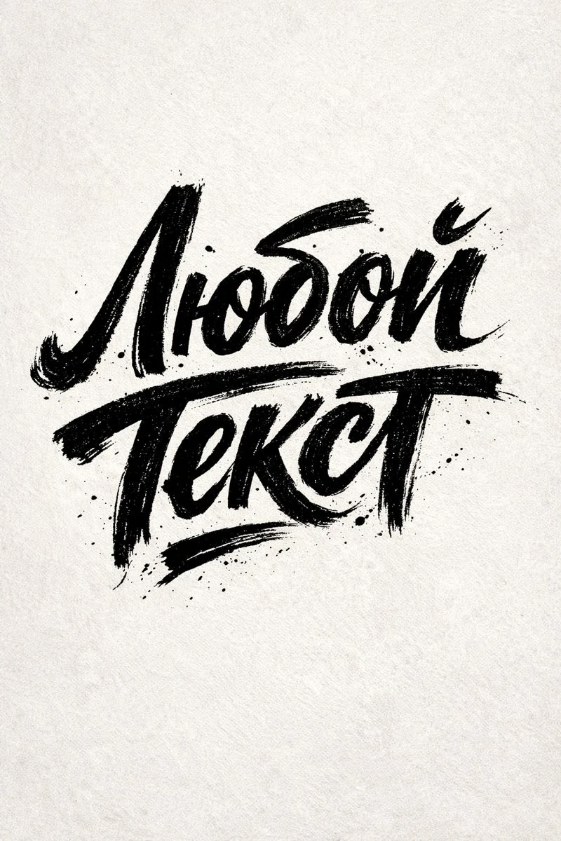
Ink lettering with active strokes
Expressive lettering with ink texture
Expressive hand lettering, "YOUR TEXT", emotional hand-drawn letterforms, bold organic strokes, visible hand movement, raw ink texture, artistic lettering style, neutral backdrop. 3:4Replace «YOUR TEXT» with the name. The phrases bold organic strokes and raw ink texture define lively strokes and an uneven surface. A neutral background helps you see the outline of the letters. The 3:4 notation describes the desired composition; actual file size depends on the selected tool.
First, evaluate the silhouette of the word. It should be readable even without examining minor abrasions. If the wide strokes overlap the gaps inside the letters, ask to increase the gaps or reduce the fill density. Don't try to immediately fix everything by adding a long list of artistic adjectives.
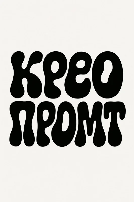
Smooth two-line lettering
Smooth two-line lettering
Create a bold typographic design of the phrase “Крео Промт” arranged on two compact lines:
First line: Крео
Second line: Промт
Use a fluid, liquid, organic psychedelic lettering.
The letters should look like ink drops or melted shapes, rounded and irregular but still legible, similar to the wordmark “cosmic” in liquid font style.Here the text is given in three places: in the general phrase, in the first line and in the second. When replacing «Крео Промт», upgrade all three parts. Otherwise, the request will simultaneously contain the old name and new words. If you need one line, rewrite the entire two-line statement.
Soft, round shapes work well for a compact title, but a long phrase can become too dense. Divide it according to its meaning. Don't leave a short preposition on a separate line just for the sake of symmetry: readability first, decorative balance second.
Assembling the poster around the inscription
- Select the result with the correct text and save the source before processing.
- Remove the background, leaving small strokes and spaces between letters. If necessary, adjust the mask manually.
- Place the title on the layout and determine its width. Don't stretch out individual letters to fill space.
- Add the date and location in regular font. Choose a style that is noticeably different from the hand-drawn title.
- Check spacing, margins, and contrast on the scaled-down layout.
If there is a photo next to the lettering, choose an area with relatively even light. Colorful details behind the letters will make reading worse. Sometimes it's easier to add a quiet background than to intensify the stroke to the point where it changes the shape of the lettering.
When the result needs to be improved
Uneven strokes may be part of the idea, but an extra letter or an incorrect connection is already a text error. First, compare the inscription with the original phrase. Then see if similar symbols merge. Check the Cyrillic alphabet especially carefully if its forms turn out to be similar to the Latin alphabet.
Keep one option with texture and one that is cleaner. A large stroke may look good on a cover, but turn into a blur in a small ad block. For the general assembly of the composition, poster practice with AI typography will be useful.
Select the inscription for the next layout
In Creative Typography you can search for an inscription by material and nature of the form. The complete library contains 823 prompts with examples; part is available in a free demo.