What inscription to turn into a sticker
For the first option, take a short message: «НОВИНКА», «ЕЩЁ» or the name of the collection. The sticker should be read together with the rest of the layout. If there are five lines of small text, a decorative outline will only add noise. It is better to leave the details of the promotion, conditions and address as regular text blocks.
Let's say we are making a banner for a new clothing collection. The main photo is already there, but on top we need a small accent «ДРОП». First, we determine the size of the sticker in the layout, then select its surface. For an active youth composition, let's try holographic film. For a calm card, a gradient without a complex texture is suitable.
Here we are talking about a sticker image for design. Generation itself does not create a file for typographic cutting or a ready-made set for the messenger. These tasks will require separate training.
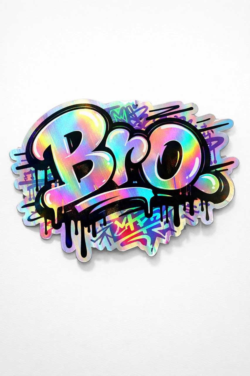
Prompt for a holographic sticker
Holographic sticker with inscription
holographic sticker typography "Your Text", graffiti handstyle, fat marker outlines, drip accents, dynamic motion lines, layered tag texture, die-cut sticker edges, iridescent foil, glossy laminate, subtle shadow on white surface, product photography, ultra detailed, 8kReplace «ВАШ ТЕКСТ» with the correct word. In the request, die-cut sticker edges is responsible for the shape of the edge, iridescent foil is responsible for the shimmer of the film, and glossy laminate is responsible for the glossy surface. Graffiti, drips and movement lines make the result more active.
If the letters are lost in the glare, first simplify the design: remove drips or lines of movement. Do not change text, color, material and lighting at the same time. Otherwise, it will be difficult to understand which change helped. After each option, look at the inscription in the size of the future banner, and not just in a large preview.
Prompt for a gradient sticker
Sticker with gradient letters
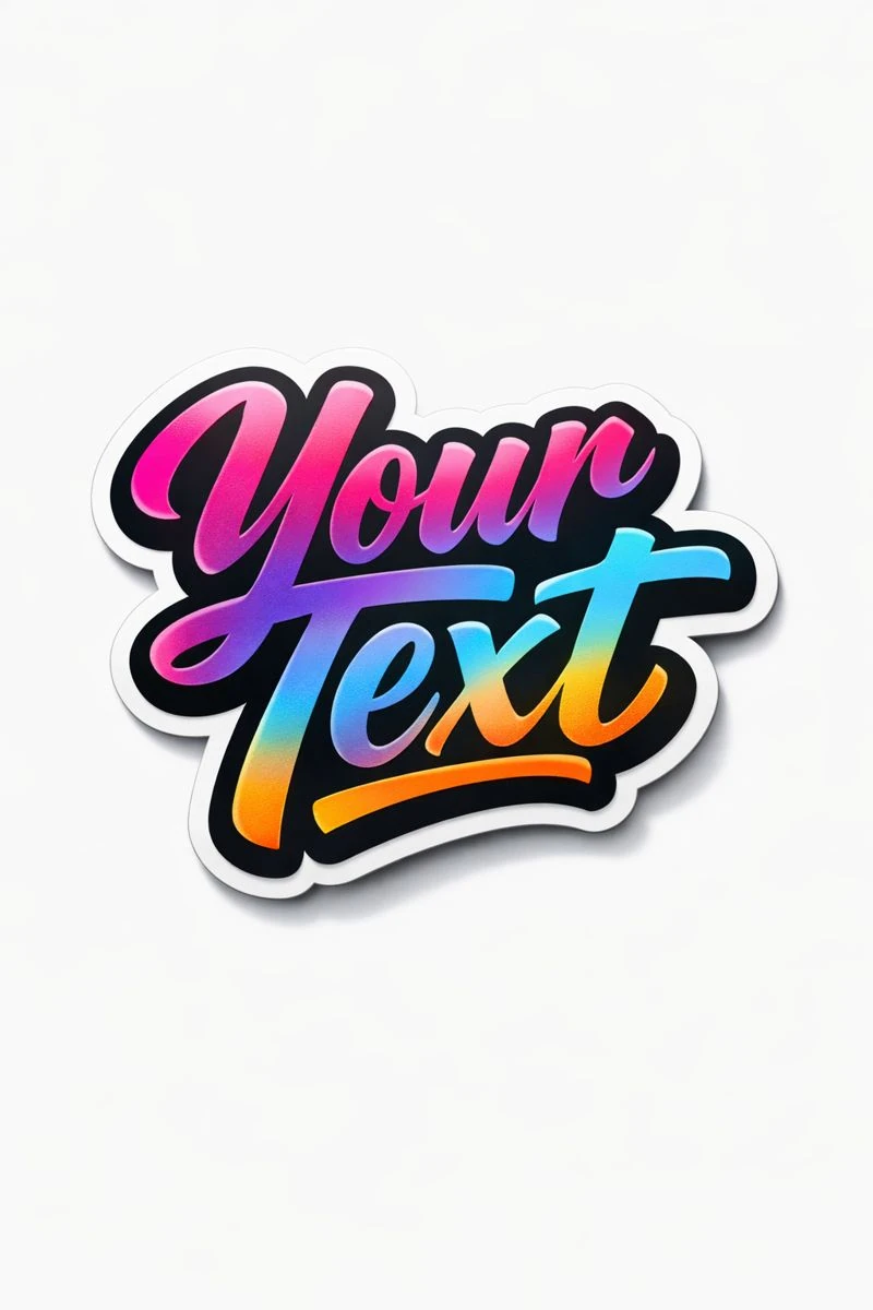
bold gradient typography "Your Text", smooth modern color transitions, high contrast, die-cut sticker edges, matte-gloss hybrid finish, clean white background, subtle drop shadow, commercial product photography, ultra detailed, 8kThis option specifies a more even inscription and color transitions. Instead of «Your Text», insert your message. To connect with the brand, specify two gradient colors and leave the rest of the description the same. This way you can get a set of accents for different sections of one store.
Both prompts have a white background and a small shadow. So don't expect transparency from the source file. The white area drawn around the letters and the background of the picture are different parts. Maintain the outline of the sticker when removing the outer background.
Preparation in a graphic editor
- Check every letter, including duplicate characters and endings. It is easier to regenerate or replace an erroneous inscription manually than to hide it in the composition.
- Remove the background around the sticker. Enlarge the image and adjust the mask on sharp corners and between individual parts.
- Place the result on a colored background. The light border will immediately show the areas where the old background remains.
- Select the size and position relative to the photo. Leave a margin from the edge of the design so that the sticker does not appear accidentally cut off.
- If the original shadow does not suit the new background, remove it and create a softer one in the editor.
Save your working file with a separate sticker layer. To transfer to another layout, export the image with transparency, if your format supports it. Do not glue the accent to the photo until the composition has been agreed upon.
What to check before publishing
Reduce the banner to phone size. The inscription should be readable immediately, and the outline should be separated from the photograph. Too much shadow will make the sign feel like a heavy sign instead of a light sticker. Too many individual stickers will begin to compete for attention.
If you need one main title, try one sticker first. Add a second one only when it has a separate task. Another way to highlight text is neon lettering: it works differently and requires a quieter environment.
Select the inscription for the next layout
In these examples, the lettering looks like a sticker. If you need another effect for the title - fabric, metal, glass or plastic - choose it in Creative Typography: 823 prompts with preview.